 1/2
PROMPT RECORD图像记录
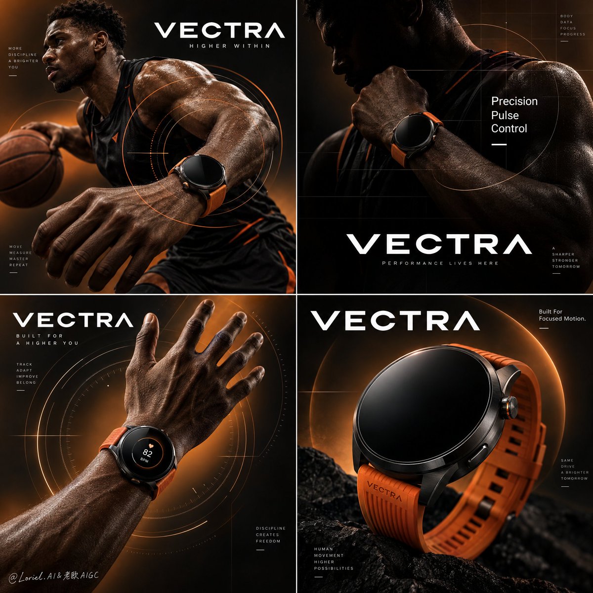
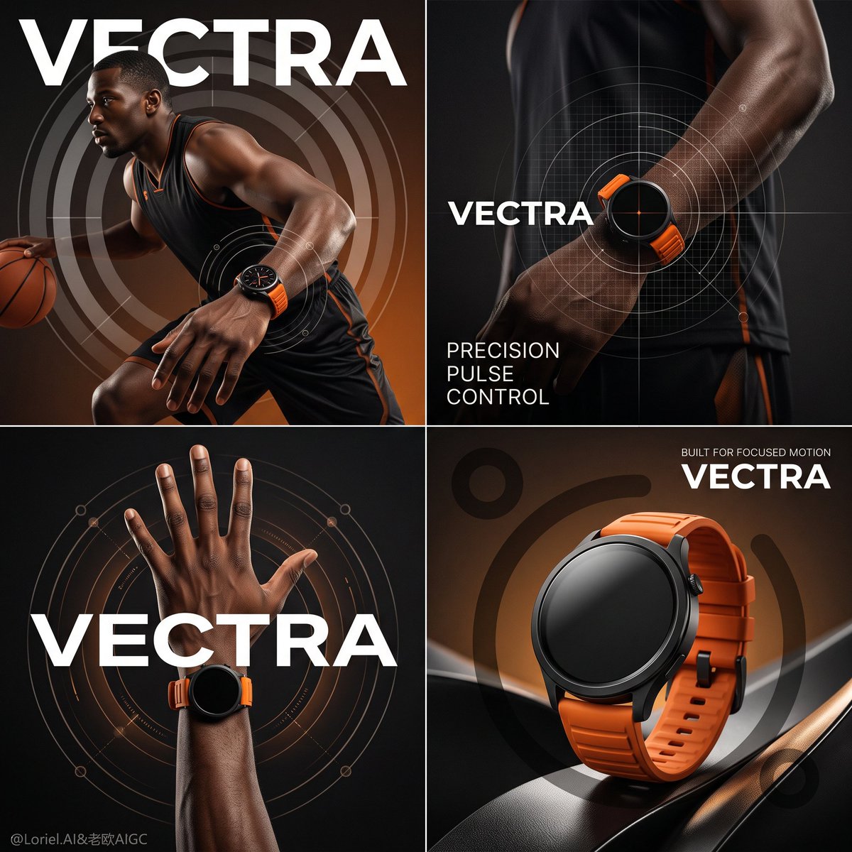
👉左侧:GPT image 2.5 | 右侧:Nano Banana 2.1 之所以有效,是因为这款手表被当作一件受控的工业物件来处理,而非运动服饰。 🧊`四个面板中的手表几何保持一致,手腕被...
中文说明
👉左侧:GPT image 2.5 | 右侧:Nano Banana 2.1 之所以有效,是因为这款手表被当作一件受控的工业物件来处理,而非运动服饰。 🧊`四个面板中的手表几何保持一致,手腕被放大,运动员退居次要,一帧几乎纯产品的主角画面` 这让整个campaign以产品为核心,而非球员。 ✨`环绕手腕的半透明靶环与精密网格,而不是环绕整个身体` 这将运动转化为图形系统,你能在不杂乱的情况下读出专注、追踪与控制。 提示词👇 为虚构的高端性能智能手表品牌 VECTRA 打造一张戛纳级商业海报,采用产品优先的四格campaign设计,融合电影级运动叙事、收藏级工业精度与策展级图形克制。保持完美的 2x2 网格、统一的黑到焦琥珀视觉世界、一位精英篮球运动员、多个以手腕为核心的构图、一格几乎纯产品的主角面板、面板内醒目...
原始 Prompt
👉Left: GPT image 2.5 | Right: Nano Banana 2.1

This works because the watch is treated like a controlled industrial object, not sportswear.
🧊`same watch geometry across all four panels, wrist enlarged, athlete secondary, one near-product-only hero frame` This keeps the campaign centered on the product, not the player.
✨`translucent target rings and precision grids around the wrist, not the whole body` This turns motion into a graphic system. You read focus, tracking, and control without clutter.

Prompt👇
A Cannes-level commercial poster for the fictional premium performance smartwatch brand VECTRA, designed as a product-first four-panel campaign fusing cinematic athletic narrative, collector-grade industrial precision, and curator-level graphic restraint. Preserve a perfect 2x2 grid, a unified black-to-burnt-amber visual world, one elite basketball athlete, multiple wrist-focused compositions, one near-product-only hero panel, bold in-panel brand typography, and translucent circular tracking graphics. The smartwatch must remain the absolute hero in all four panels, while the athlete functions only as a performance signal and scale anchor.

Use a square poster split into four equal quadrants with crisp borders. Upper-left shows the athlete in controlled forward motion with a basketball, side-profile to three-quarter angle, the lead wrist enlarged and dominant, intersected by large translucent target rings. Upper-right is darker and more abstract, showing torso, shoulder, and wrist with the watch illuminated against a silhouette body, overlaid with a refined precision grid and short editorial text. Lower-left isolates a raised forearm and open hand wearing the watch, centered inside orbital circular graphics suggesting motion capture and pulse mapping. Lower-right becomes a near-product-only close-up of the smartwatch in a sculptural black field, backed by oversized abstract circular marks and a faint warm halo. Each panel contains a bold VECTRA wordmark integrated into the layout.

The hero product is a high-end round performance smartwatch with a matte black ceramic face, ultra-thin black titanium bezel, subtle sapphire-glass curvature, precise crown and button detailing, seamless lug integration, and a vivid burnt-orange performance strap in soft-touch elastomer with engineered ribbing. The watch must feel premium, athletic, and exacting, more like elite training equipment than consumer electronics. The design stays identical across all four panels. Most displays remain dark and reflective; one wrist shot may show a restrained circular performance UI glow, minimal and elegant.

Use one powerful male basketball athlete with deep skin tone, sharp side profile, a sleeveless black performance uniform with subtle orange accents, and focused competitive energy. In the upper-left he drives forward with measured explosive intent, the basketball secondary and the watch on the lead wrist dominant. In the upper-right the body becomes partially abstracted into shadow so the watch reads as the brightest control point. In the lower-left only the forearm and hand remain, fingers naturally spread and anatomically clean. In the lower-right the athlete disappears almost entirely, letting the product carry the climax.

Keep the environment fully studio-constructed and minimal. No court, no crowd, no extra props beyond the basketball in the upper-left. The world is built from a smooth black-to-burnt-amber gradient, localized warm glows, translucent ring systems, faint precision grids, and soft graphic arcs implying speed, targeting, pulse, and control. Depth comes from lighting, figure overlap, product scale, and layered transparent graphics, never from environmental clutter.

Use a disciplined 55/25/15/5 palette: 55% black and deep graphite shadow, 25% burnt amber and copper-orange glow, 15% skin and industrial graphite highlights, 5% crisp white typography accents. Build strong directional studio lighting from upper-left and side-rear positions to carve the athlete’s cheek, shoulder, forearm, fingers, and watch case edges. The watch must receive the cleanest highlight control in every panel: thin bezel rim light, soft reflective falloff on the sapphire glass, and saturated but controlled emphasis on the orange strap. Contrast should feel dramatic, premium, and sculptural, never muddy, flat, or crushed into dead black.

Render everything as hyper-real flagship advertising photography with immaculate industrial fidelity. The watch face shows smooth dark glass, subtle reflections, precise case tolerances, and clean shadow bands around the bezel. The strap feels like premium elastomer with matte performance texture and engineered flexibility. Skin must feel real and powerful, with natural pores, tendon structure, and controlled sheen rather than sweat-heavy gloss. Graphic overlays must feel embedded in the visual system, translucent and atmospheric, not pasted on. The final image should feel like a global luxury sports-tech launch campaign.

Create a bold minimalist white wordmark VECTRA across multiple panels as one unified brand system. In the upper-right panel, place: Precision / Pulse / Control. In the lower-right panel, place: Built For Focused Motion. Typography must be geometric, crisp, spacious, and premium, integrated into the grid without crossing the watch silhouette or cluttering the compositions.

Premium sports-tech commercial poster, product-dominant, hyper-real, editorial, high contrast, clean four-panel hierarchy, no distorted anatomy, no broken fingers, no warped watch geometry, no inconsistent strap design, no muddy gradients, no cheap gamer styling, no cluttered interface, no gibberish text, no extra accessories, no style drift, no topology collapse, no flat catalog lighting.