 1/2
1/2
PROMPT RECORD图像记录
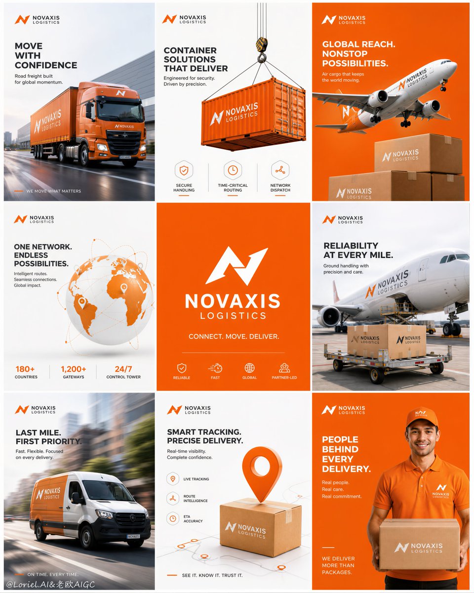
🚚 物流品牌做九宫格时,不要九张图都放卡车。让同一只包裹反复出现,才能把"速度、范围、信任、服务"变成一套完整的品牌记忆。 包裹不是道具,而是整场传播的主角。 ★ 同一只包裹作为反复出现的核心...
中文说明
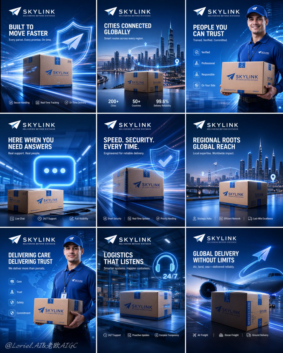
🚚 物流品牌做九宫格时,不要九张图都放卡车。让同一只包裹反复出现,才能把"速度、范围、信任、服务"变成一套完整的品牌记忆。 包裹不是道具,而是整场传播的主角。 ★ 同一只包裹作为反复出现的核心主角 同一只包裹出现在城市、机场、仓库和快递员手中;场景不断变换,品牌识别始终如一。 ★ 四个主题在九张图中反复出现 把内容收敛为速度、网络、人、服务四个主题,再有节奏地重复。九张图就形成一套系统,而不是九条独立口号。 ★ 一张图,一个服务承诺 每张只传达一个明确价值:准时、追踪、安全、覆盖、客服。用户扫过九宫格时,能拼出完整的品牌服务能力。 ★ 固定的 Logo、标题与图标区域 顶部固定品牌位,底部固定图标卖点区,中间留给主视觉。无论切换运输方式、人物或城市,都不会破坏系列感。 GPT- image 2 prompt👇...
原始 Prompt
🚚物流品牌做九宫格,不要九张都放卡车。让同一个包裹反复出现,才会把“速度、范围、信任、服务”变成一套记忆。
包裹不是道具,而是整场传播的主角。
★ branded parcel as the recurring hero object
同一只包裹出现在城市、机场、仓库、配送员手里;场景不断变,品牌识别始终不变。
★ four themes repeated across nine tiles
把内容收敛成速度、网络、人、服务四类主题,再有节奏地重复。九张图就有系统,而不是九条口号。
★ one tile, one service promise
每张只讲一个明确价值:准时、追踪、安全、覆盖、客服。用户扫九宫格时能拼出完整服务能力。
★ fixed logo, headline, and icon zones
顶部固定品牌,底部固定图标卖点,中间留给主视觉。换运输方式、人物或城市,都不会破坏系列感。

GPT- image 2 prompt👇
Create an ultra-premium 3x3 campaign board for a fictional international logistics group, designed as a Cannes-award-level advertising system with extreme realism, high brand recall, and a futuristic blue technology atmosphere. Preserve the exact structural logic of a nine-panel square grid layout: nine equal poster modules arranged in a perfect 3-by-3 composition with clean gutters, each panel functioning as part of one unified global logistics campaign. The final image must feel like an official flagship rollout for a world-class delivery brand, combining premium package realism, cinematic service storytelling, clean typography, and highly standardized corporate design language.

Core composition:
Use a strict nine-tile grid with equal proportions, precise spacing, and strong visual rhythm. Every tile must contain a consistent top logo area, a dominant hero visual zone, and a controlled message zone. The whole board should read as one integrated campaign, not nine disconnected posters. Keep the visual system highly unified through repeated blue-gradient environments, white and cyan light energy, elegant paper-airplane motifs, subtle route graphics, glowing technology accents, and consistent branded parcel design.

Brand identity:
Invent a short, memorable, English-only logistics brand name with a refined English tagline. The logo should feel minimal, aerodynamic, global, and scalable across fleet branding, social media campaigns, expo walls, and packaging systems. All visible text must be newly invented and must not copy any wording from the source image. The brand world should communicate speed, trust, smart routing, customer care, secure handling, and premium global delivery capability.

Visual atmosphere:
Build the entire board around a polished blue-forward palette dominated by royal blue, electric cyan, white, subtle silver, and restrained luminous highlights. The lighting should feel premium, futuristic, and physically believable, with soft glow, atmospheric depth, glossy reflections, and cinematic contrast. The image must feel clean, expensive, fast, and intelligent.

Nine-panel campaign logic:
Create a repeating four-theme storytelling system distributed rhythmically across the nine tiles so the board feels memorable and systematic.

Theme A, premium parcel velocity:
Show a branded parcel or shipping box as a hero product object in a dynamic high-speed environment with elegant motion-light streaks, aerodynamic energy trails, subtle shield or verification graphics, and precision-delivery symbolism. The package must feel highly realistic and visually dominant.

Theme B, citywide and regional reach:
Show a branded parcel placed against a cinematic metropolitan skyline or strategic urban-delivery environment, communicating large-scale geographic reach, last-mile fulfillment, and regional distribution power. Add subtle route-flow accents and premium environmental depth.

Theme C, human trust and frontline service:
Show a professional courier in a polished branded uniform, holding or presenting a parcel in a clean futuristic blue setting. Add minimal supporting symbolic elements such as service icons, value cues, or operational trust markers. The human figure must feel confident, reliable, and campaign-ready.

Theme D, support and smart logistics communication:
Show a premium contact-and-support concept featuring a glowing communication symbol, a branded parcel, and a clean logistics-hub or warehouse-inspired environment. This theme should communicate responsive service, full information transparency, and operational clarity.

Distribute these themes across the 3x3 board in a deliberate repetition pattern so the campaign feels like a real brand rollout with strong visual memory rather than nine unrelated ads. Slightly vary angle, crop, and secondary composition while preserving strict brand governance.

Commercial realism:
Render every parcel, courier uniform, skyline, warehouse space, floor reflection, communication symbol, and paper-airplane motif with elite advertising realism. Emphasize cardboard texture, printed identity graphics, realistic fold lines, subtle material wear, polished highlights, believable skin tones, garment stitching, reflective surfaces, and premium cinematic lighting control. Avoid generic stock-photo feeling.

Design-system discipline:
This must look like a mature enterprise campaign system. Unify logo placement, margin logic, headline scale, icon style, copy length, spacing rhythm, and color balance across all nine posters. Add subtle signs of system rigor such as repeated alignment rules, modular text blocks, restrained graphic separators, and consistent negative-space strategy. The result should feel scalable, intentional, and professionally art-directed.

Typography and copy:
Use English-only headlines and supporting copy throughout. Headlines must be short, high-impact, beautifully spaced, and premium in tone. Supporting lines should remain concise, strategic, and brand-consistent. Typography must feel architectural, clean, contemporary, and internationally polished. No heavy crude fonts, no cluttered paragraphs, no random slogans.

Creative emphasis:
The final board must merge three layers at once:
Orbit-level impact through stronger parcel hero shots, more electric motion energy, and more aggressive blue-brand presence;
Transit-level maturity through stricter layout consistency, clearer repeated service themes, and more believable logistics-system logic;
Port-level completeness through a full campaign rollout feeling, stronger repetition memory, and official flagship-presentation quality suitable for expo walls, social media launches, brand decks, and international advertising showcases.

No copied brand name, no copied slogans, no messy backgrounds, no chaotic grid, no weak hierarchy, no distorted figures, no low-detail parcels, no generic stock-ad feeling, no cheap effects, no random icons.