 1/2
1/2
PROMPT RECORD图像记录
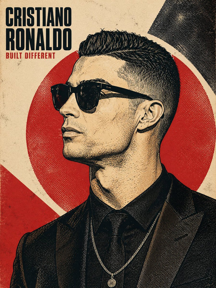
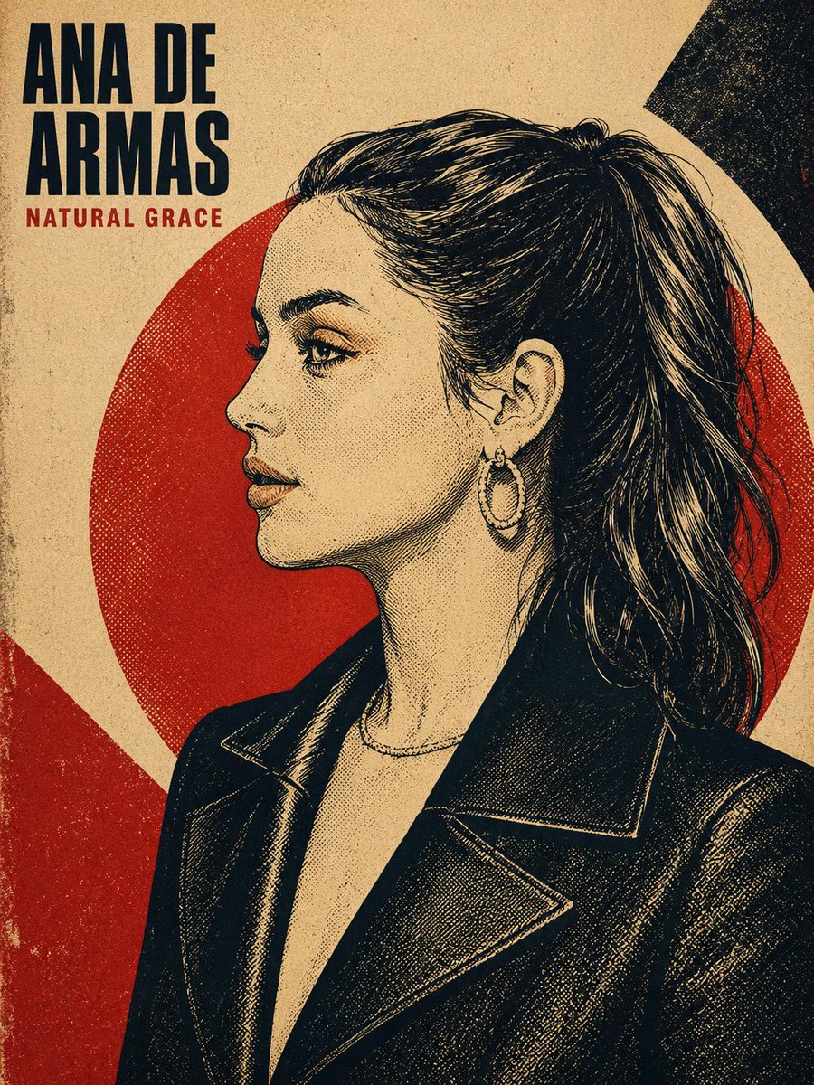
受1960–70年代启发的半色调肖像海报。 GPT Image 2 提示词: 为 {{PERSON_NAME}} 创作一幅精致的复古半色调海报艺术肖像。如有上传的参考照片则使用;否则,根据所提...
中文说明
受1960–70年代启发的半色调肖像海报。 GPT Image 2 提示词: 为 {{PERSON_NAME}} 创作一幅精致的复古半色调海报艺术肖像。如有上传的参考照片则使用;否则,根据所提及的人物姓名绘制其形象。成品必须仅为满版插画,不得包含参考照片的缩略图或嵌入小图。 以大胆的1960–70年代丝网印刷 / 胶印美学进行渲染,灵感来自复古政治海报、抗议艺术、复古杂志封面、演唱会海报,以及基于模板的图形插画。在保留可辨识的面部比例与身份特征的同时,将面孔转化为高对比墨线线条、交叉影线、点画、网点,以及雕刻式阴影。避免照片写实、气笔柔绘与平滑渐变。 构图:严格90度左侧正侧面,目光平视前方,下巴微抬,呈现自信、中性的表情。以纵向4:5或3:4构图框取头部与上肩/胸部,人物占据画面约70–85%。在头部后方放置...
原始 Prompt
1960s–70s inspired halftone portrait poster.

GPT Image 2

Prompt:
Create a refined vintage halftone poster-art portrait of {{PERSON_NAME}}. Use the uploaded reference photo when provided; otherwise, create the likeness from the named person. The final image must be a full-bleed illustration only, with no reference-photo thumbnail or inset image.

Render the subject in a bold 1960s–70s screen-printed / offset-lithograph aesthetic, inspired by vintage political posters, protest art, retro magazine covers, concert posters, and stencil-based graphic illustration. Preserve recognizable facial proportions and identity while translating the face into high-contrast ink linework, cross-hatching, stippling, halftone dots, and engraved-style shading. Avoid photorealism, airbrushing, and smooth gradients.

Composition: strict 90-degree side profile facing left, eyes looking forward, chin slightly lifted, confident neutral expression. Frame the head and upper shoulders/chest vertically in a 4:5 or 3:4 composition, with the subject occupying roughly 70–85% of the frame. Place a large solid-color sun/halo circle behind the head, with the hair and shoulders slightly breaking its edge. Make the hair highly detailed, with flowing individual strands, directional movement, and graphic highlight streaks.

Background: aged cream, paper, or canvas texture with asymmetric geometric color blocks, subtle halftone patterns, crosshatching, analog print grain, and slight screen-print imperfections. Keep the design sophisticated and cohesive rather than cluttered.

Color direction: automatically choose one limited, high-contrast palette of 2–4 colors. Default to warm aged cream + poster red + near-black ink, but allow tasteful alternatives such as deep navy + muted red/orange + cream, charcoal + burnt orange + cream, or a striking mustard/gold + black duotone. No photographic color gradients.

Typography: place the subject's name prominently in the top-left, using an extra-bold condensed grotesque sans-serif or slab-serif in ALL CAPS, tightly kerned and stacked across 1–2 lines. Add a short 2–4 word epithet or descriptor beneath it in a smaller bold condensed typeface, using the poster's accent color. Keep typography integrated into the composition and visually balanced.

Clothing: use simple modern or era-appropriate clothing with flat colors, visible fabric-fold linework, and the same halftone/engraving treatment. Preserve recognizable accessories from the reference when appropriate, but keep them minimal.

Lighting: use one hard directional light source across the profile, creating bold graphic shadow shapes. Build shadows using cross-hatching, stippling, and halftone density rather than gradients.

Final quality: crisp, highly detailed, print-ready poster illustration, sharp facial linework, authentic vintage print texture, strong graphic hierarchy, recognizable likeness, balanced negative space, and premium editorial-art direction. Maintain the same overall composition, typography placement, illustration technique, and visual language for every different person so the results feel like one unified collectible poster series. Aspect ratio 3:4