PROMPT RECORD图像记录
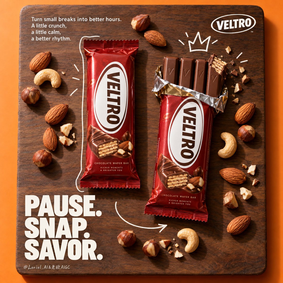
平铺图的能量来自视线的引导路径——而非堆砌更多道具。 🥜 在中央胡桃木板上垂直错落摆放两包产品,一包未拆封,一包已拆开 这样能形成清晰的“前后对比”叙事:左侧是承诺,右侧是兑现。木板承载整个画...
中文说明
平铺图的能量来自视线的引导路径——而非堆砌更多道具。 🥜 在中央胡桃木板上垂直错落摆放两包产品,一包未拆封,一包已拆开 这样能形成清晰的“前后对比”叙事:左侧是承诺,右侧是兑现。木板承载整个画面,橙色的留白边缘则让它更像一张海报,而非一张桌面照。 ✏️ 手绘白色轮廓线、皇冠与箭头标记,用于连接两包产品 涂鸦应作为方向引导工具,而非装饰。轮廓框住未拆封的条装,皇冠献给被掰开的手指,箭头则将视线带入“咬一口”与“酥脆感”的细节。 GPT- image 2.5 prompt👇 为一个虚构的海外巧克力威化品牌 "VELTRO" 创作一张高端竖版商业海报。设计风格为戛纳级平铺产品广告,让产品本身成为绝对主角。构图以一块置于鲜艳暖橙色摄影背景中央的大型长方形胡桃木板为核心。板上呈现两包 VELTRO 巧克力威化条作为主体焦...
原始 Prompt
A flat lay gets its energy from the route your eye takes—not from adding more props.
🥜 two vertically staggered packs on one central walnut board, one wrapped and one opened
This creates a clean before-and-after story: promise on the left, payoff on the right. The board contains the whole scene, while the orange margin keeps it feeling like a poster rather than a tabletop.
✏️ hand-drawn white contour, crown, and arrow marks placed to connect the packs
Use doodles as directional tools, not decoration. The outline frames the wrapped bar, the crown rewards the opened fingers, and the arrow carries attention into the bite and crunch detail.

GPT- image 2.5 prompt👇
Create a premium vertical commercial poster for a fictional overseas chocolate wafer brand, "VELTRO". Design it as a Cannes-level flat-lay product ad where the product remains the absolute hero. Build the composition around a large rectangular walnut-wood board centered on a vivid warm orange studio background. On the board, present two VELTRO chocolate wafer bar packs as the dominant focal objects: one fully wrapped bar on the left and one partially opened bar on the right, revealing crisp chocolate-coated wafer fingers, with one finger visibly bitten to expose the layered wafer interior.

Use a straight top-down studio camera with precise poster balance. The walnut board occupies most of the frame, leaving a clean orange margin on all sides. Place the wrapped pack left-center and the opened pack right-center, both vertically oriented and slightly staggered for rhythm. Scatter whole almonds, hazelnuts, and curved cashews across the board in a disciplined art-directed arrangement, with a few nut fragments near the bitten wafer to emphasize crunch and the snap moment. Add fine white hand-drawn graphic lines across the board: a crown-like doodle above the opened bar, a loose contour around the wrapped bar, and one fluid arrow sweeping across the lower center to guide the eye. Reserve the lower-left for a large stacked headline, the upper-left for a short manifesto paragraph, and the upper-right for a compact logo mark.

The hero package is a premium wafer-bar wrapper in rich deep red with a large clean white oval logotype zone. The front wrapper must read exactly "VELTRO". The packaging should feel glossy but controlled, with crisp folds, believable crimped ends, sharp print edges, and premium retail realism. The opened pack reveals four parallel chocolate wafer fingers with smooth milk-chocolate coating, subtle embossed marks, crisp snap geometry, visible layered wafer in the bitten section, and slightly torn metallic inner foil peeking from the wrapper opening.

Use almonds, hazelnuts, cashews, and a few broken nut fragments as supporting flavor cues, arranged with clean negative space and clear visual rhythm. The nuts should feel natural, tactile, and premium, never messy or accidental. Keep all supporting elements secondary to the bars. No extra beverage, plate, scattered crumbs, or irrelevant garnish.

Use strong warm studio lighting from the upper left, producing crisp directional shadows from the bars, nuts, and graphic doodles. Build a disciplined palette: 45% walnut brown, 30% saturated warm orange, 15% rich brand red packaging, 10% cream-white typography and natural nut tones. Increase contrast to carve volume into the chocolate fingers, wrapper folds, wood grain, and nut surfaces, while avoiding muddy shadows, dead black patches, greasy highlights, or dirty color contamination.

Render all surfaces with premium advertising realism: rich walnut grain with subtle sheen, glossy but not plastic packaging, smooth chocolate coating, dry crisp wafer interior, natural matte nut shells, slightly reflective torn foil, and sharp graphic doodle lines sitting cleanly on the board. The final image should feel like a sophisticated retail poster blending tactile food styling, minimalist graphic design, and strong brand storytelling.

Top-left small manifesto paragraph in clean refined sans serif:
"Turn small breaks into better hours.
A little crunch,
a little calm,
a better rhythm."
Upper-right compact logo lockup: "VELTRO".
Lower-left oversized stacked display headline in bold white type:
"PAUSE.
SNAP.
SAVOR."
Typography must be highly legible, beautifully spaced, and integrated into the board layout without touching the products. The big headline should feel heavy and poster-like, while the small copy remains elegant and editorial.

Premium vertical flat-lay poster, exact two-pack layout, product-first hierarchy, clean wood-board stage, warm orange surround, readable packaging, crisp typography, disciplined nut arrangement, and unified commercial finish. Maintain coherent wrapper geometry, realistic bitten wafer structure, natural nut proportions, clean shadow logic, elegant negative space, and strong brand clarity. Avoid extra bars, unreadable text, warped packaging, messy crumbs, random decorative particles, cheap font treatment, muddy contrast, distorted nuts, sloppy doodle placement, accidental resemblance to any real candy brand, or any loss of the product as the dominant hero.