PROMPT RECORD图像记录
香水香调系列广告应改变瓶身之外的世界——而非瓶身本身。 🍯 三个面板中重复同一居中瓶子、比例、瓶盖与标签处理;只改变瓶子周围的香调环境 瓶子成为视觉主脊。观看者读到的是一款香水按章节铺陈开来,...
中文说明
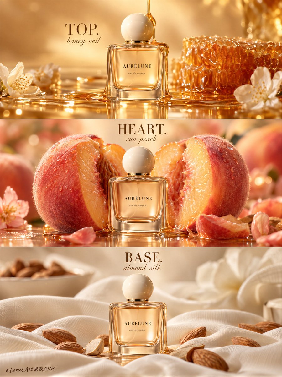
香水香调系列广告应改变瓶身之外的世界——而非瓶身本身。 🍯 三个面板中重复同一居中瓶子、比例、瓶盖与标签处理;只改变瓶子周围的香调环境 瓶子成为视觉主脊。观看者读到的是一款香水按章节铺陈开来,而非三张互不相关的美妆图像。 🍑 给每款香调一个主导的材质事件:流淌的蜂蜜、剖开的成熟蜜桃、杏仁般柔软的织物褶皱 这让香气递进一目了然。每个面板都拥有各自的触感情绪,又无需增添文案或堆砌元素。 GPT- 图像 2.5 提示词👇 为虚构香水品牌 AURÉLUNE 设计的奢华香水系列海报,将情感柔度、材质精度与策展式抽象融为一张统一的三层嗅觉图像。保持完全一致的结构:三层水平排列的香调面板,每一层都以同一只高端香水瓶作为绝对的视觉主角,分别呈现前调、中调、基调的独特原料世界。画面整洁、编辑感、透亮且以香调为主,每一条带如同一章...
原始 Prompt
A fragrance-note campaign should change the world around the bottle—not the bottle itself.
🍯 repeat the same centered bottle, scale, cap, and label treatment in all three panels; change only the note environment around it
The bottle becomes the visual spine. Viewers read one fragrance unfolding in chapters, not three unrelated beauty images.
🍑 give each note one dominant material event: descending honey, split ripe peach, then almond-soft fabric folds
This makes the scent progression visible at a glance. Every panel gets its own tactile mood without adding copy or clutter.

GPT- image 2.5 prompt👇
A luxury fragrance campaign poster for fictional perfume house AURÉLUNE, merging emotional softness, material precision, and curatorial abstraction into one unified three-tier olfactory image. Preserve the exact structure: three horizontal stacked fragrance-note panels, each built around the same premium perfume bottle as the absolute visual leader, with distinct ingredient worlds for top, heart, and base notes. The composition is clean, editorial, luminous, and note-driven, with each band reading like one chapter of the scent while the bottle remains central and dominant throughout.

Top panel: a warm amber-honey atmosphere with a smooth golden gradient background and a thin stream of glossy honey descending into the bottle zone. The bottle stands centered and sharply lit, with translucent honey glow and soft reflections. Add the centered heading “TOP.” with a smaller line such as “honey veil”. The mood is bright, molten, and seductive.

Middle panel: the bottle sits between or before a giant ripe peach split open to reveal juicy flesh and velvety skin, framed by warm peach-gold bokeh. The peach is oversized, tactile, softly glistening, and sensual, with visible fuzz, moist flesh, and natural fibers. Add the centered heading “HEART.” with a smaller line such as “sun peach”. This band is lush, ripe, and intimate, while the bottle stays the hero.

Bottom panel: the bottle rests in a creamy almond-milk atmosphere on pale ivory fabric with gentle folds, scattered whole almonds, and plush skin-close softness. The almond note should feel smooth, enveloping, and elegant rather than rustic. Add the centered heading “BASE.” with a smaller line such as “almond silk”. This band is the quietest and most intimate, with soft diffuse light and calm tactile richness.

The bottle is original and highly premium: compact rectangular glass with softly rounded shoulders, pale honey-blush liquid inside, refined thickness, warm internal reflections, and a smooth ivory dome cap. Branding is fully original and English only: “AURÉLUNE” as the main mark with one tiny descriptor such as “eau de parfum” or “skin fragrance”. The label is minimal, balanced, crisply readable, and luxuriously spaced. The same bottle appears in all three bands with consistent proportions, placement logic, and lighting quality, acting as the campaign spine.

Use refined beauty-product photography language: centered front-facing product framing in each band, shallow but readable depth, smooth tonal transitions, clean premium highlights, and sophisticated note-driven staging. Lighting is soft, layered, and controlled: amber gloss and syrup highlights in the top band, peach-skin reflectance and flesh translucency in the middle band, and creamy diffuse fabric light in the bottom band. Color hierarchy across the campaign: 60% warm honey, cream, nude, and peach-gold tones, 30% blush and fruit warmth, 10% almond brown and ivory contrast. Materials must feel hyperreal and tactile: syrup gloss, peach fuzz, juicy flesh, translucent glass, polished cap, fine fabric weave, smooth almonds, and subtle editorial print-finish polish.

Typography is restrained but structurally important. Use elegant serif capitals for “TOP.” “HEART.” and “BASE.” with a smaller soft script or italic line beneath each. External copy should stay minimal or absent so the note system and bottle carry the story. The final result should feel like a Cannes-level perfume campaign: sensual, clean, note-driven, globally polished, product-first, and visually rare. No copied branding, no copied note text, no warped bottle geometry, no muddy honey, no fake fruit texture, no dirty fabric, no broken typography, no cheap beauty-ad feel, no clutter.