PROMPT RECORD图像记录
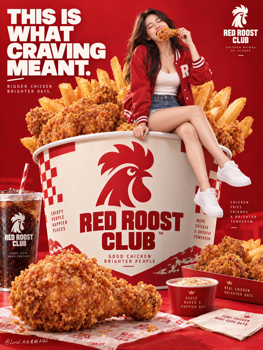
一个巨大的产品只有在细小的事物也愿意保持细小的时候才成立。 🪿 将主角炸鸡桶的尺度放大到超越日常生活的程度,再加入一位坐姿人物作为参照尺寸。 餐点立刻读起来像一座丰盛的纪念碑,而这个人物让这种...
中文说明
一个巨大的产品只有在细小的事物也愿意保持细小的时候才成立。 🪿 将主角炸鸡桶的尺度放大到超越日常生活的程度,再加入一位坐姿人物作为参照尺寸。 餐点立刻读起来像一座丰盛的纪念碑,而这个人物让这种夸张瞬间变得可信。 🍊 将饮料、配菜与额外的炸鸡推到画面外侧下边缘;沿用同一套红与奶白品牌色系。 你依然能感受到丰盛,但每一件更小的物件都在框住炸鸡桶,而非与之争夺视线。 GPT- image 2.5 提示词👇 为一个虚构的国际炸鸡品牌 RED ROOST CLUB 创作一张旗舰级快餐活动海报,作为一张纵向构图的主关键视觉,将 Orbit(轨道)、Transit(延展)与 Port(精选)完整融合为一个最佳方案:情感爆裂、系统可延展、经策展式精简。图像须同时具备戛纳级别的食品广告感、可收藏的街头食物版画感,以及全球高端零售...
原始 Prompt
A giant product only works when the small things agree to stay small.
🪿 Scale the hero bucket beyond normal life, then add one seated person as a human-size cue.
The meal reads as monumental at once, while the figure makes that exaggeration instantly believable.
🍊 Push drinks, sides, and extra chicken to the outer lower edge; repeat the same red-and-cream brand system.
You still get abundance, but every smaller item frames the bucket instead of competing with it.

GPT- image 2.5 prompt👇
Create a flagship fast-food campaign poster for a fictional international fried-chicken brand named RED ROOST CLUB, designed as a single vertically composed master key visual that fully merges Orbit, Transit, and Port into one best solution: emotionally explosive, system-expandable, and curatorially reduced. The image must feel like a Cannes-level food advertisement, a collectible street-food print, and a globally premium retail launch poster at once.

The absolute hero is one monumental fried chicken bucket meal positioned in the central lower-middle of the frame, scaled so large it reads like an edible monument. The bucket must dominate the page through size, abundance, texture, and appetite impact. Render a bold branded paper bucket with newly invented English-only identity graphics, crisp print finish, clean structural edges, and a premium red-and-cream design system. The bucket overflows with massive golden fried chicken pieces and a fan of thick fries rising behind them like a crown. The chicken must feel brutally appetizing: jagged irregular crust, deep crunchy relief, rich golden-brown breading, tiny hot-oil sheen, and dense juicy weight. One oversized foreground chicken piece should sit near the bottom edge to amplify scale and create immediate first-glance hunger.

Place one mature young woman seated lightly on the upper rim of the giant bucket as the emotional lifestyle anchor and scale cue. She is joyful, spontaneous, and caught in the act of biting into one oversized fried chicken drumstick. Her body must never overpower the meal; she exists to intensify desire and communicate scale. She wears a youthful premium casual look: a red varsity-style jacket, pale inner top, denim shorts or skirt, and clean white sneakers. Her pose is relaxed but lively, with torso leaning slightly forward into the bite, one leg subtly advanced, the other relaxed, expression bright and genuinely delighted. Anatomy must be realistic and elegant: correct head-neck-shoulder ratio, natural mature chest gravity, believable torso and pelvis structure, smooth hip-to-thigh connection, correct hands with five fingers gripping the chicken naturally, realistic skin elasticity, subtle skin texture, and no mannequin stiffness.

The background is a pure high-pressure brand-red advertising field with slight tonal modulation and subtle depth, not a literal restaurant scene. Any environmental cues must remain highly abstracted and secondary, just enough to keep the page dimensional without competing with the product. The entire poster should read as a constructed commercial stage: giant bucket at center, seated woman near upper center, extra food weight in the foreground, and only a few restrained supporting items at the far edges.

Add a tightly controlled set of secondary meal props in the lower third to support the hero bucket without diluting it: one cold cola cup with lid and straw, one creamy side dish or sauce bowl, one tray with a few additional chicken pieces, and perhaps one dipping sauce packet or condiment note. These elements must be smaller, pushed outward, and compositionally subordinate, functioning as rhythm and abundance rather than separate heroes. Keep the scene rich but not cluttered.

Typography must be entirely newly invented in English only. Do not copy any words from the source image. In the upper-left, place one bold campaign headline such as "THIS IS WHAT CRAVING MEANT." or another equally strong line, set in a clean powerful white sans-serif, optionally paired with one softer handwritten accent phrase if it strengthens the hierarchy. In one top corner, place a small fictional brand lockup. Keep all copy sparse and graphic. The type must behave as part of the poster architecture, sitting in the red negative space and never interfering with the face or the food silhouette.

Orbit: the poster must hit instantly through giant edible scale, the bite moment, and the pure-red branded pressure, making the viewer crave the meal in a single glance. Transit: the structure must feel expandable into a full campaign system where different bucket builds, combo sets, seasonal sides, sauces, and limited editions can all inherit the same product-dominant stage logic. Port: remove every nonessential environmental or narrative detail so the final image remains sharp, rare, clean, and collectible, with no restaurant clutter, no crowd, and no wasted visual information.

Lighting must be bright, warm, and appetite-driven. Use a frontal commercial key with slight top shaping so the fried crust reveals maximum relief, the fries glow golden, the bucket graphics stay crisp, and the woman’s expression remains luminous. Add subtle bounce from below to keep the foreground chicken, tray items, and lower brand details readable. Shadows should be soft, controlled, and grounding. The food must feel hot, fresh, crunchy, and immediate, never greasy in a dirty way and never flat.

Use a disciplined 60/30/10 palette hierarchy: 60% brand red field and surrounding visual pressure, 30% golden fried chicken and fries warmth, 10% cream-white bucket accents, skin tones, cola brown, and small highlight notes. The image must feel loud in appetite but exact in design, with no muddy reds and no dead black masses.

Material semantics are critical. The chicken must feel intensely crisp, thickly breaded, juicy beneath the crust, and freshly fried. The fries must feel hot, dry, and salted. The bucket must feel like real printed paperboard with structural integrity. The cola cup must feel cold and commercial. Sauces and side dishes must feel rich and edible. Wardrobe fabrics must feel casual and tactile. Skin and hair must remain natural and alive. Typography must feel like premium printed campaign design on a real poster surface.

The final image should read as a pure fast-food desire poster where giant product scale, joyful bite, and branded red-stage architecture are fused into one exact commercial object. It must be photoreal, product-dominant, globally premium, and unforgettable from first glance to final read.

Quality target and structured exclusions: photoreal only, correct female anatomy, realistic hands with five fingers, no extra fingers, no missing fingers, no fused fingers, no broken wrists, no distorted face, no warped bucket geometry, no fake chicken texture, no weak crust detail, no unreadable text, no random letters, no restaurant clutter, no muddy red field, no dead black blocks, no style drift, no AI artifacts, no watermark, no real person names, no real brand names.