PROMPT RECORD图像记录
一幅报纸社论风格的历史信息图海报,16:9 横版,主题为太空竞赛,整体设计仿照20世纪中期大开本报纸的头版,采用略带做旧效果的米白色纸张背景、黑色油墨,并以深红色作为唯一的强对比强调色;版面顶...
中文说明
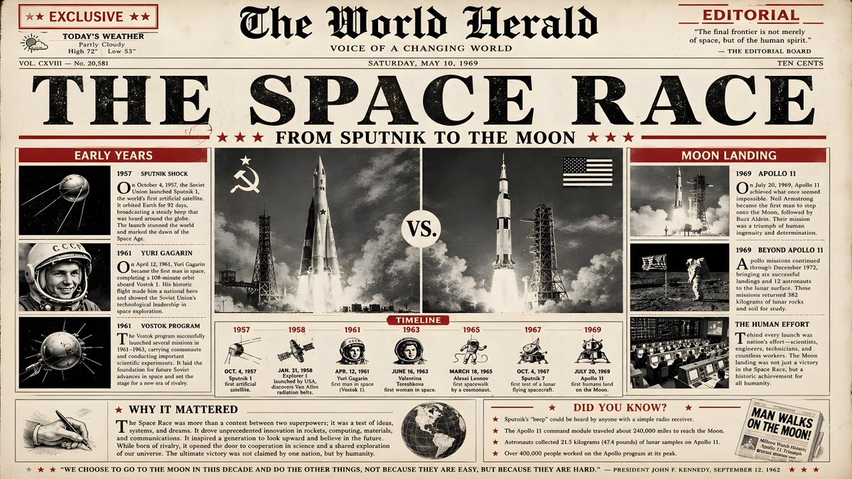
一幅报纸社论风格的历史信息图海报,16:9 横版,主题为太空竞赛,整体设计仿照20世纪中期大开本报纸的头版,采用略带做旧效果的米白色纸张背景、黑色油墨,并以深红色作为唯一的强对比强调色;版面顶部应有一条粗体主标题,写着 THE SPACE RACE,使用厚重的衬线新闻印刷字体,其下方副标题用较小的全大写字母写着 FROM SPUTNIK TO THE MOON;版面采用真实报纸般清晰的栏目网格进行划分:中央是一幅大型黑白照片风格的插图板块,展示风格化的火箭发射场景,并以左右分屏的形式分别呈现左侧的苏联火箭和右侧的美国土星五号(Saturn V),两侧配有较小的方框小版块;关键内容板块包括左侧一栏,标题为 EARLY YEARS(Sputnik、Yuri Gagarin、Vostok),中间是一条从1957年到1...
原始 Prompt
A newspaper editorial style historical infographic poster in 16:9 horizontal format about the Space Race, designed like the front page of a mid‑20th‑century broadsheet newspaper, with a slightly aged off‑white paper background, black ink, and a single strong accent color in deep red; the layout should feature a bold main headline at the top reading THE SPACE RACE in heavy serif newsprint typography, with a subheadline below reading FROM SPUTNIK TO THE MOON in smaller capital letters; the composition is divided into clear column grids like a real newspaper: a large central black‑and‑white photo‑style illustration panel showing a stylized rocket launch and a split composition of a Soviet rocket on the left and an American Saturn V on the right, flanked by smaller boxed sections; key content blocks include a left column titled EARLY YEARS (Sputnik, Yuri Gagarin, Vostok), a center timeline strip from 1957 to 1969 with milestone dates and tiny icons, and a right column titled MOON LANDING describing Apollo missions, each section set in classic serif body copy with justified text and small drop caps; use deep red only for highlights such as section headers, lines under headlines, and small tags like EXCLUSIVE, TIMELINE, and EDITORIAL; include a small “editorial” box at the bottom titled WHY IT MATTERED summarizing the political and scientific impact, and a small DID YOU KNOW? sidebar with three or four surprising facts; overall, the poster must feel like an authentic vintage newspaper front page redesigned as a clean infographic, with clear hierarchy, strong typographic rhythm, no modern UI elements, no gradients, and a restrained, historically respectful aesthetic, 16:9 horizontal ratio