PROMPT RECORD图像记录
当每个瓶子都服从同一套网格时,产品家族就会显得很昂贵。 🍓 恰好十只完全相同的方形肩部瓶子,均匀水平排列成一行 一致性是视觉上的承诺。统一的高度、瓶盖比例、标签位置和间距,让各种水果的色彩读起...
中文说明
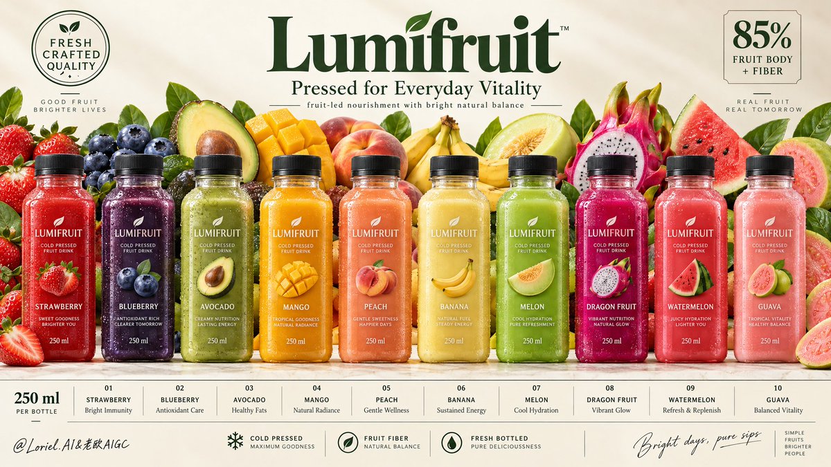
当每个瓶子都服从同一套网格时,产品家族就会显得很昂贵。 🍓 恰好十只完全相同的方形肩部瓶子,均匀水平排列成一行 一致性是视觉上的承诺。统一的高度、瓶盖比例、标签位置和间距,让各种水果的色彩读起来像一个自信的系统——而不是十个独立的产品。 🧊 底部信息条被分为十个单元格,每格与其对应的瓶子垂直对齐 这让海报变成一个零售友好的索引。视线可以从瓶子滑到口味再到卖点,无需搜索,而水果墙则留在它该在的位置:排在瓶子后方,增加丰盈感却不破坏秩序。 GPT- image 2.5 prompt👇 为一家虚构的海外冷压水果饮料品牌 "LUMIFRUIT" 创作一张高端宽幅商业海报。以严格水平海报架构构建一张高端的家族产品广告:柔和的暖象牙色背景、顶部居中的大型优雅品牌主标、中部完美对齐的十只超写实冰镇瓶装饮料、其后是一片繁茂而有...
原始 Prompt
A product family looks expensive when every bottle obeys the same grid.
🍓 exactly ten identical square-shouldered bottles, evenly spaced in one horizontal lineup
Consistency is the visual promise. Matching height, cap scale, label placement, and gaps let the flavor colors read as one confident system—not ten separate products.
🧊 bottom information strip divided into ten cells, each vertically aligned to its bottle
This turns the poster into a retail-ready index. Your eye can move from bottle to flavor to benefit without searching, while the fruit wall stays where it belongs: behind the lineup, adding abundance without breaking order.

GPT- image 2.5 prompt👇
Create a premium wide commercial poster for a fictional overseas cold-pressed fruit drink brand, "LUMIFRUIT". Build it as a high-end family product campaign with strict horizontal poster architecture: a soft warm ivory background, a large elegant central brand masthead at the top, a perfectly aligned lineup of ten hyper-real chilled bottles across the middle, a lush but controlled fruit panorama behind them, refined quality seals in the upper corners, and a clean modular information strip spanning the full bottom edge. The product lineup must remain the absolute visual hero.

At the top center, place a premium botanical wordmark reading "Lumifruit", with the subtitle "Pressed for Everyday Vitality" and the supporting line "fruit-led nourishment with bright natural balance". Top-left: a circular seal reading "FRESH CRAFTED QUALITY". Top-right: a concise nutrition block reading "85% FRUIT BODY + FIBER". Typography should feel elegant, modern, healthy, and globally branded, using deep botanical green with subtle warm neutral accents.

Across the middle, show exactly ten evenly spaced upright bottles with identical premium packaging and varied liquid colors. The bottles are clear square-shouldered chilled bottles with matte black caps, visible threading, realistic label adhesion, subtle refraction, micro-condensation, varied droplets, and dense cold-pressed juice texture. Every front label must read exactly "LUMIFRUIT". Flavors from left to right: "STRAWBERRY", "BLUEBERRY", "AVOCADO", "MANGO", "PEACH", "BANANA", "MELON", "DRAGON FRUIT", "WATERMELON", "GUAVA". Each bottle should glow in its own controlled hue: strawberry red, blueberry indigo, avocado green, mango gold, peach coral, banana cream yellow, melon green, dragon-fruit magenta, watermelon pink-red, and guava blush rose. Keep all bottle heights, widths, cap scale, and label proportions perfectly consistent.

Behind the bottles, create a rich but disciplined fruit backdrop like an abundant harvest wall: strawberries, blueberries, avocado halves, mango cubes, peach halves, bananas, melon slices, dragon fruit, watermelon wedges, guava halves, and a few fresh leaf accents. The fruits should layer tightly behind the lineup, rising just enough to amplify flavor diversity and freshness without stealing dominance from the bottles. The arrangement must feel curated, with juicy cut surfaces, wet flesh, seeds, soft berry bloom, waxy skins, and subtle leaf veining rendered with high realism.

At the bottom, build a full-width information strip divided into elegant modular cells aligned with the bottles. Each cell contains a bottle number, flavor name, and a short premium benefit phrase in small refined type. Add a left-side volume note reading "250 ml". In the center, add concise quality markers such as "cold pressed", "fruit fiber", and "fresh bottled". On the far right, add a refined handwritten-style sign-off: "Bright days, pure sips". The bottom band should feel organized, retail-ready, and beautifully spaced.

Use soft premium studio lighting from the upper front-left with luminous clarity across the lineup and backdrop, minimal but believable grounding shadows under the bottles, and strong local contrast on condensation, labels, fruit flesh, seeds, and glossy cut surfaces. Control the palette tightly: 45% warm ivory and cream, 35% fruit-spectrum color energy, 20% botanical green and dark neutral accents from typography, leaves, and caps. Increase dimensional separation enough to make the bottles feel cold, tactile, and shelf-dominant while keeping the poster bright, clean, and free of muddy shadows or dead black areas.

Materials must read with exceptional precision: chilled bottle surfaces, crisp printed labels, matte caps, translucent juice density, moist fruit flesh, fibrous mango and peach texture, creamy avocado flesh, watery melon translucency, glossy dragon fruit highlights, and natural berry bloom. The final image should combine commercial abundance, material realism, and curatorial restraint in one unified visual system, feeling like a Cannes-level international beverage campaign. Maintain exact family-line coherence, product-first hierarchy, refined spacing, readable labels, clean grid rhythm, realistic fruit-to-flavor correspondence, and premium health-brand polish. Avoid extra bottles, duplicated fruit in unnatural ways, warped packaging, unreadable labels, uneven spacing, chaotic clutter, cheap font treatment, muddy contrast, distorted fruit anatomy, broken bottom-grid logic, or accidental resemblance to any real beverage brand.