PROMPT RECORD图像记录
"咔嚓"只有在断裂处有一个清晰的力的中心时,才会让人感到满足。 🍫 双手将一根威化棒朝镜头方向拉开,断裂点居中位于画面正中 这让观众在断裂之前感受到张力。双手要同等用力地拉,露出的威化分层正好...
中文说明
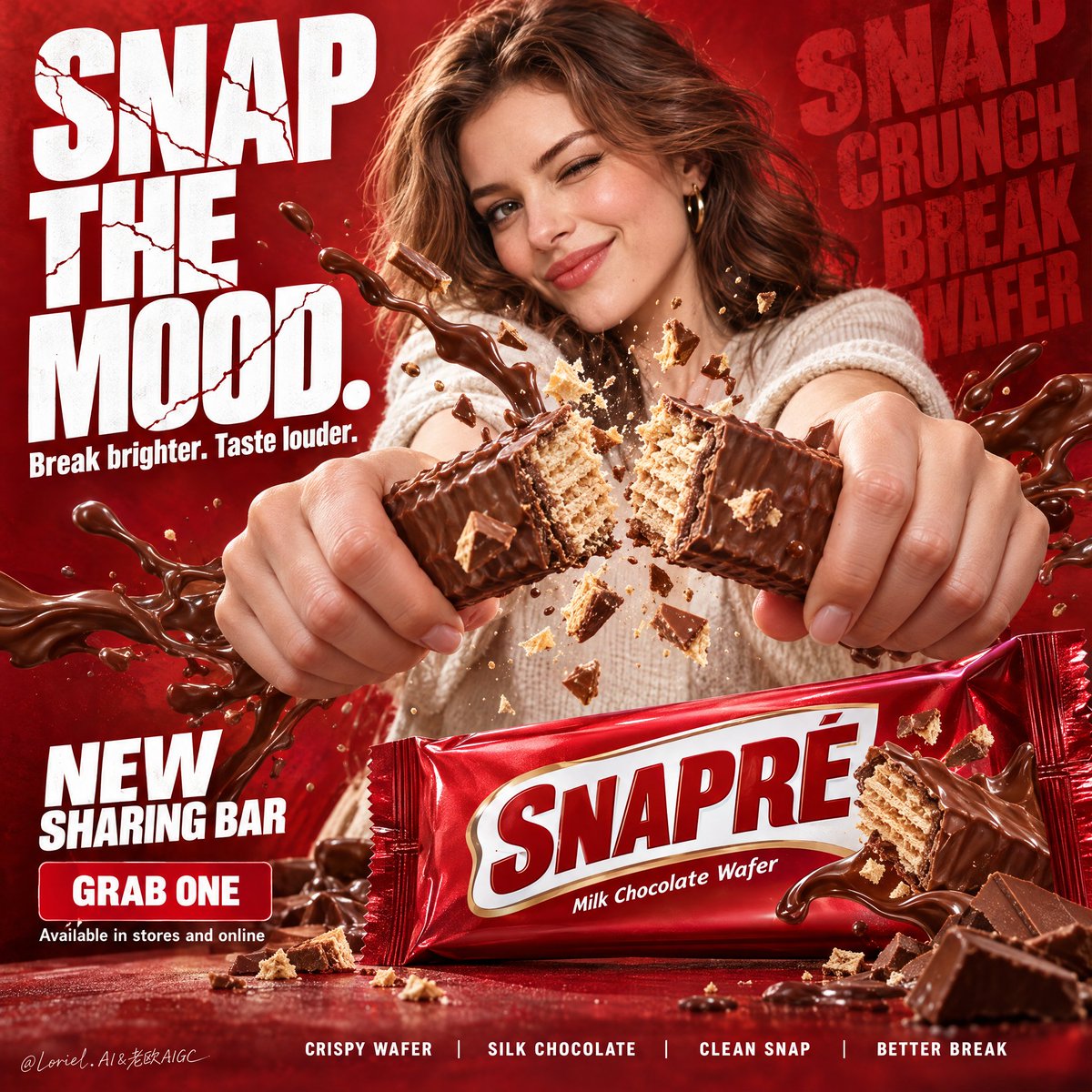
"咔嚓"只有在断裂处有一个清晰的力的中心时,才会让人感到满足。 🍫 双手将一根威化棒朝镜头方向拉开,断裂点居中位于画面正中 这让观众在断裂之前感受到张力。双手要同等用力地拉,露出的威化分层正好落在视觉中心。 💥 从断裂点向外辐射的小而受控的威化碎片与巧克力碎屑爆发 碎片应当诠释"咔嚓"的酥脆感,而不是变成五彩纸屑。紧致的爆裂能带来质感、速度与食欲——同时让底部的包装保持干净、可读。 GPT- image 2.5 prompt👇 为虚构的海外巧克力威化品牌 "SNAPRÉ" 制作一张高端竖版商业海报。把它做成戛纳级别的零食广告,融合爆发性的动作、精致的材质写实感与平面海报的克制。核心视觉是位于中上背景的一位成年、可爱风格的西方女性,朝着镜头用力掰开一根巧克力威化棒;同时位于右下前景的英雄产品包装保持大、锐利、并以...
原始 Prompt
A “snap” only feels satisfying when the break has a clear center of force.
🍫 two hands pulling one wafer bar apart toward the lens, fracture point centered in frame
This makes the viewer feel the tension before the break. Keep both hands equally committed to the pull, with the exposed wafer layers landing right at the visual center.
💥 small controlled burst of wafer shards and chocolate fragments radiating from the snap point
The fragments should explain the crunch, not turn into confetti. A tight burst gives you texture, speed, and appetite—while leaving the pack at the bottom clean and readable.

GPT- image 2.5 prompt👇
Create a premium vertical commercial poster for a fictional overseas chocolate wafer brand, "SNAPRÉ". Build it as a Cannes-level snack ad merging explosive action, refined material realism, and graphic poster discipline. The core visual is an adult cute Western woman in the upper-middle background forcefully snapping a chocolate wafer bar toward the camera, while the hero product pack in the lower-right foreground remains large, sharp, and commercially dominant. The whole poster should feel crunchy, playful, bold, and irresistibly edible.

Use a bold low-to-mid angle commercial composition with strong depth exaggeration. The woman occupies the upper center, shoulders and head visible, facing camera with a lively confident expression. Her two hands thrust toward the lens, each gripping one half of the snapped wafer bar so the breaking point lands near the center. Reserve the left half for an oversized stacked headline, place a compact secondary text cluster beneath it, keep a small product announcement block in the lower-left, anchor the hero pack in the lower-right foreground, and run a slim benefit strip along the bottom. The pack must remain the heaviest branded object.

The subject is an adult Western woman with a cute, fresh, commercially appealing look: bright expressive eyes, soft cheek structure, healthy skin, glossy medium-length hair, and a stylish casual outfit in light neutral tones. She feels energetic and charming, not childish. Capture the exact instant of a powerful snap: elegant tense hands, correct fingers, aligned wrists, a clean chocolate-bar break, and crumbs and wafer fragments flying from the center. Her expression is playful, self-assured, and slightly teasing. The wafer fingers must look thick, crisp, layered, and freshly broken, with visible pale wafer interior and smooth milk-chocolate coating.

The hero pack is a premium glossy wrapper in saturated deep red with a bold white central logo field. The front must read exactly "SNAPRÉ", with a small line: "Milk Chocolate Wafer". The wrapper should feel retail-ready and highly realistic, with crisp crimped edges, subtle foil tension, believable gloss roll-off, sharp print, and slightly puffed volume. The lower-right pack is angled slightly toward camera and lit for maximum readability.

Set the background as a dense richly textured red poster field with tonal depth. Add faint oversized repeating words in darker red on the right as graphic atmosphere: "SNAP", "CRUNCH", "BREAK", "WAFER". Around the break point, build a controlled burst of chocolate shards, wafer crumbs, and glossy chocolate splash ribbons radiating outward. Keep the splash sculptural, directional, and clean. The left headline should dominate in huge white condensed lettering with cracked fracture details echoing the snap.

Use aggressive commercial key lighting from upper front-left with strong specular control on the chocolate, hands, face, hair, and package. Add warm reflected fill from the red environment and subtle rim highlights on the subject and wrapper edges. Palette: 55% deep brand red and crimson, 20% milk-chocolate brown and cocoa, 15% warm skin and soft beige neutrals, 10% white typography and small gold-brown highlights. Increase local contrast on the wafer break, crumbs, splash edges, wrapper folds, eyes, and facial structure while avoiding muddy reds, dead black shadows, greasy gloss, or dirty midtones.

Render everything with high-end advertising realism: glossy chocolate with crisp snap edges, dry layered wafer interior, flying crumbs of varied size, believable wrapper reflections, natural skin texture, realistic fingernails, subtle fabric weave, soft healthy hair sheen, and rich red poster texture. The chocolate splash must feel dramatic but premium and controlled, frozen at the most satisfying frame of impact.

Main headline on the left:
"SNAP
THE
MOOD."
Secondary line:
"Break brighter. Taste louder."
Lower-left product announcement:
"NEW
SHARING BAR"
CTA:
"GRAB ONE"
Small footer:
"Available in stores and online"
Bottom benefit strip:
"CRISPY WAFER   |   SILK CHOCOLATE   |   CLEAN SNAP   |   BETTER BREAK"
Typography must be powerful, clean, poster-integrated, and never overlap the break point or obscure the hero pack.

Premium vertical poster, exact single-subject snap action, one hero pack in lower-right foreground, giant left headline, red brand world, product-first hierarchy, readable packaging, crisp edible break moment, and unified commercial finish. Avoid warped fingers, broken hand anatomy, malformed bars, unreadable wrapper text, extra packs, muddy splash shapes, random props, cluttered crumbs, distorted face, over-retouched skin, childish styling, cheap fonts, weak contrast, accidental resemblance to any real candy brand, or any loss of the product as the dominant hero.