PROMPT RECORD图像记录
视觉系统不是重复,而是一套能够经受主题变换的规则。 🧊 在每一页幻灯片中,锁定左上角的标志、右上角的导航、淡雅的雾色调色板、精细的衬线字体,以及极简的滑动条提示 即使图像发生变化,这些页面仍然...
中文说明
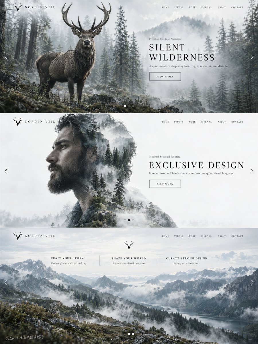
视觉系统不是重复,而是一套能够经受主题变换的规则。 🧊 在每一页幻灯片中,锁定左上角的标志、右上角的导航、淡雅的雾色调色板、精细的衬线字体,以及极简的滑动条提示 即使图像发生变化,这些页面仍然感觉属于同一个品牌。 🌿 轮换主视觉模式:一页采用野生动物,下一页采用人像–风景双重曝光,再后一页采用近乎无文字的全景画面 整个活动保持一致,却又不会沦为被复制三次的模板。 GPT- image 2.5 prompt👇 为一个虚构的生活方式与创意指导品牌 NORDEN VEIL 创建一个高端编辑级网页设计概念板,以一幅高挑的单张构图呈现,包含三张垂直堆叠的全屏网站主视觉幻灯片。整体画面应呈现为一份奢华的艺术指导演示板,而非字面意义上的网页截图:安静、电影感、极简、策展式克制,并且具有强烈的品牌识别度。在三张幻灯片中保持统一...
原始 Prompt
A visual system isn’t repetition. It’s a set of rules that survives a change of subject.
🧊 lock the upper-left mark, upper-right navigation, pale fog palette, fine serif typography, and minimal slider cues across every slide
Even when the image changes, the pages still feel like they belong to the same brand.
🌿 rotate the hero mode: wildlife on one slide, portrait–landscape double exposure on the next, then a near-text-free panorama
The campaign stays coherent without becoming a template copied three times.

GPT- image 2.5 prompt👇
Create a premium editorial web-design concept board for a fictional lifestyle and creative-direction brand called NORDEN VEIL, presented as one single tall composition containing three stacked full-screen website hero slides. The overall image must feel like a luxury art-direction presentation board rather than a literal web screenshot: quiet, cinematic, minimalist, curatorially restrained, and highly brandable. Preserve a unified design system across all three slides: a small logo mark at the upper left, a delicate navigation row at the upper right, subtle side arrows or slider dots, a spacious image-text balance, and refined negative space. The design system itself is the product, and it must remain the visual hero.

Slide 1 is wildlife-led and atmospheric. Use a large photoreal stag standing in a misty forest clearing, positioned left-center with elegant antler silhouette and quiet frontal presence. Surround the stag with soft-focus conifer trunks, pale moss, fog layers, and filtered cool daylight. The image should feel cinematic and luxurious, not rustic. Place a restrained title block toward the center-right. Use exact visible text: logo "NORDEN VEIL", navigation "HOME", "STUDIO", "WORK", "JOURNAL", "ABOUT", "CONTACT", small line "Premium Outdoor Narrative", main title "SILENT WILDERNESS", support line "A quiet interface shaped by forest light, restraint, and distance.", and button text "VIEW STORY". Typography must float lightly over the image without weakening the stag’s silhouette.

Slide 2 is portrait-led and more abstract. Use an adult bearded man in elegant left-facing side profile, large on the left half, fused with a cool forest landscape through refined photoreal double exposure. Inside the silhouette, blend mist, tree trunks, pale ground cover, winter-green tones, and airy forest depth aligned naturally with the face, hair, neck, and shoulders. The right half remains nearly white with a refined title block. Use exact visible text: small line "Minimal Seasonal Identity", main title "EXCLUSIVE DESIGN", support line "Human form and landscape woven into one quiet visual language.", and button text "VIEW WORK". Keep the portrait fully adult, anatomically correct, contemplative, and calm. The blend must feel seamless and premium, with no harsh collage edges.

Slide 3 is landscape-led and most distilled. Use a wide mountain-ridge panorama with drifting fog, layered valleys, pale sky, mossy slopes, and soft cool atmospheric light. The scene occupies almost the full slide and should feel more expansive and flagship-level than the previous two. In the upper-middle or center place a tiny emblem or stag-like symbol. Below it, place three restrained editorial content columns. Use exact small headings: "CRAFT YOUR STORY", "SHAPE YOUR WORLD", and "CURATE STRONG DESIGN". Under each heading, add one line of elegant editorial placeholder copy in English, very short and refined, not lorem ipsum. Keep the navigation and brand logic aligned with the first two slides, but let this third panel feel the most pared down and monumental.

Overall composition and style: the three slides must feel like one coherent brand universe balancing Orbit, Transit, and Port. Orbit: strong first-read hero imagery and memorable structure. Transit: repeatable modular system that can extend to multiple campaigns and categories. Port: quieter, more curated, more gallery-like reduction of UI and decoration. The board should read like a Cannes-level design proposal for a fashion, outdoor, boutique hospitality, fragrance, or art-house brand. Use precise spacing, clean hierarchy, and light interface cues only. Avoid generic web-template heaviness.

Lighting and palette: keep the full board under a refined 60/30/10 logic. 60% soft paper-white, pale stone, mist-grey, and spacious negative field. 30% muted forest green, charcoal bark, mountain blue-grey, and cool natural tones. 10% deep graphite text and subtle warm landscape accents where needed. Summer warmth is absent here; the whole system should feel cool, calm, northern, and sophisticated. Contrast should be gentle but deliberate, with clean tonal separation and no muddy midtones.

Materials and finish: hyper-real wildlife, portrait, and landscape photography fused with elegant premium UI design. Show believable fur texture on the stag, realistic beard and skin softness, natural tree haze, mountain fog depth, and sharp but delicate typography. The final board should feel like a collectible design presentation: modern, intelligent, emotionally restrained, and curatorially elevated.

Output and constraints: one complete three-slide stacked web-hero concept board, no copied source text, no real brand names, no cluttered interface, no cheap stock-template styling, no extra people, no noisy decorative UI. Keep all subjects adult and anatomically correct, all landscapes photoreal and controlled, all type crisp and readable, and all slides clearly within the same high-end editorial family. Avoid broken anatomy, muddy double exposure, pasted collage seams, oversharpened forests, unreadable navigation, gibberish text, overdecorated controls, or drift away from premium design realism.