PROMPT RECORD图像记录
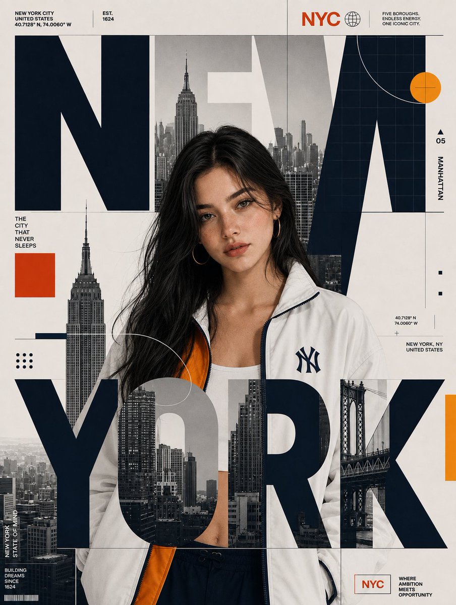
将参考图像重新制作为高端编辑风格的城市海报。将原图中的人物替换为 SUBJECT,同时保留 SUBJECT 的身份、面部特征、发型、发色、肤色和自然外观。SUBJECT 必须以与参考主体相同的...
中文说明
将参考图像重新制作为高端编辑风格的城市海报。将原图中的人物替换为 SUBJECT,同时保留 SUBJECT 的身份、面部特征、发型、发色、肤色和自然外观。SUBJECT 必须以与参考主体相同的姿势、相同的身体朝向、相同的构图、相同的比例,以及大致相同的位置站立。 将原图中的城市替换为 CITY_NAME,并专门为 CITY_NAME 重建周围的天际线、地标、建筑、桥梁和城市摄影。将所有特定于城市的标签、坐标、位置信息和说明文字相应地进行替换。 关键字体排版构图:超大尺寸的 CITY_NAME 字体必须像参考图一样,物理性地叠层在站立人物的上方。不要将所有城市文字都放在主体的背后。巨大的 CITY_NAME 字母必须横跨主体的身体,并覆盖其衣物和下半身,明显遮挡住其部分身体。同时,部分字体应保留在其头部和肩膀的后...
原始 Prompt
{
  "CITY_NAME": "",
  "SUBJECT": "",

  "prompt": "Recreate the reference image as a premium editorial city poster. Replace the original person with SUBJECT while preserving SUBJECT's identity, facial features, hairstyle, hair color, skin tone, and natural appearance. SUBJECT must be standing in the SAME pose, SAME body orientation, SAME framing, SAME scale, and approximately the SAME position as the reference subject.\n\nReplace the original city with CITY_NAME and rebuild the surrounding skyline, landmarks, architecture, bridge, and urban photography specifically for CITY_NAME. Replace all city-specific labels, coordinates, location information, and captions accordingly.\n\nCRITICAL TYPOGRAPHY COMPOSITION: The oversized CITY_NAME typography must be physically layered OVER the standing character, exactly like the reference. Do NOT place all of the city text behind the subject. The large CITY_NAME letters must pass across the subject's body and overlap her clothing and lower torso, visibly covering portions of her. At the same time, some portions of the typography should remain behind her head and shoulders. Create a true foreground/background collage: BACKGROUND CITY IMAGERY → SUBJECT → FOREGROUND OVERSIZED CITY_NAME LETTERS. The foreground letters must visibly obscure portions of the subject while the subject remains recognizable through the gaps and around the typography. The large letters should intersect the character naturally rather than appearing as text floating beside her.\n\nThe oversized CITY_NAME typography should dominate the composition and extend almost across the entire poster width. Integrate grayscale city photography inside selected portions of the letters. Keep the typography bold, geometric, heavy, and editorial. Make the letters large enough to cross directly over the subject's torso and lower body.\n\nPreserve the EXACT visual language and color code of the reference: warm cream/off-white background, deep black oversized typography, grayscale city photography, red accent blocks, blue accent elements, and yellow/gold accent elements. Do NOT create a new color palette based on CITY_NAME. Keep the same approximate colors, saturation, contrast, and proportions as the reference.\n\nPreserve the reference's structured editorial grid, thin lines, geometric circles, dots, rectangles, technical markings, small uppercase labels, coordinates, and minimalist information blocks. Adapt only the city-related content to CITY_NAME.\n\nMaintain the same vertical poster composition, subject placement, typography scale, graphic layering, spacing, photographic treatment, and premium magazine aesthetic. The final result should look like the same poster design system recreated for a different city and subject, with CITY_NAME typography clearly crossing OVER and physically overlapping the character."
}