 1/2
PROMPT RECORD图像记录
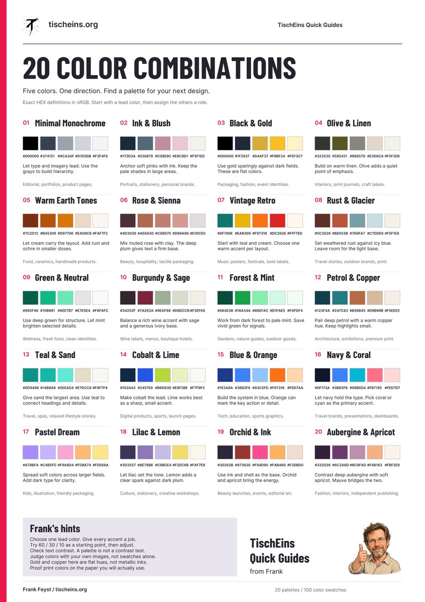
色彩选择从第一条提示词之前就已经开始。 深石油蓝、暖象牙白与一抹铜色,与酒红、鼠尾草绿和奶油白所呈现的方向截然不同。即使主体保持不变,效果也会大不一样。 我为最新的 TischEins Qui...
中文说明
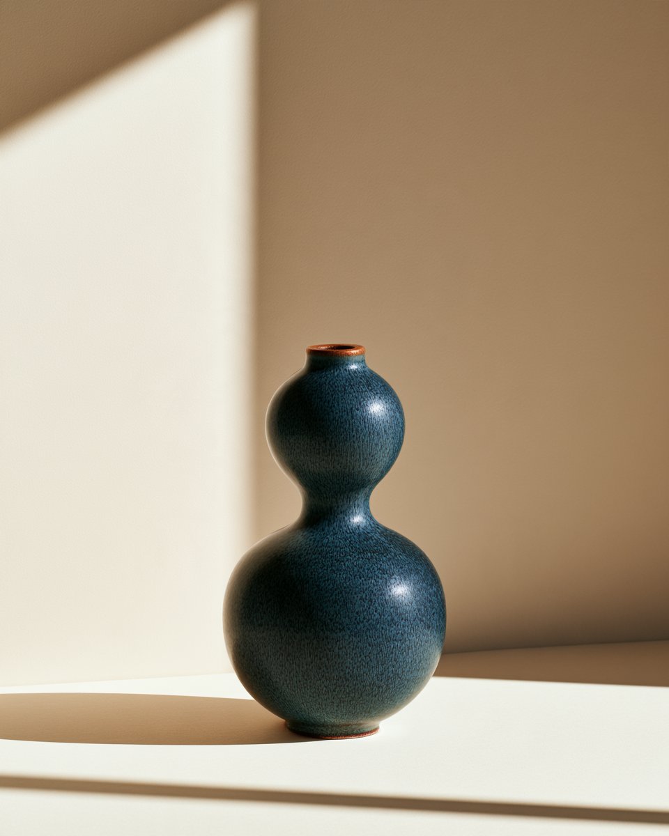
色彩选择从第一条提示词之前就已经开始。 深石油蓝、暖象牙白与一抹铜色,与酒红、鼠尾草绿和奶油白所呈现的方向截然不同。即使主体保持不变,效果也会大不一样。 我为最新的 TischEins Quick Guide 整理了 20 组五色配色方案,包含 HEX 值,以及在品牌设计、编辑设计、社交媒体发布和 AI 图像项目中的实用建议。 以下是如何在 Midjourney 中使用它的方法: 挑选一组配色方案。选择一个主色、一个背景色和一个点缀色。然后在提示词中说明每个颜色的位置。 试试“Petrol & Copper”(石油蓝与铜色): Editorial photograph of a sculptural ceramic vase, deep petrol blue glaze, warm ivory bac...
原始 Prompt
Color choices start before the first prompt.
Deep petrol, warm ivory and a touch of copper give you a very different direction from burgundy, sage and cream. Even when the subject stays the same.

I put together 20 five-color palettes for the latest TischEins Quick Guide, with HEX values and practical suggestions for branding, editorial, social posts and AI image projects.
Here’s how to use it with Midjourney:
Pick a palette. Choose a dominant color, a background color and an accent. Then tell the prompt where each color belongs.

Try “Petrol & Copper”:
Editorial photograph of a sculptural ceramic vase, deep petrol blue glaze, warm ivory background, small copper-colored details, soft side lighting, subtle shadows, restrained color palette, generous negative space --ar 4:5

Petrol defines the subject. Ivory gives it room. Copper adds a small point of interest.
Next, keep the subject and composition, but swap the palette for “Burgundy & Sage.” Compare how the color direction changes the mood.

You don’t need all five colors in every image. Start with two or three, then use the remaining shades for typography, backgrounds and graphic elements when you build the final layout.

Use descriptive color names in Midjourney. Keep the HEX values for precise color choices in your design tools. A prompt won’t guarantee an exact HEX match.
Save the guide for your next image series. Which palette would you try first?