 1/4
1/4
PROMPT RECORD图像记录
为“Destination Sketchbook(目的地写生簿)”系列创作一幅高端的 4:5 竖版插画。以马特宏峰(Matterhorn)画作作为系列 DNA,而非字面模板。 针对 [DEST...
中文说明
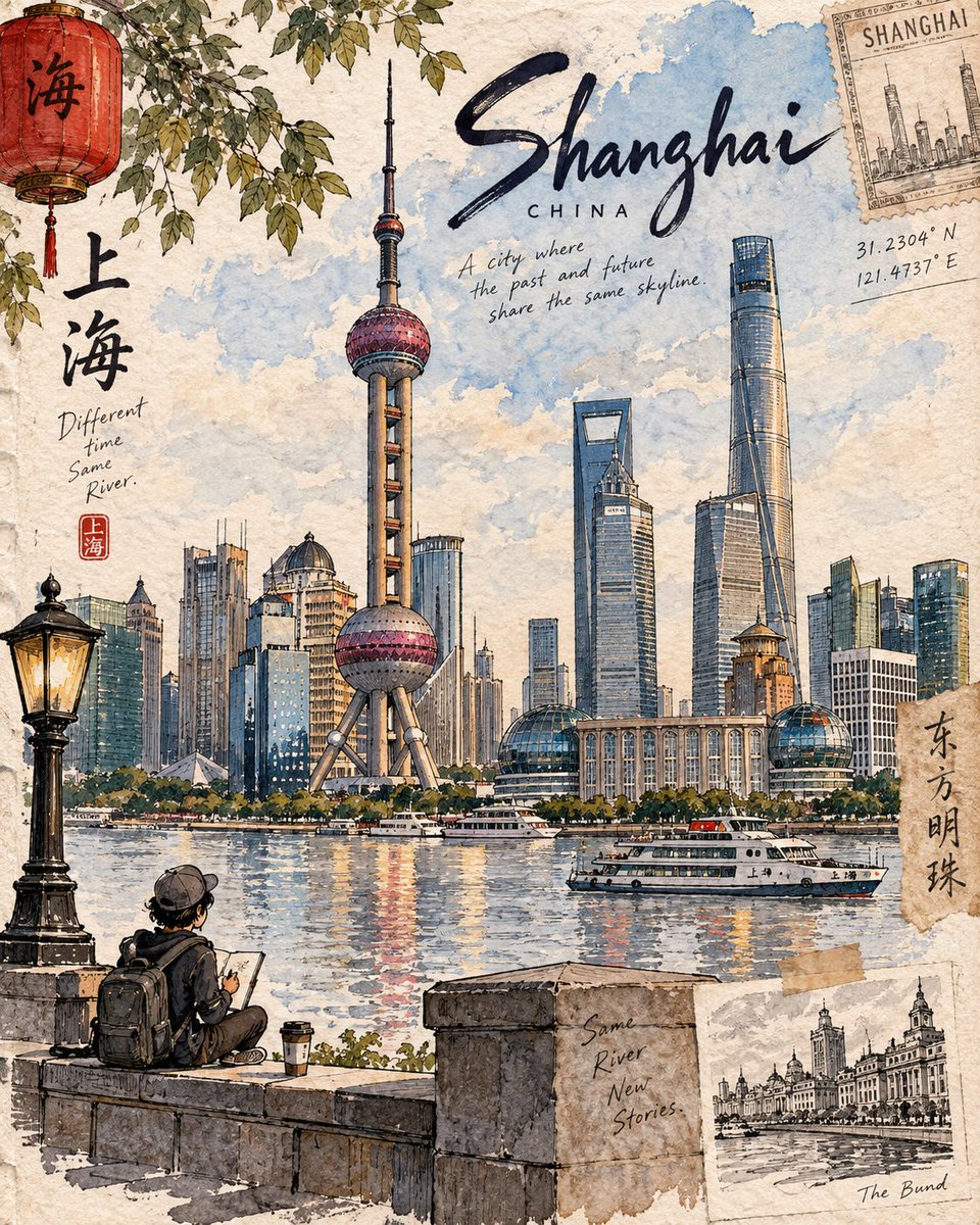
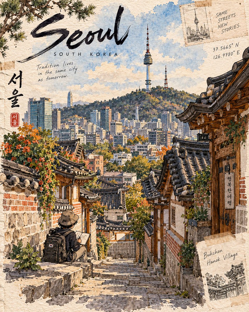
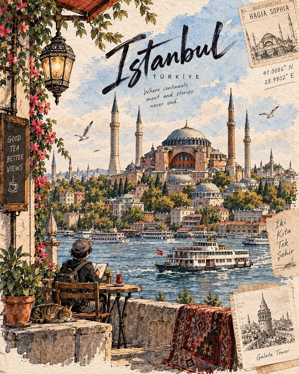
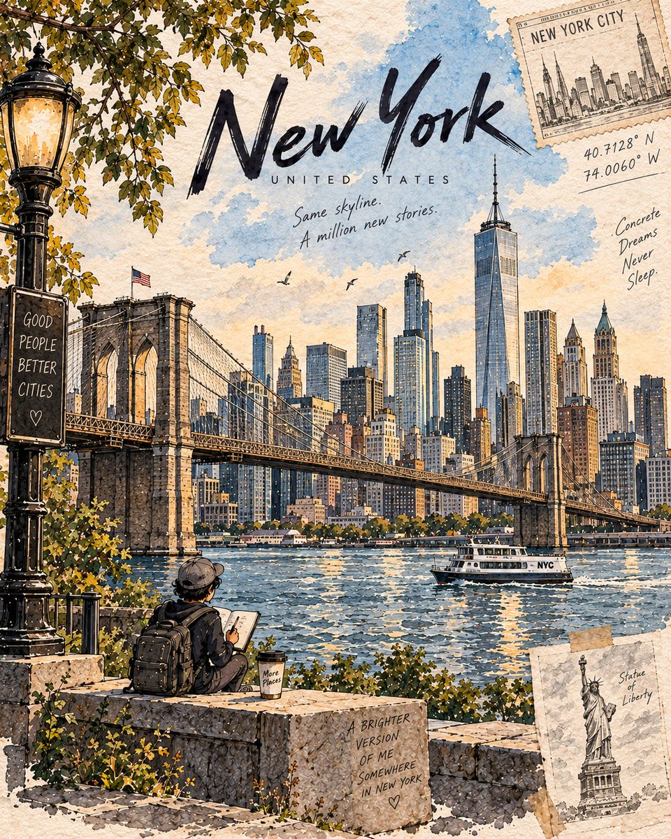
为“Destination Sketchbook(目的地写生簿)”系列创作一幅高端的 4:5 竖版插画。以马特宏峰(Matterhorn)画作作为系列 DNA,而非字面模板。 针对 [DESTINATION],识别其最具辨识度且真实的地标或地点,并围绕它构建整个场景。优先保证地理准确性:地标、建筑、地形、植被、水体、地质、文化与视角必须自然融为一体,并且可在一个地点真实观察到。绝不要拼凑地标或将不同地点的景点混搭在一起。 构图(COMPOSITION):一个主导的“主角”地标占据 60–70% 的视觉比重,具备强烈的前景—中景—背景纵深,留白充足,并恰好有 ONE 个小巧可爱的 chibi 旅行者占据画面的 8–12%。旅行者应自然地探索、写生、坐着、行走或观察——而不是面对镜头摆姿势。使用目的地特有的前景细节...
原始 Prompt
Create a premium 4:5 vertical illustration for the “Destination Sketchbook” series. Use the Matterhorn artwork as the series DNA, not as a literal template.

For [DESTINATION], identify its most distinctive and authentic landmark or place and build the entire scene around it. Prioritize geographic accuracy: landmark, architecture, terrain, vegetation, water, geology, culture, and viewpoint must naturally belong together and be realistically observable from one location. Never create composite landmarks or mix attractions from different places.

COMPOSITION: One dominant hero landmark with 60–70% visual emphasis, strong foreground–middle–background depth, generous negative space, and exactly ONE tiny cute chibi traveler occupying 8–12% of the frame. The traveler should naturally explore, sketch, sit, walk, or observe—not pose for the viewer. Use destination-specific foreground details.

STYLE: Hand-painted travel-journal artwork with expressive dark ink lines, varied line weight, loose watercolor/gouache washes, warm off-white paper, visible grain, subtle pencil marks, imperfect brush edges, natural paint bleeds, and restrained imperfections. It should feel personally observed, tactile, intimate, and handmade—not photorealistic, glossy, vector-like, or generically AI-watercolored.

Make each destination visually unique through its architecture, vegetation, geology, materials, weather, light, culture, textures, and viewpoint, while preserving the same artist identity. Avoid generic tourism clichés and decorative elements unless genuinely relevant.

TEXT: Minimal handwritten editorial lettering:
[LANDMARK NAME]
[LOCATION, COUNTRY]
Optionally add 1–2 short, location-specific observations.

COLOR: Naturally derived from the destination and season. Restrained watercolor palette, subtle accents, visible paper, no neon, excessive contrast, glossy gradients, or artificial cinematic grading.

FINAL: The destination must be immediately recognizable, geographically coherent, landmark-dominant, authentically detailed, and unmistakably part of the Destination Sketchbook series.

OUTPUT: 4:5 vertical premium hand-drawn travel-journal illustration.