PROMPT RECORD图像记录
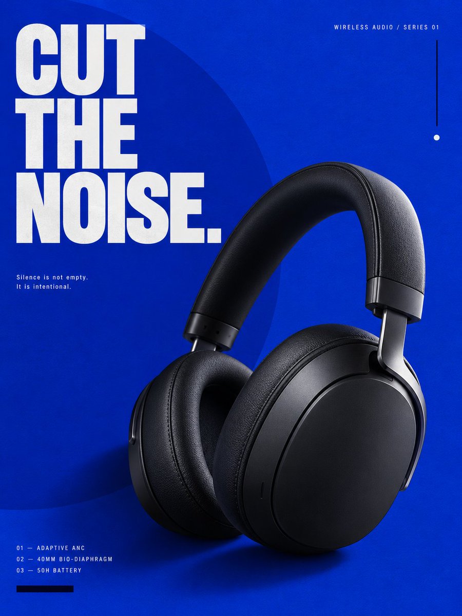
为一款高端蓝牙无线头戴式耳机制作一张完整的高端广告海报,垂直 3:4 比例。 选定风格:Klein Blue(克莱因蓝)——极致单色视觉语言,浓郁饱和的群青蓝,激进极简,雕塑感产品摄影,概念性...
中文说明
为一款高端蓝牙无线头戴式耳机制作一张完整的高端广告海报,垂直 3:4 比例。 选定风格:Klein Blue(克莱因蓝)——极致单色视觉语言,浓郁饱和的群青蓝,激进极简,雕塑感产品摄影,概念性编辑排版,画廊海报美学。 海报应呈现出以下交叉融合感:高端工业设计、当代艺术展览视觉、奢华时尚大片、实验性编辑设计、高端消费电子品牌。 不要让它看起来像常规的科技广告。 ──────────────────── 核心概念: “CUT THE NOISE.”(切断噪音。) 整张海报围绕一个强烈的视觉矛盾构建:极致饱和的克莱因蓝色块 vs 一只哑光黑色的雕塑感无线耳机。 耳机应如同一件精密的深色物体悬浮于纯色场域之中。 视觉语言应传达:静默、专注、控制、清晰、高端音质。 ──────────────────── 产品:展示一副...
原始 Prompt
Create one complete high-end advertising poster for a premium Bluetooth wireless over-ear headphone, vertical 3:4 aspect ratio. SELECTED STYLE: Klein Blue — extreme monochromatic visual language, intense saturated ultramarine blue, radical simplicity, sculptural product photography, conceptual editorial layout, gallery-poster aesthetics. The poster should feel like a crossover between: high-end industrial design, contemporary art exhibition graphics, luxury fashion campaign, experimental editorial design, premium consumer electronics branding. Do NOT make it look like a conventional technology advertisement. ──────────────────── CORE CONCEPT: “CUT THE NOISE.” The entire poster is built around one strong visual contradiction: an extremely saturated Klein-blue field versus a matte-black sculptural wireless headphone. The headphone should feel like a precise dark object suspended inside a field of pure color. The visual language should communicate: silence, focus, control, clarity, premium sound. ──────────────────── PRODUCT: Show one complete pair of premium unbranded Bluetooth over-ear headphones. Wireless only. No visible audio cable. Industrial design: large oval circumaural earcups, deep ergonomic ear cushions, matte graphite-black shell, soft-touch headband, precision-machined aluminum yokes, dark titanium joints, minimal buttons, hidden microphones, subtle tactile controls, clean seamless geometry. The product must feel: premium, real, manufacturable, minimal, architectural. Not gaming. Not DJ. Not cheap plastic. Not futuristic fantasy hardware. ──────────────────── PRODUCT SELLING POINTS: Use only three: ADAPTIVE ANC 40MM BIO-DIAPHRAGM DRIVER 50H BATTERY LIFE Do not display more than three major specifications. ──────────────────── MAIN COMPOSITION: Single complete 3:4 vertical poster. Use a radical asymmetric editorial composition. Place the headphone in the lower-right central region, occupying approximately 48–55% of the canvas. The headphone should be shown in a strong three-quarter perspective. Rotate approximately 10 degrees. The headband rises diagonally toward the upper-right area. One earcup faces the viewer, while the second remains partially visible behind it. The product should feel sculptural, almost like a museum object. Do NOT center the product. ──────────────────── BACKGROUND: Use one continuous, extremely saturated deep Klein-blue background. Color impression: International Klein Blue, deep ultramarine, very high chroma, rich pigment density. No gradient. No atmospheric environment. No room. No landscape. No digital sci-fi background. No particles. No waveforms. No neon glow. The blue itself is the visual environment. Add an extremely subtle matte pigment texture, similar to painted art paper or screen-printed ink. The texture should only become visible at close inspection. ──────────────────── PRIMARY GRAPHIC ELEMENT: Introduce one enormous geometric circle. The circle should occupy approximately 45–50% of the poster. Position it slightly outside the left edge, so only around 65% of the circle remains visible. Color: slightly lighter or darker Klein blue, only 5–8% tonal difference from the background. The circle must be subtle. It should not become a bright decorative shape. Its purpose is to create invisible visual gravity. The headphone may overlap the circle slightly. ──────────────────── SECONDARY GRAPHIC SYSTEM: Use only three additional graphic elements: one thin vertical black line, one tiny white circular index mark, one narrow horizontal black rectangle. Nothing else. Avoid decorative clutter. Every element must align to an invisible editorial grid. ──────────────────── MAIN TYPOGRAPHY: Headline: “CUT THE NOISE.” Use extremely large uppercase modern grotesk typography. Place the headline in the upper-left area. Three stacked lines. Typography should occupy approximately 30–35% of the poster width. Use: bold, condensed, precise, architectural, modern sans-serif typography. Color: pure off-white. Not bright glowing white. The typography should have strong contrast against the Klein-blue background. ──────────────────── TYPOGRAPHIC TENSION: Do not place the headline perfectly inside safe margins. Allow: the “C” of CUT to approach the left edge, the word “NOISE.” to partially overlap an invisible grid line, one word may sit behind a small part of the headphone headband. The layout should feel intentionally designed, not automatically centered. ──────────────────── SECONDARY TYPOGRAPHY: Small top eyebrow: “WIRELESS AUDIO / SERIES 01” Place near the top-right margin. Use tiny uppercase typography with wide tracking. Additional micro-copy: “ADAPTIVE ANC” “40MM BIO-DIAPHRAGM” “50H BATTERY” Place the three specifications vertically along the lower-left edge. Use small off-white typography. Add small numerical labels: 01 02 03 before each specification. Example: 01 — ADAPTIVE ANC 02 — 40MM BIO-DIAPHRAGM 03 — 50H BATTERY The typography should feel closer to editorial catalogue information than marketing copy. ──────────────────── MICRO TYPOGRAPHY: Add one tiny sentence: “Silence is not empty. It is intentional.” Place this near the middle-left area. Very small text. Two lines maximum. Large amount of negative space around it. ──────────────────── PRODUCT LIGHTING: Use premium product-photography lighting. One large diffused softbox from upper-left. A narrow white edge highlight along the right side of the headband. Very subtle reflected blue light from the background. Metal yokes should show controlled cold highlights. Ear cushions should reveal: fine leather grain, micro wrinkles, soft compression, precision stitching. Matte surfaces should remain matte. Do not make everything glossy. ──────────────────── SHADOW: Create one strong but soft sculptural shadow behind the headphone. The shadow should fall slightly toward the lower-left. Do not use a realistic floor. The shadow floats directly onto the blue background, similar to high-end studio still-life photography. The shadow must add physical depth without creating an environment. ──────────────────── COLOR SYSTEM: Approximately: 82% Klein blue 12% matte black / graphite product 5% off-white typography 1% secondary black graphic details No other colors. No red. No cyan. No purple. No rainbow. No metallic gold. No gradient. ──────────────────── DESIGN PRINCIPLE: Use reduction instead of decoration. The premium feeling must come from: scale, spacing, color confidence, precise typography, product texture, visual hierarchy, negative space. Not from effects. ──────────────────── VISUAL HIERARCHY: LEVEL 01: Klein-blue field + black headphone silhouette. LEVEL 02: CUT THE NOISE. LEVEL 03: Product details and sculptural lighting. LEVEL 04: Technical micro-copy. LEVEL 05: Tiny editorial symbols. The poster should remain powerful even when viewed as a small thumbnail. ──────────────────── OPTIONAL CROPPING DEVICE: Allow one small portion of the headphone headband to move close to the poster edge, but the complete headphone must still remain visually understandable. Do not crop away an entire earcup. Do not hide critical product structure. ──────────────────── DESIGN ATTITUDE: Think: international art-direction studio, European design museum poster, experimental audio brand identity, luxury fragrance campaign translated into technology, Japanese editorial restraint, Swiss typographic discipline, high-fashion campaign photography, premium industrial-design catalogue. The poster should feel expensive because it refuses to over-explain. ──────────────────── IMPORTANT NEGATIVE CONSTRAINTS: No cyberpunk. No futuristic city. No RGB. No glowing waveforms. No particle explosions. No holographic interface. No glass cards. No Bento UI. No black gradient technology background. No abstract sound-wave tunnel. No floating technical components. No generic blue energy. No gaming aesthetic. No Amazon product listing. No e-commerce feature boxes. No discount text. No price. No QR code. No fake logo. No people. No hands. No smartphone. No laptop. No audio cable. No watermark. ──────────────────── PRODUCT ACCURACY: one complete wireless headphone, two correctly constructed earcups, one continuous headband, correct left-right geometry, realistic hinges, realistic ear cushion depth, no duplicated components, no deformed headband, no impossible joints, no floating buttons, no broken industrial geometry. ──────────────────── TYPOGRAPHY ACCURACY: Render the main headline exactly: “CUT THE NOISE.” Supporting text must remain minimal and correctly spelled. Avoid meaningless pseudo-English. Avoid random filler paragraphs. ──────────────────── FINAL VISUAL IMPRESSION: bold, cultured, minimal, graphic, luxurious, confident, art-directed, iconic, contemporary, editorial, museum-grade, high-fashion technology. Keywords: 3:4 vertical poster, premium Bluetooth headphones, Klein blue poster, International Klein Blue, luxury audio advertising, minimal editorial design, Swiss typography, experimental product campaign, modern grotesk typography, negative space, sculptural product photography, high-end industrial design, fashion campaign aesthetics, gallery poster, contemporary graphic design, Behance-level art direction