 1/2
1/2
PROMPT RECORD图像记录
设计一张 3:4 比例的日本高级可收藏邮票海报,整体构图是一枚宏伟的奢侈邮票,像罕见的国家文物一样填满整个画面边缘。邮票应以放大的触感齿孔边缘、优雅的雕刻边框和沉浸式的物件聚焦构图主导画面。...
中文说明
设计一张 3:4 比例的日本高级可收藏邮票海报,整体构图是一枚宏伟的奢侈邮票,像罕见的国家文物一样填满整个画面边缘。邮票应以放大的触感齿孔边缘、优雅的雕刻边框和沉浸式的物件聚焦构图主导画面。 风格:手工水粉插画融合丝网印刷海报美学、传统日本版画气质、编辑级旅行艺术与博物馆级印刷极简主义。作品应通过层次化的文化身份、季节性自然、精致的城市节奏、历史建筑、轨道交通、山地景观、海岸宁静、工艺感与宁静的环境和谐来捕捉日本的真实氛围——以优雅的图形叙事呈现,而非老套的旅游图像。 构图应具有动感与不对称感。一个主要的国族元素应沿对角线在邮票中升起——例如富士山融合进流动的新干线线条与层层叠叠的传统屋顶——而次要形态以优美的动势围绕它漂移:鸟居轮廓、樱花枝条、灯笼照亮的小巷、现代天际线片段、海浪与极简的庭园几何。设计应在不沦...
原始 Prompt
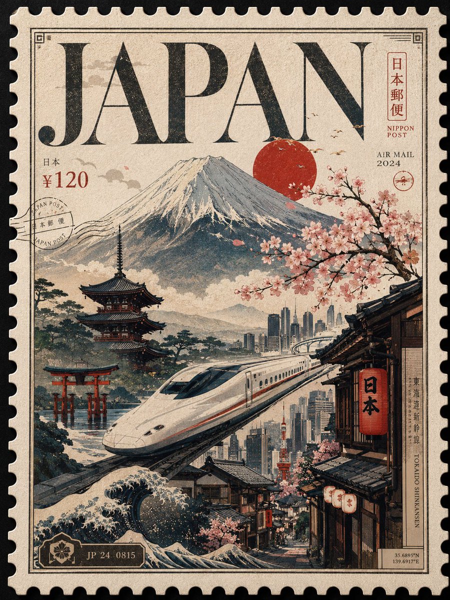
Design a premium 3:4 collectible postal-stamp poster for Japan, where the entire composition is one monumental luxury postage stamp filling the frame edge-to-edge like a rare national artifact. The stamp should dominate the canvas with oversized tactile perforation edges, elegant engraved borders, and an immersive object-focused composition.
Style: handcrafted gouache illustration blended with silkscreen poster aesthetics, traditional Japanese print sensibilities, editorial travel art, and museum-grade print minimalism. The artwork should capture Japan’s true atmosphere through layered cultural identity, seasonal nature, refined urban rhythm, historic architecture, rail transportation, mountain landscapes, coastal serenity, craftsmanship, and quiet environmental harmony — interpreted through elegant graphic storytelling rather than cliché tourism imagery.
The composition should feel dynamic and asymmetric. One dominant national element should rise diagonally through the stamp — such as Mount Fuji merging into flowing Shinkansen lines and layered traditional rooftops — while secondary forms drift around it with graceful movement: torii silhouettes, sakura branches, lantern-lit alleys, modern skyline fragments, ocean waves, and minimalist garden geometry. The design should subtly communicate the coexistence of tradition and futurism without becoming a crowded collage. Preserve intentional negative space inspired by Japanese poster design and printmaking aesthetics. Avoid clutter and over-detailed realism.
Typography is a major part of the design. The word “JAPAN” must appear massive and integrated directly into the stamp artwork like a luxury masthead, partially interacting with the illustration through masking, overlap, engraving, or layered depth. Typography should feel refined and timeless — blending modern editorial typography with subtle inspiration from Japanese calligraphy and vintage postal design.
Keep all secondary typography minimal and authentic: tiny denomination number, 日本郵便–inspired postal markings, AIR MAIL / POST text, issue year, serial numbers, microscopic cancellation marks, engraved information strips, subtle kanji details, and refined border inscriptions integrated naturally without cluttering the composition.
Lighting should feel like premium collectible print photography: soft directional highlights revealing tactile matte washi-paper grain, embossed ink edges, subtle print pressure, delicate shadow depth around perforation cuts, and refined ink density. No dramatic cinematic lighting.
Color palette should feel elegant, restrained, and distinctly Japanese: • warm ivory
• sumi black
• muted indigo
• vermilion red
• sakura pink
• moss green
• weathered wood brown
• soft fog gray
with carefully controlled accents inspired by ukiyo-e prints, Kyoto streets, Tokyo night signage, and seasonal landscapes.
Final result should feel like an ultra-rare commemorative Japanese postage stamp sold in a luxury museum design store — sophisticated, tactile, immersive, collectible, and timeless.
Negative: generic anime aesthetics, floating tourist landmarks, souvenir-style compositions, busy collages, excessive typography, fake vintage distress, stock vector icons, random gradients, low-detail illustration, centered layouts, generic stamp mockups, noisy textures, over-rendered realism.