PROMPT RECORD图像记录
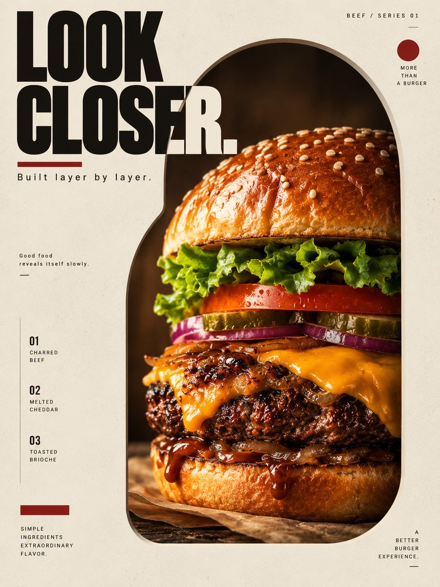
Gptimage2 提示词分享: 为一款高端牛肉汉堡创建一整张完整的、3:4 竖版比例的高端广告海报。 选定风格: 窗口窥探 × 极简结构主义 —— 几何镂空构图,建筑式负空间,受控的视觉揭示...
中文说明
Gptimage2 提示词分享: 为一款高端牛肉汉堡创建一整张完整的、3:4 竖版比例的高端广告海报。 选定风格: 窗口窥探 × 极简结构主义 —— 几何镂空构图,建筑式负空间,受控的视觉揭示,极简编辑式排版,高端美食摄影。 这张海报必须感觉像一件当代设计作品,而不是一张传统的快餐广告。 ──────────────────── 核心创意概念: “LOOK CLOSER.” 汉堡在第一眼并不会完全暴露地呈现。 相反,海报在画面中开凿一个大型几何孔洞,让观者可以“窥探”到汉堡。 这个孔洞就像一扇窗。 透过这扇窗,观者可以看到: 金色布里欧修面包, 融化的芝士, 焦香牛肉, 新鲜蔬菜, 浓郁酱汁。 产品应感觉被部分隐藏,却又不可抗拒地显现。 视觉张力来自: 隐藏, 裁切, 负空间, 材质对比, 以及精准的排版。 ─...
原始 Prompt
Gptimage2 prompt share:

Create one complete high-end advertising poster for a premium beef burger, vertical 3:4 aspect ratio.

SELECTED STYLE:
Window Peeking × Minimal Structuralism — geometric cut-out composition, architectural negative space, controlled visual reveal, minimal editorial typography, high-end food photography.
The poster must feel like a contemporary design object rather than a conventional fast-food advertisement.

────────────────────

CORE CREATIVE CONCEPT:

“LOOK CLOSER.”

The burger is not presented fully exposed at first glance.

Instead, the poster uses a large geometric aperture carved through the visual field, allowing the viewer to “peek” into the burger.

The aperture acts like a window.

Through this opening, the viewer sees:

golden brioche,
melted cheese,
charred beef,
fresh vegetables,
rich sauce.

The product should feel partially hidden but irresistibly revealed.
The visual tension comes from:
concealment,
cropping,
negative space,
material contrast,
and precise typography.
────────────────────
PRODUCT:

Show one premium beef burger.

Burger construction:

glossy toasted brioche bun,
small sesame seeds,
fresh crisp lettuce,
ripe tomato,
pickles,
thin red onion,
melted cheddar cheese,
one thick flame-grilled beef patty,
caramelized onion,
dark glossy burger sauce,
toasted brioche bottom bun.
The burger should feel handcrafted,
substantial,
juicy,
fresh,
premium,
and physically believable.
The beef patty is the visual center.
Texture:
deep caramelized crust,
rough handmade edges,
visible ground-beef structure,
subtle rendered fat,
small char marks,
natural moisture,
no plastic texture.

────────────────────

MAIN VISUAL DEVICE:

Create one enormous geometric cut-out shape occupying roughly 60% of the poster.

Shape:

a vertical rounded rectangle,
or a tall irregular architectural arch.
The aperture should start near the upper-middle area and extend downward.
Inside the cut-out:
show the burger in photorealistic commercial food photography.
Outside the cut-out:
keep the poster extremely graphic and minimal.
This creates a strong contrast:
REAL FOOD
inside the window
vs.
FLAT GRAPHIC SPACE
outside the window.
────────────────────

COMPOSITION:
Single complete 3:4 vertical poster.
Place the cut-out slightly off-center,
leaning toward the right side.
The burger should sit inside the aperture,
occupying around 55–60% of the poster height.
Show the burger in a low three-quarter hero perspective.
Do not center everything perfectly.

Use intentional asymmetry.

Leave strong negative space on the left side for typography.

────────────────────
CROPPING:
The aperture may crop a small portion of the burger edges,
but the entire structure must remain understandable.
The top bun,
beef layer,
cheese,
and bottom bun
must all remain visible.
Do not crop away the entire top or bottom.
The cropping should create tension,
not destroy product readability.
────────────────────

BACKGROUND:

Use a warm muted cream / pale sand background.

Flat color.

No gradient.

No environment.
No table scene.

No restaurant.

No kitchen.

No landscape.

The background should feel like premium uncoated printed paper.

Add very subtle fine grain.

────────────────────

COLOR SYSTEM:
Primary:

warm cream,
off-white,
soft beige.

Product:
natural burger colors.

Accent:

deep oxblood red.

Use the red very sparingly.

Only for:
one narrow geometric bar,
one small circular mark,
one thin typographic underline.

No neon.
No rainbow palette.

No excessive yellow-red fast-food colors.

────────────────────

GRAPHIC STRUCTURE:

Use a strict invisible grid.

Add only a few controlled elements:

one thin vertical line,
one short horizontal rule,
one small circular index mark,
one narrow red rectangle,
one small numeric label.

Keep the graphic system minimal.
Every element must align to the grid.

────────────────────
MAIN TYPOGRAPHY:
Headline:
“LOOK
CLOSER.”
Large uppercase modern grotesk type.

Place in the upper-left area.

Stack on two lines.
Typography should be bold,
architectural,
clean,
confident.

Color:

deep charcoal black.

Do not use distressed fonts.

Do not use playful diner lettering.

────────────────────

SECONDARY TYPOGRAPHY:

Small eyebrow text:

“BEEF / SERIES 01”

Place near the upper-right margin.

Use tiny uppercase letters with wide tracking.

Small supporting copy:

“Built layer by layer.”

Place beneath the headline.

Then add three small product notes:

01 — CHARRED BEEF

02 — MELTED CHEDDAR
03 — TOASTED BRIOCHE
Place vertically along the lower-left edge.

────────────────────

MICRO COPY:

Add one tiny two-line statement:

“Good food
reveals itself slowly.”

Place in a quiet area with generous negative space.

────────────────────

FOOD LIGHTING:
Use premium commercial food photography.
Large soft key light from upper-left.

Warm highlight on the top bun.

Subtle backlight around the lettuce and cheese.

Deep but readable shadows around the beef.

Preserve realistic:

bun pores,
beef crust,
cheese folds,
lettuce veins,
tomato moisture,
sauce gloss.

Avoid over-shiny surfaces.

No fake HDR.

────────────────────
DEPTH:
The cut-out should feel like it is physically punched through the poster.
Add subtle realistic shadow around the aperture edge.
The shadow should be very soft and controlled.

This creates the illusion of a thick paper board with the burger visible behind it.

Do not make it look like a 3D sci-fi portal.

Think:

architectural model,
die-cut packaging,
museum catalogue,
premium print object.

────────────────────

TYPOGRAPHIC HIERARCHY:
LEVEL 01:
LOOK CLOSER.

LEVEL 02:
burger inside the cut-out.

LEVEL 03:
Built layer by layer.

LEVEL 04:
01 / 02 / 03 ingredient notes.

LEVEL 05:
micro-copy and index marks.
────────────────────
DESIGN ATTITUDE:
Think:

European editorial design,
Japanese packaging restraint,
Swiss grid,
premium food campaign,
architecture magazine,
contemporary art catalogue,
luxury product photography.

The poster should feel quiet,
intelligent,
and highly controlled.

────────────────────

IMPORTANT:

This is NOT:

a diner poster,
a delivery-app advertisement,
a restaurant menu,
an e-commerce food image,
a fast-food promotion.

No price.

No sale text.

No QR code.

No logo.

No hands.

No person.

No fries.

No cola.

No flying ingredients.

No food explosion.

No flames.

No heavy smoke.

No dripping cheese waterfall.

No messy sauce splash.

No wooden table.

No checkered pattern.
No neon.

No retro Americana.

────────────────────

AI QUALITY CONTROL:

one burger only,
correct bun structure,
one beef patty only,
no duplicated vegetables,
no floating ingredients,
no warped bread,
no impossible cheese geometry,
no plastic food texture,
no raw beef,
no overcooked black patty,
no fake logo,
no random gibberish text,
accurate English typography,
clean die-cut aperture,
clear graphic hierarchy.

────────────────────

FINAL VISUAL IMPRESSION:

minimal,
appetizing,
architectural,
graphic,
premium,
editorial,
controlled,
clever,
modern,
gallery-worthy,
high-design.

Keywords:

3:4 vertical food poster,
premium beef burger,
window peeking,
die-cut poster,
architectural negative space,
Swiss editorial design,
luxury food advertising,
premium commercial food photography,
minimal graphic design,
warm cream background,
oxblood red accent,
contemporary typography,
high-end art direction,
Behance-level food campaign