PROMPT RECORD图像记录
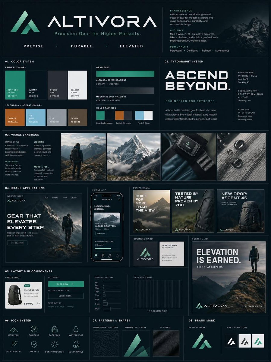
我使用 ChatGPT image 2.0 制作了一张完整的品牌套件海报。 下面我分享了实际的提示词模板,你可以将其中的内容替换为你自己的品牌信息后使用。 请尝试以下提示词…… "为以下品牌创...
中文说明
我使用 ChatGPT image 2.0 制作了一张完整的品牌套件海报。 下面我分享了实际的提示词模板,你可以将其中的内容替换为你自己的品牌信息后使用。 请尝试以下提示词…… "为以下品牌创建一个高级的竖版品牌指南板(4:5 长宽比): [BRAND NAME] 行业:[INDUSTRY / NICHE] 目标受众:[AUDIENCE TYPE] 品牌个性:[3–5 TRAITS] 核心情感:[FEELING YOU WANT TO EVOKE] 使用结构化的模块化网格(3–4 列),精确的间距、对齐和强烈的视觉层级。布局必须感觉像高端机构演示稿,而非拼贴。 核心规则 所有内容都必须从品牌输入中逻辑推导: 配色必须反映品牌个性和行业 字体必须匹配基调(奢华、科技、俏皮等) 形状和视觉元素必须在所有版块中保持一...
原始 Prompt
I created a full brand kit poster using ChatGPT image 2.0.

I have shared the actual prompt template below that you can use to replace with your brand.

Try the prompt below...

"Create a premium vertical brand guideline board (4:5 aspect ratio) for the brand:

[BRAND NAME]
Industry: [INDUSTRY / NICHE]
Target Audience: [AUDIENCE TYPE]
Brand Personality: [3–5 TRAITS]
Core Emotion: [FEELING YOU WANT TO EVOKE]

Use a structured modular grid (3–4 columns) with precise spacing, alignment, and strong visual hierarchy. The layout must feel like a high-end agency presentation, not a collage.

Core Rule

Everything must be logically derived from the brand inputs:

Color palette must reflect the brand personality and industry

Typography must match tone (luxury, tech, playful, etc.)

Shapes and visual elements must feel consistent across all sections

No randomness. No generic defaults.

1. Header Section (Top)

Brand name in a dominant headline style

Short tagline (max 6 words)

3 brand descriptors (e.g. Bold / Precise / Minimal)

Keep it clean, confident, and visually anchored.

2. Color System

Define 3–5 primary colors

Define 2–4 secondary/accent colors

Show large swatches with HEX codes and labels

Also include:

2 gradient styles

2–3 real pairing examples (UI or branding usage)

Palette must feel intentional and cohesive.

3. Typography System

Define hierarchy:

Headline (strong, expressive)

Subheading (structured)

Body (high readability)

Show real text samples:

Large title

Medium subheading

Short paragraph

Typography must align with brand tone.

4. Visual Language

Define:

Image style (editorial, minimal, cinematic, etc.)

Lighting direction

Texture/material inspiration

Include 3–4 small visual tiles (moodboard style) that clearly reflect the brand world.

5. Brand Applications

Show realistic, polished mockups:

Website hero section

Mobile app UI

2–3 social media creatives

Business card

One large ad format (poster or billboard)

All must strictly follow the defined system (colors, fonts, spacing).

6. Layout & UI Components

Display:

Card layout system

Buttons

Spacing rules

Grid alignment

Keep functional, minimal, and consistent.

7. Icon System

6–8 icons

Consistent style (outline or solid)

Uniform stroke weight

Geometry aligned with brand personality

8. Patterns & Shapes

Create subtle design elements:

Geometric forms

Repeating motifs

Background textures

They must support, not dominate.

9. Rendering & Finish

Ultra-clean composition

Clear section separation

Strong hierarchy

High-end editorial or tech aesthetic

Soft shadows, depth, premium lighting

Final output must look like a professional brand guideline board used in real client presentations, not AI-generated clutter."