 1/3
1/3
PROMPT RECORD图像记录
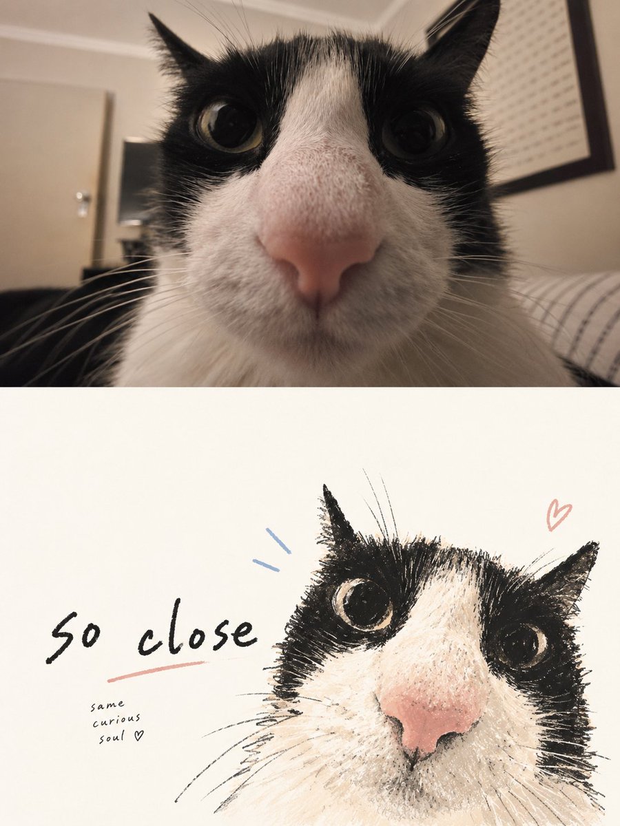
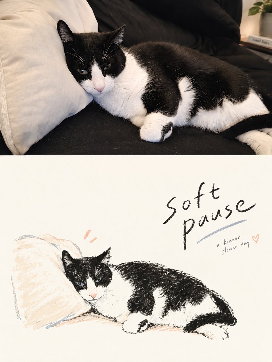
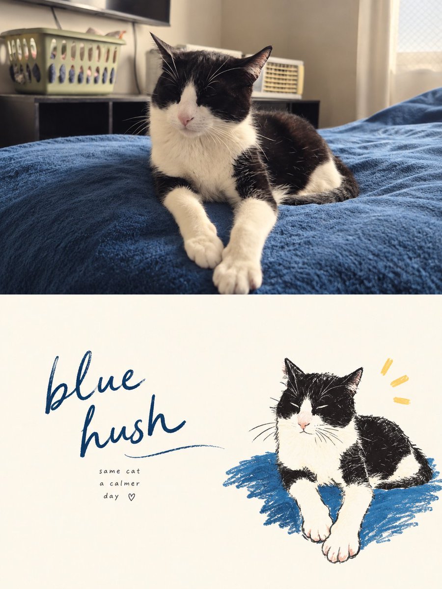
请将我上传的每张照片分别制作成一张高端设计海报。不要制作多图拼贴。每张照片都要单独输出一张海报。 整体采用 3:4 的竖向构图,划分为高度完全相等的两个部分,上半部分和下半部分各占画布的 50...
中文说明
请将我上传的每张照片分别制作成一张高端设计海报。不要制作多图拼贴。每张照片都要单独输出一张海报。 整体采用 3:4 的竖向构图,划分为高度完全相等的两个部分,上半部分和下半部分各占画布的 50%。 上半部分应保留原始照片。维持人物的身份、结构、姿态、真实质感、自然光线和原始色彩氛围。仅进行细微而精致的调色,使图像呈现艺术杂志或展览摄影的视觉品质。周围环境可以自然延展以适应画幅,但主体绝不能被拉伸、扭曲或改变。 对于下半部分,请进行完全全新的艺术判断。仅仅从原始照片中提取最具辨识度的主体、轮廓、结构、姿态和叙事关系,然后将其重构为手绘涂鸦生活方式插画 / 稚拙插画 / 马克笔画。不要保留每一个物体,也不要复刻原始场景。主动去除大部分背景和无关信息。通过删减、重构、裁切和尺度变化,重新引导画面,使即便原本普通的构图...
原始 Prompt
Please turn each photo I upload into a separate, high-end designed poster. Do not create multi-image collages. Output each photo as an individual poster.

Use an overall 3:4 vertical composition, divided into two sections of exactly equal height, with the top and bottom each occupying 50% of the canvas.

The upper half should preserve the original photograph. Maintain the subject’s identity, structure, pose, realistic texture, natural lighting, and original color atmosphere. Apply only subtle, refined color grading to give the image the visual quality of an art magazine or exhibition photograph. The surrounding environment may be naturally extended to fit the format, but the main subject must never be stretched, distorted, or altered.

For the lower half, make a completely new artistic judgment. Extract only the most recognizable subject, silhouette, structure, pose, and narrative relationship from the original photo, then reconstruct them as a Hand-drawn Doodle Lifestyle Illustration / Naïve Illustration / Marker Drawing. Do not preserve every object. Do not replicate the original scene. Actively remove most of the background and irrelevant information. Through reduction, recomposition, cropping, and scale changes, re-direct the image so that even an ordinary original composition can be transformed into a visually resolved artwork.

Simplify and symbolize the forms. The illustration should feel loose, expressive, and full of personality. Use slightly shaky, broken, imperfect hand-drawn lines, with natural marker, crayon, or oil pastel style coloring. Allow slight coloring outside the lines, visible unpainted gaps, and handmade imperfections. Do not aim for realistic proportions, perfect perspective, or highly detailed rendering.

The lower half must be built around an extremely generous amount of intentional negative space. The illustrated elements should occupy only a relatively small portion of the composition, while the remaining space is deliberately left empty. The subject may be placed off-center, pushed toward an edge, suspended within the frame, or partially cropped, depending on the direction of the pose and the visual center of gravity. Negative space and the subject should work together to create positive and negative shapes, distance, pauses, and a sense of breathing room. It is always better to draw less than to fill the entire frame.

Graphics and typography must be re-composed as a single integrated system, rather than following a simple “text above, character below” layout. First establish an invisible grid, visual axes, and reading path. Then determine the placement of the typography. Text may sit close to the subject’s contour, follow the direction of an action or gesture, align with the head or shoulder line, occupy a large area of negative space, or interact with the illustration through offset placement, overlap, and asymmetrical visual echoes. Avoid mechanical centering, vertical stacking, and fixed templates. The illustration should carry the emotion, while the typography controls the rhythm. Together, they should complete the composition.

The language of the typography is unrestricted, but use only a very small number of genuinely meaningful words or short phrases. Use light, natural handwriting with subtle variations in character width and pen pressure. Preserve a slightly spontaneous handwritten quality, but keep letter spacing, line spacing, and overall placement carefully controlled through editorial design. A slightly more prominent short phrase may be paired with extremely small supporting text to create hierarchy, but avoid menu-like headings, long blocks of copy, or layouts filled with text.

The overall result should pursue naïve drawing, mature composition, intelligent relationships between graphics and typography, and an extremely generous amount of negative space, like a high-end independent magazine, lifestyle editorial illustration, or art publication.