 1/3
1/3
PROMPT RECORD图像记录
(可用于 gemini、gpt 或任何其他 AI 模型): https://t.co/OQMYT3X5hA 1. 🎯 角色 + 风格 DNA • 目的:定义图像创作者的思维方式与美学操作系统...
中文说明
(可用于 gemini、gpt 或任何其他 AI 模型): https://t.co/OQMYT3X5hA 1. 🎯 角色 + 风格 DNA • 目的:定义图像创作者的思维方式与美学操作系统 • 核心模式: - 作为面向未来的品牌活动设计师、CGI 产品摄影师与保健品包装美术指导,为一个高性能健康品牌创作正面主视觉海报。 - 参考:Nike ACG 编辑系统、Nothing 极简科技品牌、赛博朋克实验室界面图形、瑞士网格海报、地下性能补剂活动、科幻 UI 诊断 • 可复用概念: - 角色:CGI 产品摄影师 + 品牌系统设计师 + 实验性字体美术指导 - 镜头:居中英雄级产品图,融入海报系统 - 类别:高端益智 / 能量补剂瓶 - 风格参考:粗野主义字体、蓝图式 UI 叠加、实验室规格包装、高对比电商编辑、限量...
原始 Prompt
Prompt

(can be used with gemini, gpt or any other AI model):
https://t.co/OQMYT3X5hA

1. 🎯 ROLE + STYLE DNA
• Purpose: Defines the image-maker mindset and the aesthetic operating system
• Core Pattern:
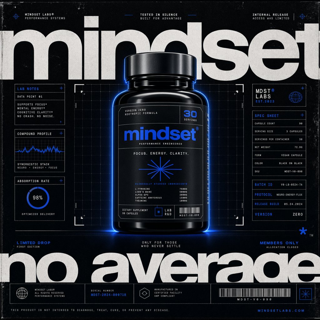
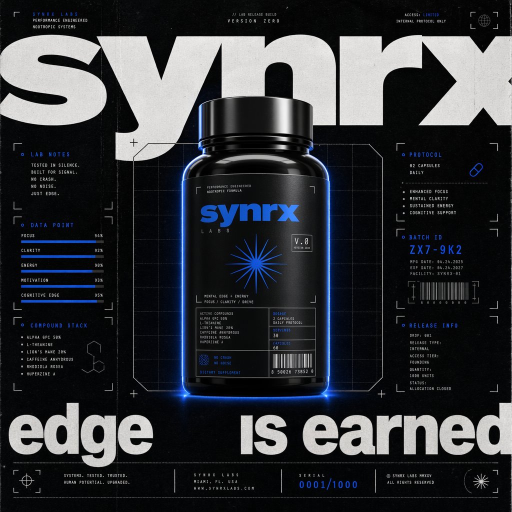
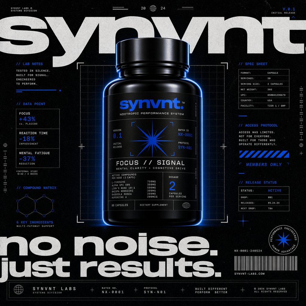
- Act as a futuristic brand campaign designer, CGI product photographer, and supplement packaging art director creating a front-facing hero poster for a high-performance wellness brand.
- References: Nike ACG editorial systems, Nothing minimal tech branding, cyberpunk lab interface graphics, Swiss grid posters, underground performance supplement campaigns, sci-fi UI diagnostics
• Reusable Concepts:
- Role: CGI Product Photographer + Brand Systems Designer + Experimental Typographic Art Director
- Shot: Centered hero packshot integrated into a poster system
- Category: Premium nootropic / energy supplement bottle
- Style refs: brutalist typography, blueprint UI overlays, lab-spec packaging, high-contrast e-commerce editorial, limited-drop product launch graphics
• Editable knobs:
- Replace references to shift from cyber-lab to luxury, fashion, biotech, gaming, or sports
- Replace category to adapt for fragrance, skincare, hardware, beverage, or apparel

2. 🧩 BRAND IDENTITY TRANSLATION
• Purpose: Converts brand personality into graphic and physical language
• Core Identity in This Reference:
- Brand reads as engineered, exclusive, clinical, performance-focused, futuristic, and culturally sharp
- The wordmark is the hero, not just the product
- Identity is built from contrast between silence and intensity: black void, white type, electric blue signal accents
• Logic Template:
- IF brand has a wordmark:
- Make the wordmark oversized and partially cropped by the canvas edges
- Use it as environmental typography behind and around the product
- IF brand has a symbol:
- Repeat the symbol as interface marker, label emblem, and accent motif
- Translate identity into 3 systems:
- Typography = dominance and authority
- Product = proof object
- UI micrographics = scientific credibility
• Key Abstraction:
- You are not merely showing packaging
- You are staging a brand signal inside a technical poster interface
• Editable knobs:
- Interpretation style:
- literal = use exact wordmark/symbol
- abstract = create a geometric motif inspired by the brand essence
- Tone:
- clinical
- athletic
- cult premium
- hacker-tech

3. 📏 SCALE & COMPOSITION SYSTEM
• Purpose: Controls premium poster tension and discovery
• Hard Rules:
- Product centered vertically and horizontally
- Bottle occupies about 30–38% of canvas width
- Oversized wordmark occupies 70–90% of total canvas width and sits behind product
- Main product isolated in a technical framing box or grid field
- Surrounding negative space filled with structured annotations, never empty emptiness
- Top and bottom typography should feel cropped by the frame for editorial force
• Composition Logic:
- Center = product proof
- Background = brand authority
- Side columns = lab notes / claims / spec sheet / drop language
- Bottom strip = metadata, codes, protocol language, footer system
• Cinematic Concept:
- The object feels archived, tested, and released under controlled conditions
• Editable knobs:
- More luxury: reduce side-note density
- More tech: increase UI overlays and grid visibility
- More commercial: enlarge bottle to 42–48%
- More editorial: increase type cropping and asymmetry

4. 🧱 OBJECT GEOMETRY
• Purpose: Defines the physical artifact precisely
• Base Form:
- Glossy black supplement bottle
- Cylindrical body with soft shoulder transitions
- Slightly wider cylindrical cap with shallow rounded edge
- Tall label rectangle with tight margins and technical panel segmentation
• Camera Angle:
- Straight-on frontal view with very slight low-to-neutral perspective
- Minimal rotation, almost perfectly symmetrical
- Keeps label legible and iconic
• Edge Detail:
- Strong rim light outlining silhouette
- Soft blue halo glow around bottle contour
- Reflective cap catches brighter metallic highlights than body
• Editable knobs:
- Bottle type: capsule jar, canister, serum bottle, can, fragrance flacon
- Cap finish: matte black, gunmetal, brushed aluminum
- Perspective: perfectly orthographic for cleaner UI feel, or 5–10° perspective for more realism

5. 🎨 COLOR SYSTEM
• Purpose: Creates instant brand recognition through disciplined contrast
• Core Palette:
- Background: deep textured black / charcoal
- Typography: stark white
- Accent: electric cobalt blue
- Product: black-on-black with blue highlights
• Contrast Logic:
- Use only 3 dominant values:
- black field
- white macro typography
- blue signal accents
- Blue should appear as energy activation, not flood fill
- White carries hierarchy, blue carries precision and pulse
• Color Placement Rules:
- Main wordmark and large slogan in white
- Label logo and key iconography in blue
- Technical annotations mostly white, with selective blue highlights for numbers, dividers, and emphasis
- Glow around product should be subtle electric blue
• Editable knobs:
- Accent hue: cobalt, neon cyan, acid green, infrared red
- Background depth: pure black for cleaner output, dusty black for more analog grit
- Contrast intensity: soft premium vs hyper-electric launch poster

6. 🧪 MATERIAL SYSTEM
• Purpose: Defines tactile realism and poster finish
• Product Materials:
- Bottle body: glossy black plastic or lacquered composite
- Cap: satin metal or polished dark anodized finish
- Label: matte black stock with subtle sheen difference from bottle
• Poster Surface Language:
- Slight distressed print texture
- Faint dust, scan noise, paper wear, and light scratches
- Grid and UI lines should feel screenprinted or plotted
• Lighting Interaction:
- Front lighting is controlled and low-key
- Side/rim lights separate black bottle from black background
- Blue underglow or contour glow adds sci-fi energy
- Highlights must be crisp but not luxury-glossy to the point of beauty ad softness
• Editable knobs:
- Cleaner output: remove distress and noise
- More underground: add xerox grain, toner texture, misregistration, subtle print wear
- More futuristic: strengthen emissive glow and interface luminosity

7. ✂️ GRAPHIC SYSTEM
• Purpose: Defines the poster intelligence layer around the object
• Core Elements:
- Oversized cropped headline wordmark at top
- Oversized cropped slogan at bottom
- Central technical grid behind product
- Corner crop marks and framing brackets
- Side modules labeled like lab notes, data point, spec sheet, batch ID, protocol, versioning
- Tiny metadata footer with codes, release labels, URLs, serial language
- Barcode and abstract symbol marks
• Rules:
- Use monospaced or engineered microtype for annotation text
- Use bold neo-grotesk sans serif for giant headlines
- Keep all small text aligned to a rigid grid
- Use short, punchy copy fragments instead of long paragraphs
- Every element should imply testing, scarcity, or system logic
• Tone of Copy:
- controlled
- quiet confidence
- exclusive
- high-performance
- anti-hype but still aspirational
• Editable knobs:
- Increase scarcity language for drop culture
- Increase scientific claims language for biotech feel
- Increase athletic copy for sports-performance positioning

8. 🔤 TYPOGRAPHY SYSTEM
• Purpose: Recreates the identity backbone
• Headline Style:
- Massive lowercase sans serif wordmark
- Heavy to extra-bold weight
- Tight spacing
- Cropped aggressively by frame edges
• Secondary Type:
- Condensed or monospaced utility text
- Small uppercase labels
- Modular placement in boxes and columns
• Hierarchy Rules:
- Level 1: giant white brand and slogan text
- Level 2: blue product logo and symbol
- Level 3: white utility annotations and spec labels
- Level 4: tiny metadata and footer strings
• Editable knobs:
- More fashion: use cleaner editorial grotesk
- More industrial: increase monospace density
- More luxury-tech: reduce microcopy, enlarge spacing

9. 💡 LIGHTING SYSTEM
• Purpose: Controls realism and mood
• Setup:
- Low-key studio lighting
- Soft frontal fill for label readability
- Strong rim lights on left and right edges
- Narrow top highlight on cap
- Faint electric blue glow around bottle base and contour
• Result:
- Bottle emerges from black like a precision object in a test chamber
- Black-on-black remains readable because of edge separation
• Editable knobs:
- More premium: soften blue glow
- More sci-fi: intensify underglow and blue edge bloom
- More raw: reduce glow, rely on silver speculars only

10. 🧾 COPY + BRAND VOICE EXTRACTION
• Purpose: Makes the design feel like the same brand world
• Voice Traits:
- sparse
- technical
- elite but restrained
- confident, never loud
- product-as-advantage language
• Sample Copy Logic:
- Use fragments like:
- tested in silence
- no crash, no noise
- access was limited
- version zero
- performance engineered
- batch ID / protocol / release build
- Claims should feel systemized, not salesy
• Editable knobs:
- More exclusive: members-only, internal release, allocation closed
- More clinical: absorption rate, compound profile, dosage grid
- More cultural: first drop, selected only, early access protocol

11. 🔁 REBUILD FORMULA
• Use this structure:
- PHASE A: Define role and aesthetic DNA
- PHASE B: Translate brand into oversized typography + signal motif
- PHASE C: Build centered product composition within a technical grid
- PHASE D: Use black / white / electric blue contrast logic
- PHASE E: Define glossy black bottle materials and low-key lighting
- PHASE F: Add lab-interface annotations, metadata, barcode, and release language
- PHASE G: Finish with subtle print distress and campaign-poster tension