PROMPT RECORD图像记录
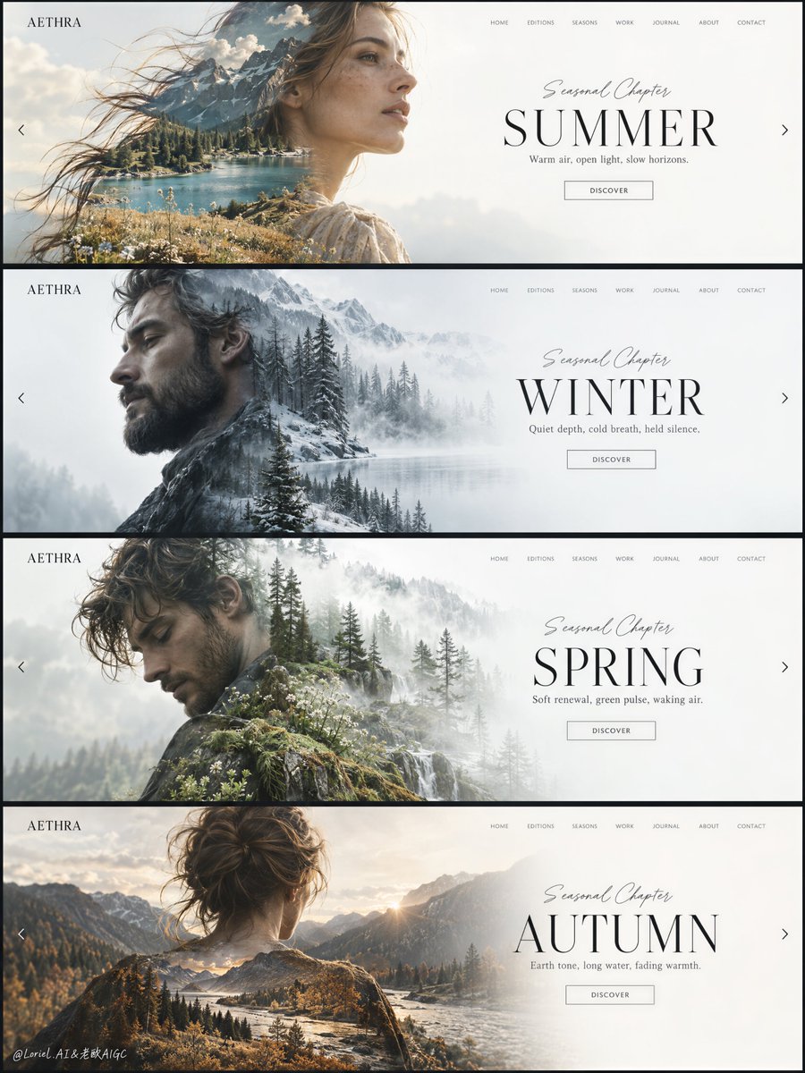
季节的变化最能打动人心,当一切静止,唯有氛围流转。 🪽 重复完全相同的主视觉网格:左侧人像,右侧开阔的标题区域,固定的导航、标签与按钮位置 四张幻灯片在尚未阅读季节之前,就已成为一个无可混淆的...
中文说明
季节的变化最能打动人心,当一切静止,唯有氛围流转。 🪽 重复完全相同的主视觉网格:左侧人像,右侧开阔的标题区域,固定的导航、标签与按钮位置 四张幻灯片在尚未阅读季节之前,就已成为一个无可混淆的设计系统。 🌿 仅改变每一张人像中嵌入的风景、光线温度,以及克制的季节调色 夏、冬、春、秋彼此分明,却无需为每一次变换重新排版。 GPT- 图像 2.5 提示词👇 为虚构生活方式品牌 AETHRA 创作一块高级编辑级网页设计 Campaign 板:以一幅纵向整体构图呈现,内含四张上下堆叠的全屏网站主视觉幻灯片,每张基于同一套优雅的界面系统,但以不同季节重新诠释。整张图必须呈现奢华创意指导提案的气质:极简、通透、高端,且如策展般精准。四张幻灯片保持一致的布局:左上角小型方形品牌标识、右上角一条纤细精致的导航栏、左侧半幅的大型...
原始 Prompt
Seasonal variety works best when everything but the atmosphere stays still.
🪽 repeat the exact hero grid: portrait on the left, spacious title field on the right, fixed navigation, label, and button positions
The four slides read as one unmistakable design system before you even read the season.
🌿 change only the embedded landscape, light temperature, and restrained seasonal palette inside each portrait
Summer, winter, spring, and autumn feel distinct without needing a new layout every time.

GPT- image 2.5 prompt👇
Create a premium editorial web-design campaign board for a fictional lifestyle brand called AETHRA, presented as one single tall composition containing four stacked full-screen website hero slides, each built from the same elegant interface system but reinterpreted through a different season. The entire image must feel like a luxury creative-direction presentation: minimalist, airy, high-end, and curatorially precise. Preserve a consistent layout across all four slides: a small square brand mark at the upper left, a thin refined navigation row across the upper right, a large human portrait on the left half rendered as a soft double-exposure silhouette, and a clean seasonal title block on the right half over a spacious white or near-white field. The “product” is the design system itself, and it must remain the dominant visual focus.

Overall composition: four horizontal website hero banners stacked vertically in one clean presentation board, separated by thin dark dividers or slim frame gaps. Each slide follows the same structure but carries its own seasonal mood, palette, portrait direction, and embedded landscape. The board should read like a polished design showcase for a premium homepage slider concept. Typography, grid, whitespace, navigation rhythm, and button placement must stay consistent from slide to slide. The left portrait and right title area should always form the primary balance. Everything must feel deliberate, spacious, and highly art-directed.

Slide 1, SUMMER: an adult woman in side profile or three-quarter profile facing right, with softly windblown hair and a graceful elongated silhouette. Inside her silhouette, blend a luminous alpine summer landscape: teal lake water, sunlit ochre grass, pale rocky mountains, soft cloud haze, and warm summer air. Main title on the right reads exactly: "SUMMER". Small script line above reads exactly: "Seasonal Chapter". Supporting line below reads exactly: "Warm air, open light, slow horizons." Small button text reads exactly: "DISCOVER".

Slide 2, WINTER: an adult bearded man in left-facing side profile, calm and introspective. Inside the silhouette, blend a muted winter forest landscape with bare trees, cool fog, pale frost, bluish-grey shadows, and soft white atmospheric layering. Main title reads exactly: "WINTER". Small script line above reads exactly: "Seasonal Chapter". Supporting line below reads exactly: "Quiet depth, cold breath, held silence." Small button text reads exactly: "DISCOVER".

Slide 3, SPRING: an adult man in a softly bent or turning pose, looking slightly downward, elegant and reflective. Inside the silhouette, blend a light spring woodland scene with soft evergreen layers, misty white light, pale moss, wet bark, and fresh emerging growth. Main title reads exactly: "SPRING". Small script line above reads exactly: "Seasonal Chapter". Supporting line below reads exactly: "Soft renewal, green pulse, waking air." Small button text reads exactly: "DISCOVER".

Slide 4, AUTUMN: an adult woman or androgynous adult figure shown from the back or slight rear three-quarter view, head centered, silhouette broad and calm. Inside the silhouette, blend an autumn river-valley landscape with muted golden grasses, cool mountain shadow, forest edge, silver water flow, and pale amber dusk light. Main title reads exactly: "AUTUMN". Small script line above reads exactly: "Seasonal Chapter". Supporting line below reads exactly: "Earth tone, long water, fading warmth." Small button text reads exactly: "DISCOVER".

Brand and interface system: the small top-left mark on every slide reads exactly: "AETHRA". The top-right navigation on every slide reads exactly: "HOME", "EDITIONS", "SEASONS", "WORK", "JOURNAL", "ABOUT", "CONTACT". Keep the UI elegant, understated, and believable as a real luxury website, but reduce clutter so it still feels like a gallery-grade image rather than a literal web screenshot. Include tiny left and right arrow cues near the side edges of each slide to imply a fullscreen slider. Typography should be thin, premium, editorial, and spatially balanced, with the main seasonal titles in large refined uppercase serif or elegant display text, the smaller interface elements in light modern sans-serif, and the script line above each title delicate and controlled.

Double-exposure treatment: the portrait silhouettes must be photoreal and anatomically elegant, with clean profiles, believable shoulders and necks, natural skin and hair detail where visible, and very soft edge transitions where the landscapes merge into the faces and bodies. The landscapes should align with the contour logic of each portrait so the horizon lines, tree masses, grass layers, and fog fields feel embedded inside the figures rather than pasted on top. Keep the integration subtle and premium, with no harsh collage cutouts, no muddy overlaps, and no chaotic texture stacking.

Lighting and palette: overall board palette must remain restrained, premium, and seasonally differentiated while unified by the clean white interface field. Use a 60/30/10 logic within each slide, but maintain a coherent full-board look. Summer: warm white, teal water, sunlit ochre. Winter: cool whites, fog grey, blue-green forest shadow. Spring: pale mist, fresh green, soft bark brown. Autumn: warm stone, muted amber, deep conifer shadow. Keep contrast soft but deliberate, with enough tonal separation to preserve facial silhouettes and text readability. The board must feel calm, expensive, and editorial, never loud or saturated.

Materials and finish: hyper-real portrait photography fused with fine-art landscape exposure and luxury UI design. Show realistic hair wisps, skin softness, lake texture, tree silhouette detail, mist depth, mountain atmosphere, and crisp rendered typography. The final image should feel like a Cannes-level digital-art-direction board: modern, collectible, emotionally intelligent, and brand-system driven.

Output and constraints: one complete four-slide seasonal campaign board, no copied source text, no real brand names, no extra people, no cluttered interface, no heavy decorative noise, no cheap stock-template feeling. Keep all portraits adult, elegant, and anatomically correct. Keep typography crisp and readable, white fields spacious, blends clean, and seasonal differences clear but controlled. Avoid broken facial structure, muddy double exposure, random texture spill, unreadable UI, over-sharpened forests, oversaturated palettes, pasted collage edges, gibberish text, or drift away from high-end editorial realism.