PROMPT RECORD图像记录
SKU 系列图最怕"换个包装、换个背景"。真正有记忆点的做法,是让每个口味拥有自己的情绪世界,但始终复用同一套品牌骨架。 ★ 锁定 2x2 四宫格海报 固定四宫格、标题位置、信息条和包装位;用...
中文说明
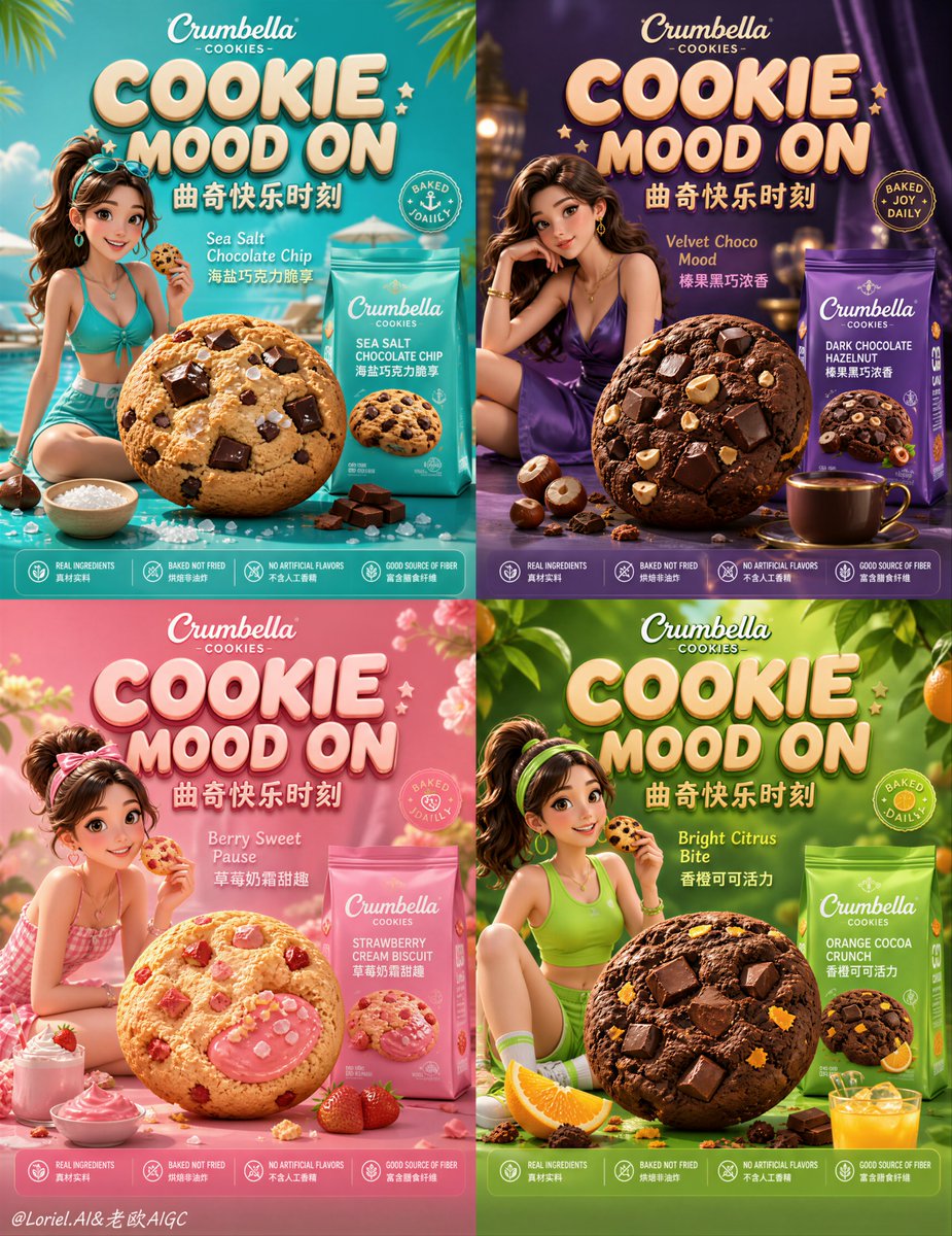
SKU 系列图最怕"换个包装、换个背景"。真正有记忆点的做法,是让每个口味拥有自己的情绪世界,但始终复用同一套品牌骨架。 ★ 锁定 2x2 四宫格海报 固定四宫格、标题位置、信息条和包装位;用户先识别"这是同一个品牌系列",再读取不同口味。 ★ 大饼干 + 女主 + 产品包装 每一格都只守住这三个主角:大饼干制造食欲,人物赋予情绪,包装完成购买识别。 ★ 口味世界匹配服装、道具与配色 青绿配海盐与泳池、紫色配榛果与夜晚、粉色配草莓奶霜、绿色配香橙与活力。口味不是颜色标签,而是一整套生活场景。 ★ 同一套 Logo 架构,只变口味配色 包装结构、Logo、底部卖点图标保持一致,只变色彩和食材线索;系列越多,这条规则越重要。 GPT-image 2 提示词👇 为自创曲奇品牌创作一张旗舰级亚马逊电商详情页活动海报,采...
原始 Prompt
SKU 系列图最怕“换个包装、换个背景”。真正有记忆点的做法,是让每个口味拥有自己的情绪世界,但始终复用同一套品牌骨架。
★ locked 2x2 grid poster
固定四宫格、标题位置、信息条和包装位;用户先识别“这是同一个品牌系列”,再读取不同口味。
★ oversized cookie + heroine + product package
每一格都只守住这三个主角:大饼干制造食欲,人物赋予情绪,包装完成购买识别。
★ flavor world matches outfit, props, and palette
青绿配海盐与泳池、紫色配榛果与夜晚、粉色配草莓奶霜、绿色配香橙与活力。口味不是颜色标签,而是一整套生活场景。
★ same logo architecture, only flavor palette varies
包装结构、Logo、底部卖点图标保持一致,只变色彩和食材线索;系列越多,这条规则越重要。

GPT- image 2 prompt👇
Create a flagship Amazon e-commerce detail-page campaign poster for a self-created cookie brand in a pure Disney / Pixar-quality 3D cartoon style, strictly preserving 100% of the original four-panel composition logic, panel rhythm, visual hierarchy, camera distance, typography placement logic, and retail storytelling structure: a locked 2x2 grid poster with four differentiated flavor worlds, each panel featuring a stylish healthy young woman interacting with an oversized hero cookie used as a premium lifestyle stage, while the cookie product bag remains clearly visible as the core sellable retail hero, surrounded by matching flavor ingredients, drink props, appetite cues, seasonal details, and polished commercial graphic elements. Do not redesign the macro layout. Keep the exact visual framework of top title zone, central heroine plus giant cookie focus, adjacent product packaging, flavor-support props, promotional badge areas, and lower information strip, but elevate the entire poster into a more mature flagship snack-brand campaign image.

Build one highly unified premium brand system with stronger campaign discipline. Brand name: “Crumbella Cookies”. Re-create the main campaign headline in a polished, rounded, dimensional premium 3D lettering style as “COOKIE MOOD ON”, paired with an elegant Chinese subtitle system such as “曲奇快乐时刻”. The whole poster must feel like one official seasonal campaign from a mature flagship snack brand, not four separate pretty panels. Each quadrant belongs to the same coherent brand family while carrying its own flavor narrative: Panel 1 in aqua-turquoise for sea-salt chocolate chip, Panel 2 in deep royal violet for dark chocolate hazelnut, Panel 3 in rose-magenta for strawberry cream biscuit, Panel 4 in fresh citrus green for orange cocoa crunch. Packaging across all four panels must share the same structural design language, same logo architecture, same premium material finish, same illustration consistency, and only vary through flavor palette and ingredient accents.

Push the Orbit-level focus harder: in every panel, the oversized cookie, heroine pose, and product package must read instantly as the primary visual triad. The women should feel youthful, healthy, elegant, cheerful, sunlit, premium, and highly memorable, each with a distinct but brand-consistent outfit and accessory styling that matches her flavor world. Poses must feel natural, aspirational, and ad-worthy, with correct anatomy, beautiful hands, correct feet, believable shoulders, relaxed hips, elegant leg placement, natural facial expression, and refined anti-AI skin finish. The cookies must look irresistibly edible and elevated to hero status: crisp baked edges, premium crumb texture, rich chocolate chunks, glossy fillings, nut fragments, strawberry cream detail, orange zest sparkle, subtle crumbs, and commercial-grade food rendering that feels delicious, tactile, and collectible.

Deepen the Port-level worldbuilding so each quadrant functions like a complete mini flavor universe while still belonging to one larger campaign. Panel 1 should feel breezy, sunny, fresh, and poolside-delight driven; Panel 2 should feel richer, velvet-like, indulgent, and slightly luxurious; Panel 3 should feel playful, sweet, romantic, and glossy-summer feminine; Panel 4 should feel bright, juicy, energetic, and citrus-happy. Props, drinks, ingredient motion, decorative accents, and flavor storytelling should all reinforce the emotional identity of each cookie line without clutter. The result should feel like a full premium seasonal campaign world where each cookie flavor owns a distinct lifestyle mood.

Visual style must remain pure Disney / Pixar-inspired 3D commercial art with a more mature flagship finish: clean rounded modeling, translucent soft materials, refined warm lighting, subtle atmospheric particles, soft glow, elegant bounce light, premium surface control, smooth shadow transitions, polished packaging reflections, sophisticated toy-like realism, and extremely clean commercial rendering. Typography must be newly invented and artistically redesigned, never copied. Use premium rounded dimensional English display lettering, elegant Chinese supporting copy, polished badge systems, neat bottom icon descriptors, and a minimal official brand mark. Suggested micro-copy may include “Baked Joy Daily”, “Velvet Choco Mood”, “Berry Sweet Pause”, “Bright Citrus Bite”, and concise Chinese flavor descriptors like “海盐巧克力脆享”, “榛果黑巧浓香”, “草莓奶霜甜趣”, “香橙可可活力”, all styled as one mature campaign language.

The final image must feel like a formal flagship snack-brand campaign for Amazon: high-selling, highly recognizable, clean yet rich, playful yet premium, youthful yet stable, visually explosive but commercially disciplined, with locked four-panel structure, product-first hierarchy, packaging clarity, strong appetite appeal, and one unified brand universe. Negative constraints: no ink wash, no paper texture, no ancient Chinese style, no gritty realism, no harsh contrast, no flat vector look, no anime style, no clutter overload, no cheap typography, no muddy colors, no broken anatomy, no malformed hands or feet, no low-end snack ad feeling.