 1/2
PROMPT RECORD图像记录
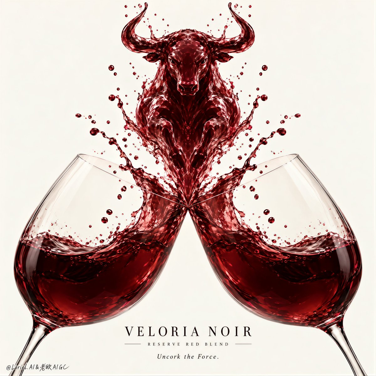
公牛之所以让人感觉是刻意设计的,是因为碰撞首先是以对称性来构建,其次才是象征意义。 🍷 两面镜像的酒杯,杯肚大小、倾斜角度、杯口高度、酒液水位以及距中心轴的距离完全一致 这使得冲击力显得庄重而...
中文说明
公牛之所以让人感觉是刻意设计的,是因为碰撞首先是以对称性来构建,其次才是象征意义。 🍷 两面镜像的酒杯,杯肚大小、倾斜角度、杯口高度、酒液水位以及距中心轴的距离完全一致 这使得冲击力显得庄重而非偶然。观者会先信任这种对称感,然后才会注意到液体雕塑。 🐂 从两侧杯口等量上升的液体力线汇聚成居中的公牛轮廓:清晰的牛角、头部、胸部,然后是逐渐收窄的躯体,消融回飞溅的水柱 这头公牛读起来是碰撞中被葡萄酒重塑的形象——不是一张被贴进水花里的动物图片。保持外侧飞沫的镜像对称,中央造型保持干净。 GPT- image 2.5 提示词👇 为虚构酒庄 VELORIA NOIR 设计的奢华葡萄酒海报,作为一张极简、高冲击力的广告图像,构建于两只完美对称的红酒杯在中央碰撞之上。保持精确结构:正面、居中、严格均衡的构图,一只水晶杯从左...
原始 Prompt
The bull only feels intentional because the collision is engineered as symmetry first, symbolism second.
🍷 two mirrored wine glasses with identical bowl size, tilt angle, rim height, wine level, and distance from the central axis
This makes the impact feel ceremonial rather than accidental. The viewer trusts the symmetry before noticing the liquid sculpture.
🐂 liquid force lines rising equally from both rims into one centered bull silhouette: clear horns, head, chest, then a tapering body dissolving back into splash strands
The bull reads as wine transformed by the collision—not an animal pasted into a splash. Keep the outer droplets mirrored and the central form clean.

GPT- image 2.5 prompt👇
A luxury wine poster for fictional house VELORIA NOIR, designed as a minimalist high-impact advertising image built around two perfectly symmetrical red-wine glasses colliding at the center. Preserve the exact structure: a front-facing, centered, rigorously balanced composition where one crystal glass rises from the lower left and the other from the lower right, mirrored in angle, height, bowl size, wine level, rim position, and splash force. Their rims meet exactly on the center axis, launching a sculptural burst of dark ruby wine upward into a single iconic liquid totem. The wine is the absolute visual leader.

Use a pale warm ivory or refined stone-white background with strong negative space and museum-level stillness. The glasses are large, elegant, hyperreal, and partially cropped by the lower frame, but perfectly mirrored across the vertical centerline. Their bowls hold deep red wine with clean curved surfaces, visible meniscus, realistic refraction, thin crystal edges, and equal liquid volume. The collision point is precisely centered. From that midpoint, the wine erupts into the unmistakable silhouette of a charging bull or horned wine-spirit. The bull must feel born from the liquid itself: strong neck, lifted chest, clear head angle, subtle horn definition, fluid shoulder mass, and a tapering lower body dissolving into splash strands and droplets. It should stay elegant, premium, and physically plausible, never cartoonish or muddy.

The wine material is the emotional core: dark garnet, ruby, and black-cherry tones with translucent edges, glossy highlights, dynamic thickness variation, suspended droplets, and fine splash mist. Freeze the impact at the perfect instant, with mirrored force lines rising from both glasses into the central liquid creature. Keep the splash controlled, clean, and premium, with symmetrical energy and no chaotic scatter. The glasses remain elegant supporting anchors, while the liquid-born bull becomes the heroic symbol of force, taste, and identity.

Create a fully original English-only luxury wine identity. External typography must stay minimal and secondary. If text is used, place one short elegant serif headline below the collision zone, centered on the same axis, such as “Uncork the Force.” or “Taste the Charge.” Add a tiny VELORIA NOIR wordmark with a subtle support line like “Reserve Red Blend”. Typography must be discreet, refined, and perfectly aligned, never competing with the liquid sculpture. If text weakens the symmetry, omit the headline and let the visual carry the campaign.

Lighting is clean, soft, and sculptural: a large diffused frontal key with slight side shaping kept symmetrical, crisp highlights tracing both glass rims equally, soft internal glow in the red wine, delicate reflections across the splash surfaces, and enough tonal contrast to define the liquid bull without dirty shadows or muddy buildup. Color hierarchy: 70% pale ivory background and clear glass transparency, 20% rich ruby-crimson wine body, 10% deep burgundy shadow accents and black text details. Materials must feel hyperreal and tactile: thin crystal glass, liquid refraction, suspended droplets, splash membranes, and premium editorial smoothness.

The final result should feel like a Cannes-level wine campaign: minimal, iconic, perfectly symmetrical, product-dominant, materially seductive, symbolically powerful, and graphically unforgettable. No copied branding, no copied title, no asymmetrical glass placement, no uneven wine levels, no warped glass geometry, no broken liquid anatomy, no muddy wine color, no cheap surrealism, no unnecessary props.