PROMPT RECORD图像记录
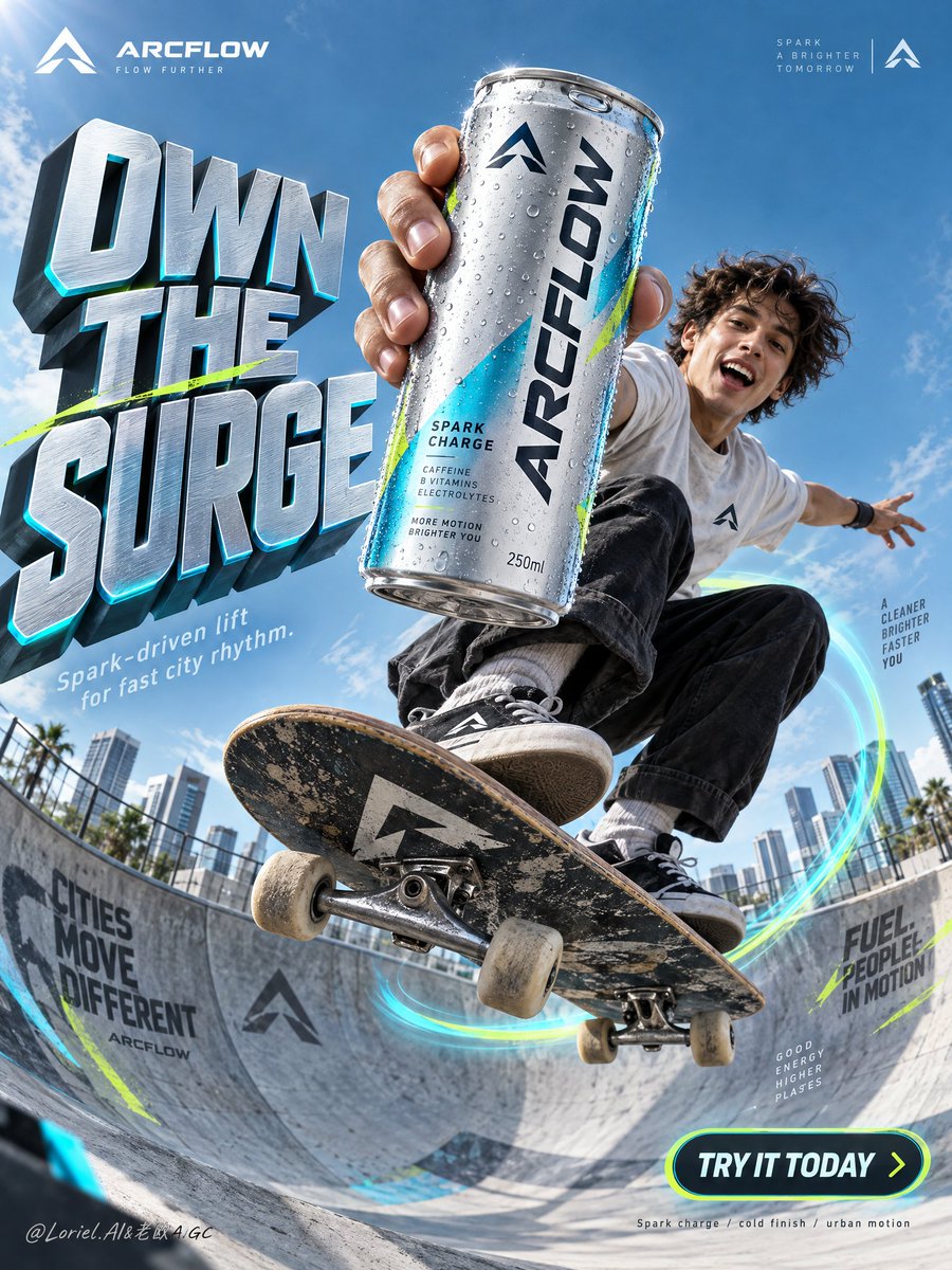
能量不来自滑板。能量来自罐头抢走了相同的视角。 ⚡ 产品距离镜头仅几英寸,在低角度动作镜头中显得巨大无比 这让罐头在不停止动作的情况下掌控画面。骑手在背景中保持活力,而强制透视让产品感觉也在向...
中文说明
能量不来自滑板。能量来自罐头抢走了相同的视角。 ⚡ 产品距离镜头仅几英寸,在低角度动作镜头中显得巨大无比 这让罐头在不停止动作的情况下掌控画面。骑手在背景中保持活力,而强制透视让产品感觉也在向你冲来。 🛹 滑板手在滑板碗上方腾空,超广角低机位相机,城市天际线在后方 低机位赋予跳跃的尺度,并为标题留下干净的天空。产品、骑手和排版都指向相同的上升方向——所以在你读任何字之前,海报就已经感觉很快了。 GPT- image 2.5 prompt👇 为一个虚构的海外功能性气泡饮料品牌"ARCFLOW"创建一个高级的垂直商业海报。将真实存在的实体饮料罐与高概念的都市动作广告语言相融合,让产品成为绝对的主角。围绕现代混凝土碗中定格的滑板跳跃构建场景,罐头被推向离镜头最近的位置并主导构图,同时运动员和环境在不竞争的情况下放大其...
原始 Prompt
The energy doesn’t come from the skateboard. It comes from the can stealing the same perspective.
⚡ product held inches from the lens, oversized against a low-angle action shot
This lets the can own the frame without stopping the action. The rider stays alive in the background, while forced perspective makes the product feel like it is moving toward you too.
🛹 skateboarder launched above a skate bowl, ultra-wide low camera, city horizon behind
A low camera gives the jump scale and leaves clean sky for the headline. The product, rider, and typography all point in the same upward direction—so the poster feels fast before you read a word.

GPT- image 2.5 prompt👇
Create a premium vertical commercial poster for a fictional overseas functional sparkling drink brand, "ARCFLOW". Fuse a real physical beverage can with high-concept urban action ad language, keeping the product as the absolute visual leader. Build the scene around a frozen skateboard jump in a modern concrete bowl, with the can thrust closest to the lens and dominating the composition while the athlete and environment amplify its energy without competing.

Use an ultra-low-angle wide commercial lens from inside the bowl, looking upward into a clean open sky. Preserve a poster architecture with a massive sculptural headline block on the left, the athlete and hero can aligned along the center-right axis, luminous motion arcs wrapping the board trajectory, small official brand marks in the upper corners, and a rounded CTA badge in the lower right. Keep strong negative space in the upper background so the title and product silhouette stay instantly readable. The can must appear larger than the athlete’s face and occupy the strongest focal zone.

The hero product is a hyper-real 250ml can of ARCFLOW Spark Charge in brushed silver aluminum with electric cyan accents, acid-lime micro details, and a deep graphite logo lockup. The surface shows realistic condensation droplets, crisp pull-tab geometry, subtle edge reflections, premium label sharpness, and tactile coated-metal finish. The exact front text must read "ARCFLOW". Add a small minimalist symbol logo in the top corners, reduced, elegant, and globally branded.

A young skater is captured at the peak of a jump above the bowl in a compact crouched pose, one arm aggressively extending the can toward camera, the other stretched outward for balance. The skateboard cuts diagonally through the lower middle with believable tilt, visible trucks and wheels, and physically correct foot pressure. Body mechanics must feel athletic and grounded, with coherent center of gravity, convincing grip, natural clothing tension, and correct hand anatomy. The athlete’s expression is exhilarated and alive, but the product remains dominant.

Set the action in a clean urban skate bowl with refined wall graphics, smooth concrete curvature, and soft-focus city blocks in the far background. Replace playful clutter with a disciplined tech-sport visual language: only a few angular branded shards and sleek directional graphic fragments near the lens. Depth should layer clearly: near-lens graphic accents, hero can and skater in the mid-foreground, bowl and motion ring in the midground, architecture and sky in the background.

Use bright directional daylight from the upper left with crisp highlights on the can rim, condensation, face, limbs, shoes, and board edges. Add subtle cyan reflected light from the bowl and motion trails to enrich shadows without flattening form. Build a 60/30/10 palette: 60% cool sky blue and silver-cyan atmosphere, 30% graphite and deep neutral structure, 10% acid lime accents. Increase light-shadow separation to sculpt volume in the can and skateboard, while avoiding dirty blacks, dead shadows, haze, or oversaturated chaos.

Render everything with elite commercial realism. The can must feel manufactured and touchable: brushed aluminum, coated print, varied droplets, soft specular roll-off, real seam lines, and precise tab indentation. The skateboard shows believable grip texture, layered wood edge, metal truck reflections, and slightly worn wheels. Concrete has fine grain and controlled mural overspray. Clothing feels light, breathable, and sunlit. The image should read as a synthesis of luxury product photography, sports advertising, and award-level graphic poster design.

Create all typography as newly invented art-directed copy integrated into the composition flow. Main left headline: "OWN THE SURGE". Secondary line below: "Spark-driven lift for fast city rhythm." Lower-right rounded badge: "TRY IT TODAY". Very small bottom technical note: "Spark charge / cold finish / urban motion". Typography should be sculptural, high-impact, cleanly spaced, and fused with the environment, using cool metallic silver faces, cyan edge glow, graphite side planes, and subtle lime accents. Keep all text away from the can label and the athlete’s face.

Vertical ad-poster composition, product-first hierarchy, physically believable frozen action, clean premium commercial execution, no copied slogans, no real person names, no unrelated props, no clutter, no sticker collage, no generic stock-ad feeling. Maintain sharp packaging readability, correct can proportions, coherent skateboard geometry, correct fingers and joints, a single clean hero product, unified style language, elegant layout rhythm, and disciplined negative space. Avoid duplicated limbs, malformed hands, warped board shape, floating objects without support logic, unreadable label text, chaotic type placement, distorted logo, muddy grading, dirty blacks, accidental extra cans, cheap font treatment, cartoon drift, painterly drift, overdecorated particles, and broken spatial perspective.