PROMPT RECORD图像记录
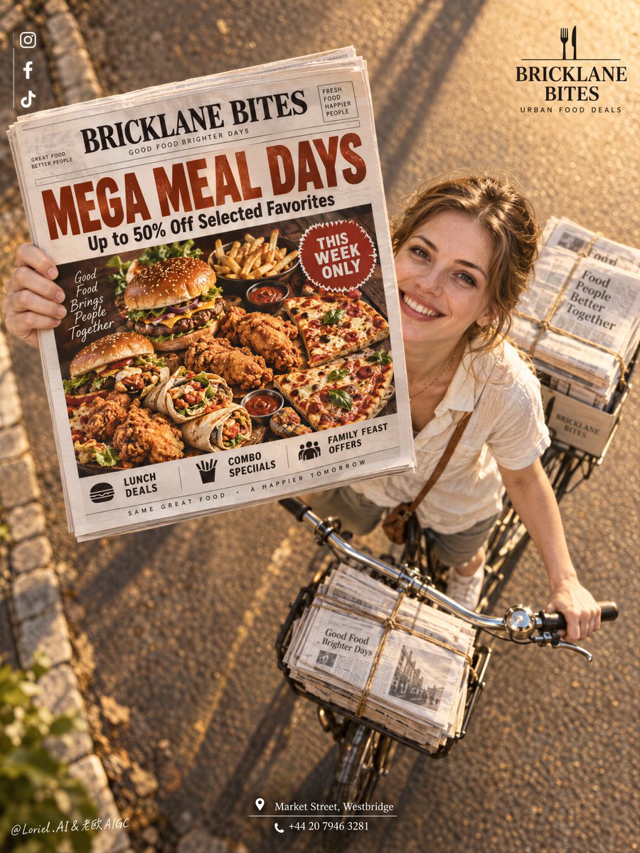
报纸之所以有效,是因为它不是道具——它是海报里面的海报。 🗞️ 报纸在画面左上中央被举起朝向镜头,通过强制透视放大,自行车与骑行者沿对角线向后退 促销内容先于街景被读到。你获得了一个可信的投递...
中文说明
报纸之所以有效,是因为它不是道具——它是海报里面的海报。 🗞️ 报纸在画面左上中央被举起朝向镜头,通过强制透视放大,自行车与骑行者沿对角线向后退 促销内容先于街景被读到。你获得了一个可信的投递瞬间,却没有牺牲美食优惠的可读性。 🍔 将报纸头版视为一整版完整的美食广告版面:一个超大的标题、一个主菜拼盘、一个紧凑的紧迫感徽章 这让优惠即使在远处也能一眼扫读。它不是贴在照片上的纹理,而是一个真正存在的促销实物。 GPT- image 2.5 prompt👇 一张为虚构餐饮品牌 BRICKLANE BITES 制作的高端餐厅促销海报,将街头质感、材质精度与平面清晰度融合在同一张图像中。保持完全相同的结构:戏剧性的高角度俯视视角下,一辆自行车行驶在一条温暖阳光的公路上,一位成年西方白人女孩抬头微笑,将一份报纸直接伸向镜头...
原始 Prompt
The newspaper works because it is not a prop—it is the poster inside the poster.
🗞️ newspaper lifted toward the lens in the upper-left center, enlarged by forced perspective, with the rider and bicycle receding diagonally behind it
The promotion reads before the street scene. You get a believable delivery moment without sacrificing the food offer’s legibility.
🍔 treat the newspaper front page as a complete food-ad layout: one oversized headline, one hero platter, one compact urgency badge
This keeps the offer instantly scannable even at a distance. The print feels like a real promotional object, not texture pasted over a photograph.

GPT- image 2.5 prompt👇
A premium restaurant promotion poster for fictional dining brand BRICKLANE BITES, merging street charm, material precision, and graphic clarity into one image. Preserve the exact structure: a dramatic high-angle overhead view of a bicycle moving along a warm sunlit road, an adult Western white girl looking up and smiling while extending a newspaper directly toward the camera, tied newspaper bundles on the bicycle, a small brand mark in the upper right, a clean vertical social-icon strip in the upper left, and a centered address block near the bottom. The newspaper front page remains the absolute visual leader.

The girl is photoreal, adult, naturally attractive, and believable, with realistic skin texture, subtle pores, natural lips, soft facial structure, correct head-neck-shoulder proportion, elegant hands with five normal fingers, believable wrists and elbows, natural posture, and no distortion. She wears a simple light cream short-sleeve shirt with relaxed summer styling, authentic rather than fashion-forward. She rides the bicycle and looks up with a bright persuasive smile, but stays secondary to the newspaper and its promotion.

The camera angle is critical: a top-down three-quarter overhead shot, with the bicycle diagonally crossing the lower right quadrant and the newspaper lifted toward the lens in the upper-left-central area, creating a bold forced-perspective moment. The road is warm and glowing with golden-hour sunlight, long soft shadows, subtle edge stones, and clean depth. The bicycle is classic and practical, with realistic metal handlebars, front tied bundles, rear stacks of paper, and believable weight balance. The whole image should feel like Orbit, Transit, and Port fused together: emotionally inviting, materially exact, and graphically elevated.

The newspaper front page is fully redesigned in English as a restaurant mega-discount promotion. Use a bold premium food-ad layout with a large appetizing hero spread of burgers, fried chicken, loaded fries, wraps, and pizza slices arranged in a dramatic overhead tray or platter, with rich warm highlights, crisp fried texture, glossy sauces, and irresistible realism. Use one giant original English headline such as “MEGA MEAL DAYS” or “BIG BITES, SMALLER PRICES”, plus one strong support line such as “Up to 50% Off Selected Favorites”. Add only a few smaller clean sub-lines like “Lunch Deals”, “Combo Specials”, “Family Feast Offers”, and one compact badge like “This Week Only”. Keep the newspaper typography sharp, readable, premium, and uncluttered.

Branding is minimal and elegant. Upper right: a clean BRICKLANE BITES logo with a short descriptor such as “Urban Food Deals”. Upper left: minimal social icons aligned vertically. Bottom center: one refined English address-and-contact block such as “Market Street, Westbridge” and one phone line. Outside the newspaper, keep text restrained so the printed promo page carries most of the communication.

Lighting is warm, cinematic, and commercially precise: golden-hour key light from the upper side, soft facial glow on the girl, crisp highlights on the newspaper edges, readable print contrast, gentle metallic reflections on the bicycle handlebar, and strong volume without muddy shadows or clutter. Color hierarchy: 55% warm amber road and sunlight, 25% cream and white newspaper tones, 20% rich food colors including red, golden brown, lettuce green, and sauce accents. Materials must feel hyperreal and tactile: printed paper grain, folded newspaper edges, twine-bound stacks, metal bicycle parts, realistic skin, cotton shirt fabric, crisp fried crust, glossy sauces, and clean commercial food photography embedded in the newspaper design. The final image should feel like a Cannes-level food-promo campaign fused with a street-distribution photograph: persuasive, warm, premium, clean, and highly readable.