PROMPT RECORD图像记录
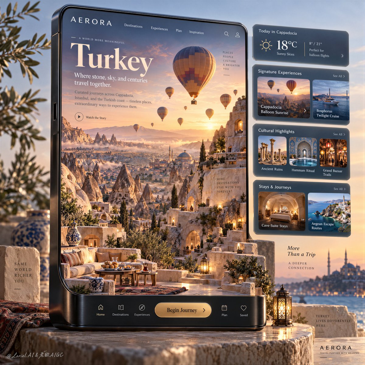
屏幕在风景越过其边缘的那一刻便化身为目的地。 🎈 一场沉浸式的卡帕多奇亚日出充盈整个屏幕,石阶平台与阶梯越过玻璃边界,延伸至设备底座之上。 画面从扁平的旅行内容转变为一座可触可感的微缩世界,观...
中文说明
屏幕在风景越过其边缘的那一刻便化身为目的地。 🎈 一场沉浸式的卡帕多奇亚日出充盈整个屏幕,石阶平台与阶梯越过玻璃边界,延伸至设备底座之上。 画面从扁平的旅行内容转变为一座可触可感的微缩世界,观者几乎可以步入其中。 🧭 一组排列严整的紧凑型规划卡片,规整地悬浮于景观焦点区域之外。 界面保持实用与清晰,不打断目的地的纵深感与情绪张力。 GPT- image 2.5 提示词👇 为一家虚构的奢华目的地平台 AERORA 设计的顶级旅行海报广告,采用超写实、产品主导的旗舰主视觉——一座宏伟的垂直智能旅行设备占据画面核心,屏幕之内物理化地承载着土耳其的精髓。设备为绝对的主角,居中且尺寸超大,配以精致的黑色金属边框、细腻的拉丝纹理、柔和的圆角、真实的玻璃反射,以及高端杂志般的界面美学。在屏幕内部,打造一座更具视觉冲击力与更精...
原始 Prompt
The screen becomes a destination the moment the landscape crosses its edge.
🎈 an immersive Cappadocia sunrise filling the display, with stone terraces and stairways continuing beyond the glass onto the device base
The scene shifts from flat travel content into a tangible miniature world the viewer could almost enter.
🧭 a disciplined stack of compact planning cards aligned outside the scenic focal area
The interface remains useful and legible without interrupting the destination’s depth or emotional pull.

GPT- image 2.5 prompt👇
A premium travel-poster advertisement for a fictional luxury destination platform called AERORA, designed as a hyper-real product-led hero visual where a monumental vertical smart travel device dominates the composition and physically contains the essence of Turkey inside its screen. The device is the absolute hero object, centered and oversized, with refined black metal edges, subtle brushed texture, softly rounded corners, realistic glass reflections, and a high-end editorial interface aesthetic. Inside the screen, create an immersive miniature world of Turkey with stronger visual impact and more polished commercial hierarchy: Cappadocia at sunrise as the main hero scene, with layered fairy chimneys, carved cave-suite terraces, pale sandstone ridges, elegant stone stairways, boutique courtyard platforms, hand-thrown ceramic vessels, patterned rugs used sparingly, low lantern glow, and multiple hot-air balloons floating through a radiant peach-and-gold dawn sky. The lower section of the scene must break beyond the flat screen boundary and continue physically onto the device base as a seamless three-dimensional travel diorama, making the destination feel tangible and collectible.

Framing and composition: front-facing three-quarter hero angle, vertical poster layout, strong rule of thirds, the device occupying most of the frame, the Cappadocia scene filling the left and central screen zones, and a disciplined stack of luxury interface cards floating to the right in perfect alignment. Preserve the original structure of a dominant immersive screen world plus modular planning information, but sharpen the visual hierarchy so the destination reads first, the product body reads second, and the service system reads third. Keep broad clean negative space around the outer background so the product feels premium, not crowded.

Scene design inside the device: make the Turkish destination read as more iconic, layered, and aspirational than before. The core landscape is Cappadocia, but enrich the travel proposition within the same skeleton: sculpted rock valleys, cave-hotel architecture, sunrise terraces with refined breakfast styling kept minimal, fine stone paving, warm niche lights, and drifting morning haze. Add several balloons at different distances, some larger and closer, some smaller and receding into the sky, all physically plausible and elegantly spaced. In the mid and lower depth, suggest deeper destination richness with subtle Turkish cues: a distant domed roof silhouette, a hint of patterned Iznik-blue ceramic detail, and one carefully integrated water-toned travel vignette inside the information system that nods to the Bosphorus without breaking the main Cappadocia focus. The world must feel luxurious, transportive, and unmistakably Turkey.

Interface and information design: use an editorial luxury-travel UI with clean serif headline styling and precise sans-serif navigation. At the top of the screen place the brand name "AERORA" with a refined navigation row. The main headline must read exactly: "Turkey". The subheadline must read exactly: "Where stone, sky, and centuries travel together." Add a short support line in elegant English describing curated journeys across Cappadocia, Istanbul, and the Turkish coast. On the floating right-side cards, include premium modules for weather, signature experiences, cultural highlights, and trip planning. The experience cards should reference destination-relevant content such as Cappadocia balloon sunrise, Bosphorus twilight cruise, ancient ruins, hammam ritual, Grand Bazaar trails, cave-suite stays, and Aegean escape routes. The bottom integrated device bar should carry refined minimal icons and a gold-accent call-to-action button reading exactly: "Begin Journey".

Lighting and color: stronger sunrise contrast than before, with a luminous warm key light from the inner horizon, soft ambient fill, cool blue-lilac shadows inside stone recesses, golden edge light on terrace architecture, subtle atmospheric bloom in the sky, and gentle studio reflections on the product body. Build clear dimensional contrast so the carved rock forms, boutique cave openings, and balloon shapes feel crisp and memorable. Palette balance: 60% warm ivory stone, sunrise peach, sand, and mineral beige; 30% deep Aegean blue, twilight cobalt, and cool glass reflections; 10% muted gold and amber highlights in interface accents and CTA elements. The frame should feel serene, luxurious, emotionally expansive, and highly aspirational without muddy contrast, plastic glare, or dead black zones.

Materials and finish: extremely realistic premium product rendering fused with collectible architectural miniature craftsmanship. Show porous stone, matte plaster, low-iron glass clarity, brushed black metal housing, soft polished edges, realistic ceramic glaze, subtle woven textile detail, elegant micro foliage, and crisp interface typography. Keep every texture sharp but curated, with no excess ornament. The final result should feel like a Cannes-level international tourism campaign: object design, interface design, and destination storytelling fused into one world-class collectible image.

Typography: all text in English only. Use a refined editorial serif for the main destination name and elegant modern sans-serif for interface labels, module titles, and navigation. Typography must feel art-directed, integrated, and spatially aware, never pasted flat over the scene. Maintain precise spacing, premium hierarchy, and strong readability while keeping text away from the key hero landmarks of the Cappadocia world.

Output and constraints: polished luxury travel advertisement, product-led composition, immersive Turkish destination diorama, clean modular UI system, physically plausible miniature architecture, premium photoreal finish, no real person names, no clutter, no cheap brochure styling. Avoid warped device geometry, broken interface alignment, unreadable text, malformed hot-air balloons, floating stairs, distorted buildings, duplicated windows, inconsistent scale, muddy colors, oversharpened CGI, plastic-looking stone, chaotic icons, weak contrast, or drift away from high-end destination branding.