PROMPT RECORD图像记录
最强的一招,是把建筑做成情感意象,把展板做成证明体系。 塔楼在第一眼就完成说服。两侧的栏目与底部的图纸只需要以克制的方式支撑这种印象,而不是用同样的音量把一切解释清楚。 🏙️ 向上升腾的白色地...
中文说明
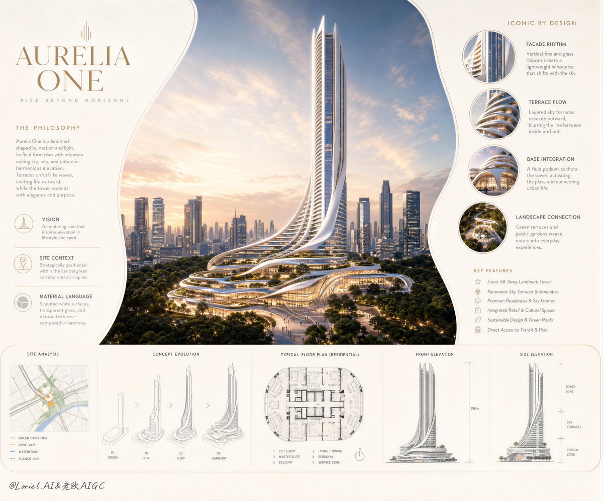
最强的一招,是把建筑做成情感意象,把展板做成证明体系。 塔楼在第一眼就完成说服。两侧的栏目与底部的图纸只需要以克制的方式支撑这种印象,而不是用同样的音量把一切解释清楚。 🏙️ 向上升腾的白色地标塔楼与流动的基座综合体,占据中央主视觉窗口 这赋予页面记忆。你首先看到的是一个向上的建筑姿态:塔楼、露台、天际线与公园 canopy 一同将视线拉入同一种垂直运动。 📐 弧形侧边信息栏 + 整洁的底部平面与立面带 这让呈现保持高级感。销售细节、注解、楼层平面与图解围绕主效果图有序排列,使展板感觉像一份奢品发布资产,而不是一张拥挤的建筑图纸。 GPT- image 2 prompt👇 为一家虚构的房地产品牌创作一张超高端的建筑销售展示海报,作为旗舰项目的发布展板,将超写实的建筑可视化与顶级的建筑呈现图形语言相融合。严格保留...
原始 Prompt
The strongest move is making the building the emotional image, and the board the proof system.
The tower does the selling at first glance. The side columns and bottom drawings only need to support that impression with discipline, not explain everything at equal volume.
🏙️ rising white landmark tower and fluid podium complex dominating the central hero window
This gives the page its memory. You see one upward architectural gesture first: tower, terraces, skyline, and park canopy all pulling the eye into the same vertical motion.
📐 curved side information columns plus a clean bottom band of plans and elevations
This keeps the presentation premium. The sales details, callouts, floor plans, and diagrams stay organized around the hero render, so the board feels like a luxury launch asset instead of a crowded architecture sheet.

GPT- image 2 prompt👇
Create an ultra-premium architectural sales presentation poster for a fictional real estate brand, designed as a flagship development launch board that fuses hyper-real building visualization with elite architectural presentation graphics. Preserve the original structural logic exactly, but intensify the first-glance impact so the entire page is immediately captured by the building’s upward thrust and fluid movement. The layout must center on one iconic future-forward tower and sculptural podium complex, surrounded by highly restrained curvilinear information panels on the left and right, with a clean lower strip of plans, elevations, and concept diagrams. The whole board must feel like a world-class luxury developer launch visual: internationally premium, highly controlled, and instantly memorable.

The building is the absolute protagonist and must dominate the page with a powerful sense of ascension and flow. Design a slender white landmark tower that rises decisively upward from a sweeping multi-level podium whose terraces unfurl outward in layered fluid ribbons, as if the architecture is being lifted by wind and carved by motion. The tower should feel vertically aspirational and sharply elegant; the podium should feel like a continuous dynamic landform that wraps, expands, and guides the eye upward into the tower. The entire silhouette must be iconic and clean, readable at first glance as one unified super symbol. Architecture must remain fully believable and buildable, with coherent structural rhythm, realistic glazing, terrace depth, circulation logic, facade articulation, and integrated lighting.

Place the project in a dense metropolitan skyline at golden-hour dusk, with abundant dark green tree canopy and a refined civic plaza at the base. The central hero rendering should occupy roughly half of the page and sit within a softly framed fluid-edged presentation window that echoes the architecture’s own curves. Tiny human figures should appear only as scale accents near the base, secondary and discreet. The city beyond should remain atmospheric and slightly subdued so the architecture reads instantly as the dominant force.

Push the Transit direction strongly: simplify the board, increase negative space, reduce explanatory noise, refine alignment, and make all typography and diagrams feel more international, luxurious, and editorial. Push the Port direction strongly: compress the full-page memory into three dominant symbols only, the rising tower-and-podium hero form, the two side fluid information columns, and the bottom architectural drawing band. Everything else must become subordinate. The page should feel cleaner, sharper, and more brand-defining than a typical architecture board.

Top left: a large original English project title in elegant serif typography, such as a fictional name like “AURELIA ONE” or “VELA ASCENT,” with a smaller English subtitle beneath. Left column: a concise block of project philosophy text, followed by a few icon-led bullets for vision, site context, and material language. Right column: a vertical series of circular or rounded detail callouts showing facade rhythm, terrace flow, base integration, and landscape connection, plus a minimal “Key Features” list. Bottom band: a disciplined sequence of miniature planning graphics including site analysis, concept evolution, floor plans, and front/side elevations, all precisely aligned and graphically elegant. Use only original invented English wording and labels, never copied text.

Graphic language must deeply merge real architecture and design representation: warm-white background with soft gray undertones, fluid panel edges, refined linework, precise architectural drawing conventions, thin annotation rules, subtle arrows, pale gray-blue diagram accents, and restrained iconography. Typography must be sparse, elegant, and subordinate to the building. The building render must remain visually dominant and act as the emotional anchor of the whole composition.

Lighting and atmosphere: golden-hour to early-evening sky with peach, pale blue, silver gray, and warm cream transitions. Use gentle side-front sunlight to sculpt the tower and podium curvature, with soft but clear shadow falloff to emphasize the upward thrust and layered terrace movement. Strengthen light-shadow separation enough that the building reads with immediate volume and lift. Add warm interior glow in selected podium openings and tower slots, soft aerial haze over the skyline, subtle glass reflections, and fine atmospheric particles in the light. If depth feels weak, reinforce volumetric separation between foreground architecture, park canopy, and distant city while keeping the image clean and premium.

Material rendering must be exceptionally refined: satin white shell surfaces, low-iron glass, pale brushed metal trims, warm lit interiors, crisp paving joints, realistic trees, layered stone and concrete landscape edges, and accurate miniature figures. Plans and diagrams should look like premium printed architectural graphics with elegant gray line weights, pale tonal fills, and precise drafting logic. The entire board should feel pristine, highly collectible, globally premium, and ready for a luxury real estate sales campaign.

Style: hyper-real architectural visualization fused with top-tier developer branding, elite competition-board clarity, and flagship editorial design. Keep the composition elegant, minimal, logical, and visually overwhelming on first glance. No clutter, no copied titles, no real company names, no real architect names, no Chinese headline, no watermark, no existing logos, no impossible structure, no muddy shadows, no black blotches, no chaotic diagrams, no low-detail skyline, no messy annotation blocks.