 1/2
1/2
PROMPT RECORD图像记录
最有力的部分并非水彩风格本身,而是将立面浓缩为一个令人难忘的建筑符号。 这类销售海报之所以奏效,是因为建筑可以在三秒内被读懂:白色雕塑般的壳体、蓝色凹陷的空腔、温暖的底层光晕。 🧊 连续柔边的...
中文说明
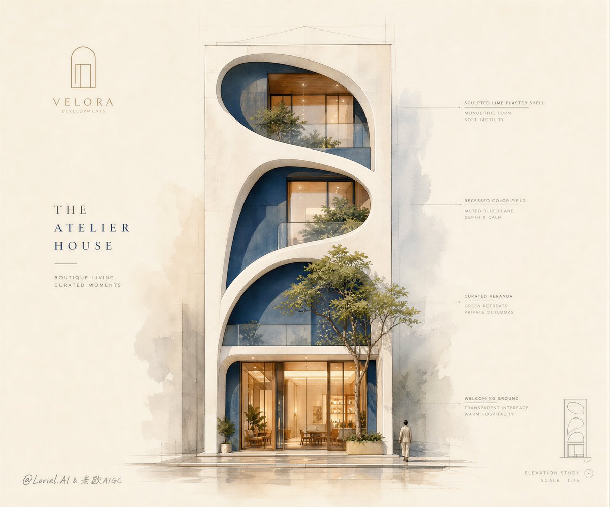
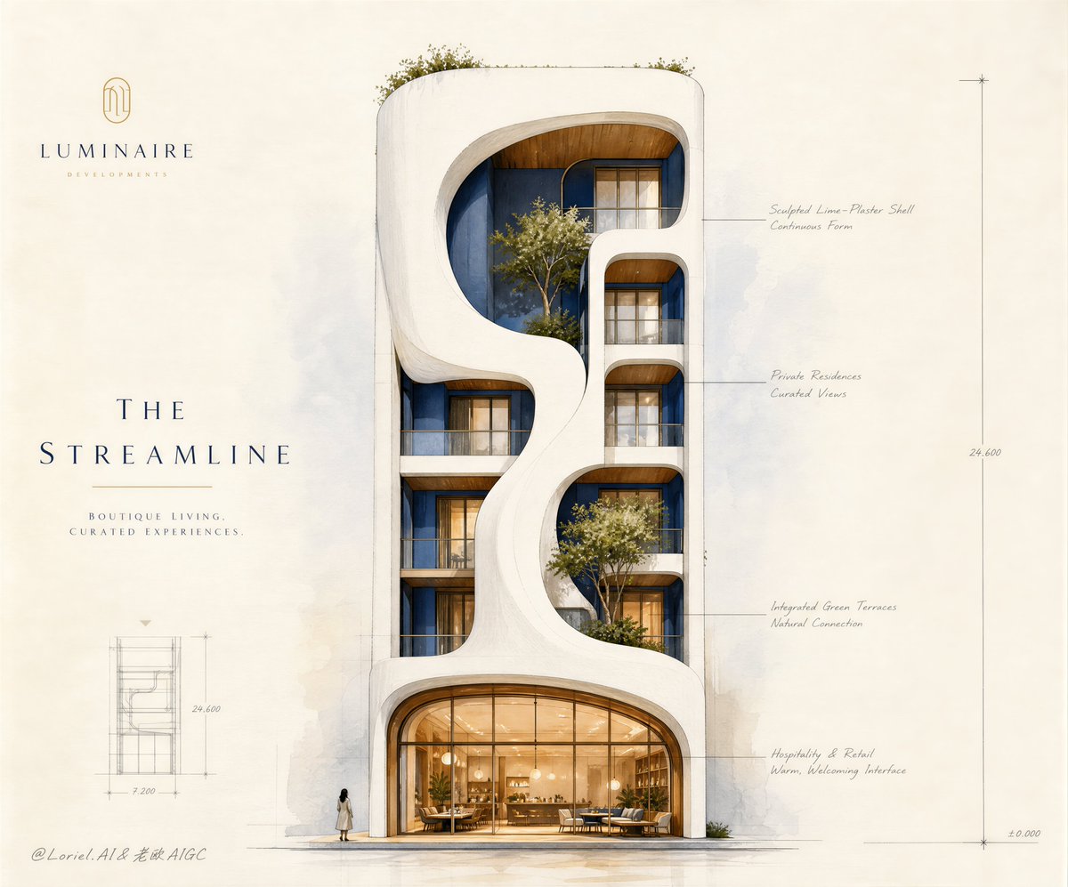
最有力的部分并非水彩风格本身,而是将立面浓缩为一个令人难忘的建筑符号。 这类销售海报之所以奏效,是因为建筑可以在三秒内被读懂:白色雕塑般的壳体、蓝色凹陷的空腔、温暖的底层光晕。 🧊 连续柔边的白色建筑外皮将整个立面包裹为一整块雕刻般的体量 这样可以避免立面沦为楼层的堆叠。观看者首先看到的是统一完整的轮廓,然后才在其内部发现开口与露台。 🌊 哑光钴蓝色的凹陷墙板,搭配精致玻璃后方的暖琥珀色室内空间 这解决了纵深感的问题。蓝色的空腔让白色壳体显得立体,而琥珀色的底层则让项目显得可居住且具有高端感。 GPT- image 2 prompt👇 为一家虚构的豪华房地产开发商创作一张超高端的建筑销售海报,在保留诗意水彩与建筑速写语言的同时,将其提升为更具国际感、旗舰感和象征凝练度的呈现。构图采用干净的竖向单体建筑立面研究,...
原始 Prompt
The strongest part is not the watercolor style. It is the facade being reduced into one memorable architectural symbol.
This kind of sales poster works when the building can be read in three seconds: white sculptural shell, blue recessed voids, warm ground-floor glow.
🧊 continuous soft-edged white architectural envelope wrapping the facade as one carved mass
This keeps the elevation from becoming a collection of floors. The viewer sees one unified silhouette first, then discovers the openings and terraces inside it.
🌊 muted cobalt-blue recessed wall planes with warm amber interiors behind refined glazing
This solves the depth problem. The blue voids make the white shell feel dimensional, while the amber ground floor makes the project feel inhabitable and premium.

GPT- image 2 prompt👇
Create an ultra-premium architectural sales poster for a fictional luxury real estate developer, preserving the poetic watercolor-and-architectural-sketch language while elevating it into a more international, flagship, and symbolically distilled presentation. The composition is a clean vertical single-building facade study on a warm off-white paper background, with one boutique mixed-use landmark centered in the frame and surrounded by only a minimal amount of elegant technical notation. The image must feel like a collectible developer launch sheet, a top-tier architectural watercolor presentation, and a luxury property campaign visual at the same time.

Design one slender urban boutique building with a highly recognizable sculptural facade: a continuous soft-edged white architectural envelope wraps the whole elevation like a single flowing carved mass, forming two or three large rounded voids that reveal deep blue recessed wall planes and warm interior spaces. The facade silhouette must be instantly memorable and extremely clean, reading as one unified super symbol. The ground floor should be transparent, inviting, and premium, with warm amber lighting, refined glazing, elegant timber frames, and subtle hospitality or sales-gallery atmosphere. Upper levels should feel quieter and more exclusive, with selective planted terraces or inset lounge spaces. Add one strategically placed tree growing through or in front of a facade opening to soften the composition and enhance lifestyle appeal, but keep it subordinate to the building form.

Push the Transit direction strongly: simplify the page, reduce annotation density, enlarge negative space, clean up all secondary details, and make the whole image feel more international, luxurious, editorial, and controlled. Push the Port direction strongly: compress the visual memory into three dominant symbols only, the central white sculptural facade mass, the deep blue recessed voids, and the warm glowing ground-floor interface. Everything else must become light atmosphere. The building must remain the unquestioned visual hero.

Preserve the watercolor effect clearly and elegantly: soft pigment washes, transparent tonal layering, restrained ink outlines, delicate pencil construction traces, subtle drafting notes, light paper grain, and controlled pigment bloom around edges and shadows. The rendering must not look like a loose illustration; it should feel like a highly disciplined architect’s hand-rendered presentation where watercolor atmosphere and real material logic coexist perfectly. Materials must still read believably: matte white stucco or lime plaster, muted cobalt-blue inset planes, warm natural wood, low-iron glass, pale stone paving, and fresh green foliage.

Lighting should be soft, luminous, and premium, like late afternoon daylight translated through watercolor media. Use gentle warm-cool contrast: creamy white shell, slightly cooler blue recesses, warm interior amber glow, and tender green foliage catching light. Shadows should remain transparent and watercolor-like, never heavy, but deep enough to give the architecture volume and presence. Keep the street calm and minimal, with only a tiny human scale figure if needed, very secondary.

Graphic layout must be extremely restrained: one minimal fictional developer mark, one elegant original English project title, and a few sparse English architectural notes placed around the facade with beautiful spacing. Do not copy any source wording. Typography should feel premium, architectural, small, and secondary to the building image. The whole page should look quieter, more expensive, and more iconic than a typical facade study.

Color system: warm off-white paper, ivory-white facade, muted cobalt-blue recessed spaces, amber interior light, soft timber brown, pale graphite linework, and restrained spring green foliage. Keep saturation disciplined, breathable, and globally premium. The final image must feel calm, sophisticated, highly brandable, and immediately recognizable.

No copied brand names, no copied cafe text, no heavy black shadows, no messy sketch clutter, no distorted architecture, no fantasy structure, no overcrowded street scene, no random cars, no excessive people, no dirty paper stains, no black blotches, no watermark, no existing logos.