PROMPT RECORD图像记录
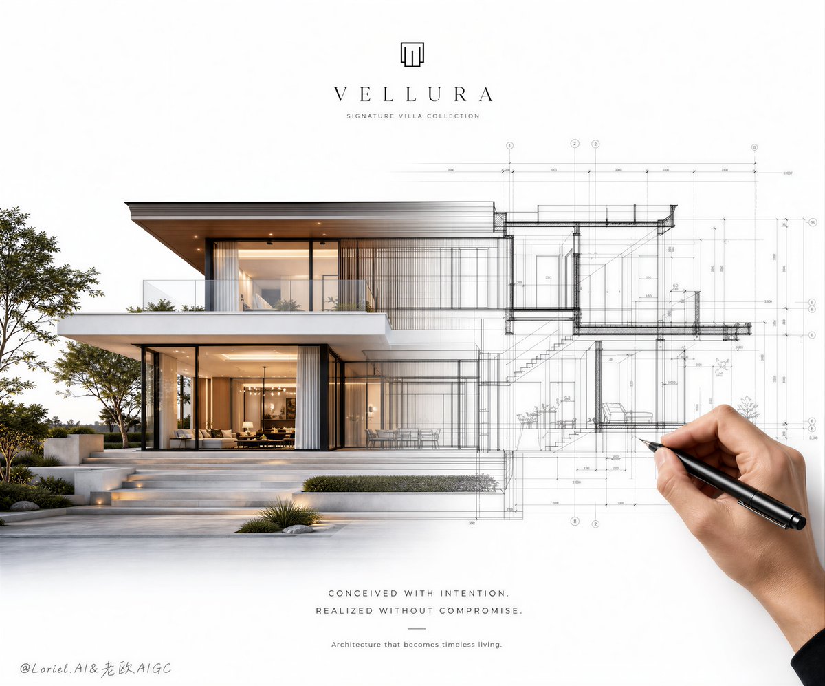
诀窍不在于把照片和蓝图分开。 而是让一方变成另一方。 这套别墅之所以成立,是因为实建一侧和线条一侧共享相同的屋檐边线、玻璃节奏、楼梯逻辑和结构网格。 ✨ 已建成的别墅逐渐消融为精确的建筑剖面线...
中文说明
诀窍不在于把照片和蓝图分开。 而是让一方变成另一方。 这套别墅之所以成立,是因为实建一侧和线条一侧共享相同的屋檐边线、玻璃节奏、楼梯逻辑和结构网格。 ✨ 已建成的别墅逐渐消融为精确的建筑剖面线条 这样可以让过渡感觉不像是拼贴。你会看到实体的房子逐渐变细成为图纸线条,而同一套建筑在两侧依然清晰可读。 🧊 只保留三个主导符号:真实别墅、技术图纸、建筑师之手 这就去除了常见的销售海报噪音。观众一眼就能理解整体概念:设计、建造和奢华生活属于同一个被控制的过程。 GPT-图像 2 提示词👇 为一家虚构的奢华房地产开发商制作一张超高端的建筑销售海报,设计成一张“概念到现实”的主视觉:已建成的别墅仿佛正主动地从自身的建筑图纸中生长出来。保持完全一致的核心构图:干净的白色背景、一栋现代住宅居中正面视角、左侧渲染为完全成真的超写...
原始 Prompt
The trick is not splitting photo and blueprint.
It is making one become the other.
The villa works because the built side and the linework side share the same roof edges, glass rhythm, stair logic, and structural grid.
✨ the finished villa gradually dissolves into precise architectural section linework
This keeps the transition from feeling like a collage. You see the solid house thin out into drawing lines, while the same architecture remains readable across both sides.
🧊 three dominant symbols only: real villa, technical drawing, architect hand
This removes the usual sales-poster noise. The viewer understands the whole idea instantly: design, construction, and luxury living are part of one controlled process.

GPT- image 2 prompt👇
Create an ultra-premium architectural sales poster for a fictional luxury real estate developer, designed as a concept-to-reality hero visual where a finished villa appears to actively grow out of its own architectural drawing. Preserve the exact core composition: a clean white background, a modern residence centered in frontal view, the left side rendered as a fully realized hyper-real built architecture photograph, the right side rendered as an elegant black technical drawing and section-elevation sketch, with a realistic hand holding a black pen in the lower-right foreground. The entire image must feel like a world-class developer launch campaign, an architect’s design statement, and a collectible premium sales poster at the same time.

The most important visual force is the transition energy from left to right: the real built architecture must appear to extend, dissolve, and transform into drafting lines, as if the building is actively emerging from the blueprint. Strengthen this transformation so the slab edges, glazing lines, roof plane, stair geometry, structural grid, and interior partitions all flow progressively from fully built form on the left into semi-material linework and then into pure architectural drawing on the right. The transition must feel elegant, deliberate, and fluid, never abrupt or collage-like. It should look as though the villa is being born from the architect’s pen and technical intelligence.

The building itself is the absolute visual protagonist: a refined two-story contemporary villa with crisp white volumes, floor-to-ceiling low-iron glass, thin black or dark bronze framing, warm timber soffits, calm horizontal slabs, and a stepped landscape plinth. The left built side must feel highly desirable and fully real, with luminous glazing, soft warm interiors, pale plaster or stone walls, elegant furniture silhouettes, subtle reflections, restrained landscaping, and a few trees placed to support the composition. The architecture must remain believable, buildable, luxurious, and globally premium.

On the right side, depict the same house as a precise architectural drawing using premium black technical linework: section cuts, elevation lines, dimensional strings, structural notation, staircase indications, interior outlines, construction guides, and delicate drafting hierarchy. The linework must be rigorous but beautiful, standardized yet poetic, with enough information to feel like a real architect’s presentation, but kept clean and elegant. The drawing density should gradually increase toward the far right while remaining airy and highly legible.

Place a realistic adult hand in the lower-right foreground holding a black pen, naturally aligned with the drawing process. The hand must be anatomically correct and secondary to the architecture, but it should reinforce the idea that design is actively generating reality. Fingers must have correct proportions, realistic joints, believable skin texture, natural grip tension, and no deformation. The pen tip should connect organically to the drafted line system.

Push the Transit direction strongly: simplify all graphic noise, reduce annotation clutter, enlarge negative space, refine alignment, and make the entire image feel more international, more luxurious, more editorial, and more controlled. Push the Port direction strongly: compress the full visual memory into three dominant symbols only, the left real villa, the right technical drawing, and the drawing hand in the lower-right. Everything else must stay subordinate. The image should feel cleaner, sharper, and more brand-defining than a typical architecture board.

Lighting should be soft, premium, and controlled. The left built architecture should be washed in bright elegant daylight with gentle shadow depth and warm interior glow visible through the glass. The right drawing side should remain lighter, flatter, and more graphic, but still physically coherent within the same visual world. Increase the tonal separation between real architecture and drawing just enough to heighten the transformation effect. Keep the whole page airy, luminous, and free of heavy black masses.

Graphic language must be extremely clean and high-end: large negative space, thin black drafting lines, refined micro-annotation marks, minimal fictional English project title and discreet developer logo, and elegant editorial spacing. Use only original invented English naming. Typography must be sparse, luxurious, and secondary to the architectural image. The poster should feel like a flagship launch ad for a signature villa product.

Material rendering must be exceptionally refined: matte white walls, clear low-iron glass, warm natural wood soffits, pale stone terraces, precise mullions, subtle landscape textures, soft ground shadow, crisp white presentation surface, and premium black ink drafting lines. The overall fusion of built architecture and design representation must feel seamless, intelligent, and immediately striking.

Color system: dominant white and soft warm gray, black technical lines, pale greenery, amber timber warmth, soft golden interior glow, and minimal neutral landscape tones. Keep saturation restrained, premium, and globally architectural.

No copied project names, no real company names, no Chinese headline, no cluttered annotations, no messy sketch lines, no abrupt split between photo and drawing, no distorted perspective, no fantasy structure, no extra buildings, no muddy shadows, no black blotches, no watermark, no existing brand logos, no malformed hands, no extra fingers, no broken finger anatomy.