PROMPT RECORD图像记录
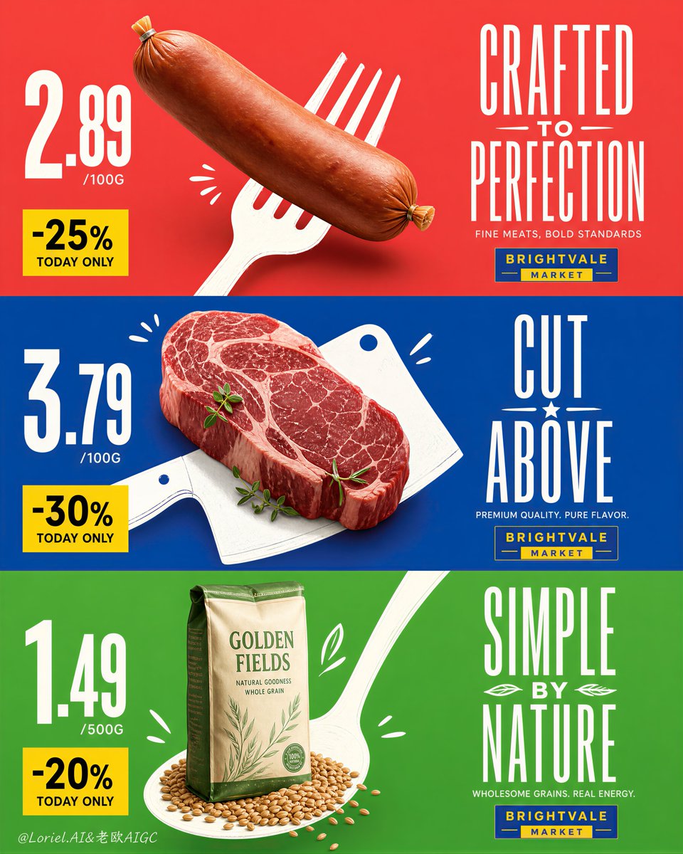
这个版式之所以有效,是因为每个产品都搭配了一个图形工具,而不仅仅是彩色背景。 叉子、砍刀和勺子在承担销售任务:它们抬起香肠、固定牛排、托起谷物袋,使每个版面都能作为一个醒目的零售符号被读取。...
中文说明
这个版式之所以有效,是因为每个产品都搭配了一个图形工具,而不仅仅是彩色背景。 叉子、砍刀和勺子在承担销售任务:它们抬起香肠、固定牛排、托起谷物袋,使每个版面都能作为一个醒目的零售符号被读取。 🍴 真实杂货产品与超大扁平白色餐具剪影物理融合 这能产生立竿见影的视觉冲击。产品看起来仍然像是被拍摄的商业照片,但餐具从远处赋予它一个简单、易记的轮廓。 🟨 最左侧巨大的价格数字,下方配一个干净的黄色折扣块 这让超市的功能一目了然。即使采用高端美术指导,购物者也能按相同的顺序在三个版面上扫描价格、折扣、产品和标题。 GPT- 图像 2 提示词👇 创作一幅超高端的纵向三联超市活动海报,由三个上下堆叠的横向促销版面组成,将大胆的图形简洁感与高端零售美术指导相结合。严格保留原始结构逻辑:每个版面在左半部分包含一个主导的真实摄影杂...
原始 Prompt
This layout works because every product gets a graphic tool, not just a colored background.
The fork, cleaver, and spoon are doing the selling: they lift the sausage, anchor the steak, and stage the grain bag, so each panel reads as one bold retail symbol.
🍴 real grocery product physically integrated with an oversized flat white utensil silhouette
This creates immediate impact. The product still looks photographed and commercial, but the utensil gives it a simple, memorable shape from far away.
🟨 giant price numerals on the far left with a clean yellow discount block beneath
This keeps the supermarket function clear. Even with premium art direction, the shopper can scan price, discount, product, and headline in the same order across all three panels.

GPT- image 2 prompt👇
Create an ultra-premium vertical triptych supermarket campaign poster composed of three stacked horizontal promotional panels, blending bold graphic simplicity with high-end retail art direction. Preserve the original structural logic exactly: each panel contains one dominant real photographed grocery product on the left half, one oversized white hand-drawn utensil silhouette integrated behind or beneath the product, giant price numerals on the far left, a yellow discount block in the lower-left zone, and a tall elegant headline system on the right. The three panels must feel like one coherent flagship supermarket campaign, but each should have its own strong color identity and product personality.

Push both Transit and Orbit qualities together: make the composition cleaner, more international, more premium, and more controlled, while also strengthening the visual thrust between each product and its white illustrated utensil shape. The product must feel physically lifted, pinned, or propelled by the utensil silhouette, creating immediate graphic impact without losing commercial clarity. Keep the layout highly disciplined, spacious, and print-ready, with refined alignment, stronger hierarchy, and more luxurious product retouching.

Top panel: use a vivid but sophisticated coral-red field. Place one large premium deli sausage diagonally from upper-left toward center-left, photographed with soft studio realism, subtle casing tension, gathered tied end, smooth matte skin, and gentle form shadow. Behind it, integrate a large flat white fork silhouette so the sausage and fork read as one inseparable visual unit. Add only a few small white doodle accents to enhance motion. On the far left, place very large off-white price numerals with a small yellow discount block beneath. On the right, place a tall condensed original headline in elegant white display typography, plus a small fictional rectangular supermarket mark beneath it in a blue-yellow palette.

Middle panel: use a saturated but refined cobalt-blue field. Place a thick premium raw beef steak slightly left of center, hyper-real and luxurious, with rich marbling, pale fat seams, moist surface texture, and a few fresh green herb leaves. Behind it, integrate a large white illustrated cleaver silhouette as a bold structural graphic. The steak should feel anchored into the cleaver shape, with a few minimal white accent marks around it. Keep the same pricing system on the left and a newly invented headline system on the right.

Bottom panel: use a fresh but premium bright green field. Place a standing bag of high-quality grain slightly left of center, paired with a small pile of loose grains at the base. Behind it, integrate a large white spoon silhouette rising diagonally through the layout so the product and spoon become a single advertising symbol. Add a few restrained white doodle marks. Maintain the same price and discount structure on the left and a new original headline block on the right.

Style: top-tier international supermarket key visual, premium retail poster design, realistic product photography fused with flat graphic illustration, bold negative space, crisp color blocking, refined typography, playful but controlled hand-drawn energy, Cannes-level retail advertising polish. The products must remain the absolute visual heroes, with the utensil silhouettes acting as graphic amplifiers rather than competing elements.

Typography rules: use only original invented promotional wording, no copied slogans, no real brand names, no Russian text, no existing logos. Headline letters should be tall, elegant, condensed, slightly poster-like, and highly legible. Price numerals should be oversized and commanding. Discount blocks should be clean yellow rectangles with strong dark text. The fictional supermarket marks should be small and secondary.

Lighting and materials: soft premium studio lighting, realistic product textures, restrained grounded shadows, subtle highlights, clean packaging print, believable grain details, crisp herb freshness, matte white utensil silhouettes, perfectly flat saturated backgrounds, precise print-ready edges. Keep everything extremely clean, modern, sharp, and commercially powerful.

Color system: coral-red, cobalt-blue, and vivid green as dominant fields; white utensils and headline typography; yellow discount blocks; blue-yellow mini logo accents; realistic natural food colors. High contrast, excellent readability, polished hierarchy, and premium emotional tone.

No copied text, no real supermarket logos, no watermark, no clutter, no random props, no extra products, no messy texture, no muddy shadows, no dark dirty patches, no distorted utensils, no warped packaging, no low-detail food texture, no chaotic doodles, no weak hierarchy.