PROMPT RECORD图像记录
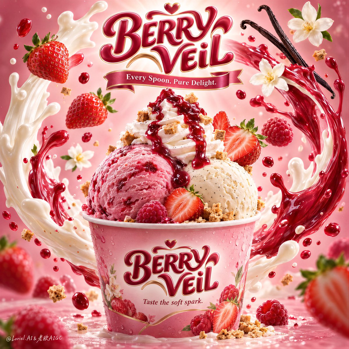
想让飞溅海报感觉有序?别在每个空隙都塞配料。 🪽 两条向上飞起的液体弧线——一条奶油色,一条莓果红——环绕杯子交织,但不穿过正面标签 它们在产品周围形成光环,既增加动感,又让杯子保持可读。 🍓...
中文说明
想让飞溅海报感觉有序?别在每个空隙都塞配料。 🪽 两条向上飞起的液体弧线——一条奶油色,一条莓果红——环绕杯子交织,但不穿过正面标签 它们在产品周围形成光环,既增加动感,又让杯子保持可读。 🍓 漂浮的草莓、树莓、花朵和香草荚,仅沿外圈轨道在不同景深分布 风味线索看起来丰富,但中心区域依然足够清晰,让冰淇淋球和品牌标识成为主角。 GPT- image 2.5 prompt👇 一张超写实高级甜品海报,为一个名为 BERRY VEIL 的虚构国际冰淇淋品牌打造,遵循 Orbit-plus-Transit 方向精炼,原有主角结构保持完整,但风味世界变得更强、更清晰、更具系列化潜力。一个品牌化的粉色甜品杯作为绝对主角置于下方中央,盛有两勺大份冰淇淋:一勺丰盈的草莓覆盆子粉色冰淇淋,一勺浓郁香草豆荚冰淇淋,顶部冠以高耸的奶...
原始 Prompt
Want a splash poster to feel controlled? Don’t add ingredients to every gap.
🪽 two upward liquid arcs—one cream, one berry-red—intertwining around the cup without crossing its front label
They create a halo around the product, so the motion adds energy while the cup stays readable.
🍓 floating strawberries, raspberries, blossoms, and vanilla pods placed at varied depths only along the outer orbit
The flavor cues feel abundant, but the center stays clear enough for the scoops and branding to lead.

GPT- image 2.5 prompt👇
A hyper-real premium dessert poster for a fictional international ice cream brand called BERRY VEIL, refined in an Orbit-plus-Transit direction where the original hero structure stays intact but the flavor world becomes stronger, clearer, and more series-ready. A branded pink dessert cup sits in the lower center as the absolute hero, holding two large scoops of ice cream: one lush strawberry-raspberry pink scoop and one creamy vanilla-bean scoop, crowned by a tall whipped cream swirl and a glossy berry coulis cascade. The composition must feel brighter, richer, and more instantly appetizing than a standard strawberry dessert ad.

Framing and composition: vertical poster layout, centered hero cup, sculptural brand crest floating at the top center, and two sweeping liquid arcs rising from both sides of the cup to form an elegant halo-like enclosure around the product. Preserve the current skeleton exactly: top logo, central cup, two large wrapping splash curves, and floating fruit and flavor cues in balanced orbit. Sharpen the hierarchy so the cup reads first, the scoops second, the liquid choreography third, and the floating ingredients fourth. Keep the product fully readable and visually dominant.

Product design: the paper cup is premium, softly glossy, and tinted with a delicate berry-pink gradient, with subtle condensation and crisp printed branding. Front label text reads exactly: "BERRY VEIL". Beneath it, write exactly: "Taste the soft spark." The strawberry-raspberry scoop should feel creamier, juicier, and deeper in color than a basic strawberry scoop, with natural frozen fruit texture and a faint marbled richness. The vanilla-bean scoop should feel smooth, dense, and luxurious, with tiny vanilla specks visible. The whipped cream swirl must have clean, soft ridges and hold a dramatic ruby-red berry glaze. Scatter a few tiny crisp biscuit or caramelized crumble cubes around the cream and base for texture contrast.

Flavor staging and spatial choreography: keep the same central splash system, but push the fruit language slightly toward a strawberry-raspberry hybrid direction for stronger flavor identity and series flexibility. Use several ripe strawberries with realistic seeds, cut faces, and fresh green tops, alongside one or two small raspberry-like berry notes or deeper red fruit accents. Two elegant vanilla pods curve in from the upper right, and two or three soft white blossom flowers remain as airy fragrance cues. The liquid arcs should stay physically plausible: one creamy white dairy splash and one vivid berry-red fruit splash intertwining around the cup in a smooth, upward motion, with smaller droplets suspended at varying depths. The splashes must frame the cup, never bury it.

Lighting and color: luminous premium commercial lighting from upper center-front, soft wraparound fill, subtle rim accents on the scoop edges and cup rim, and a stronger radiant halo behind the top brand mark. Background grading transitions from bright blush cream in the center to richer strawberry-pink and rose-mauve toward the edges. Palette balance: 60% blush pink, milky white, and soft cream; 30% berry red and glossy coulis crimson; 10% vanilla black-brown, leaf green, and tiny golden crumble accents. Build more contrast and flavor saturation than before while keeping the overall frame elegant and premium.

Materials and finish: hyper-real food photography fused with polished fantasy splash rendering. Show creamy frozen micro-texture, juicy fruit skin, realistic strawberry seed detail, glossy coulis viscosity, soft whipped cream ridges, paper cup texture, liquid translucency, and fine reflective droplets. Keep everything tactile, luminous, and premium, with no sticky clutter or messy over-rendering. The final result should feel like a Cannes-level FMCG dessert key visual: radiant, delicious, and easy to extend into a product line.

Typography: all visible text in English only, integrated as premium confectionery branding. The floating top logo reads exactly: "BERRY VEIL" in a bold rounded custom script with a polished confectionery 3D finish. Beneath it, add a ribbon-style line reading exactly: "Every Spoon, Pure Delight." On the cup front, repeat exactly: "BERRY VEIL" and beneath it exactly: "Taste the soft spark." Typography must feel dimensional, sweet, and elegant, harmonizing with the pink-and-berry flavor system while staying clear of the scoop silhouette.

Output and constraints: premium global ice cream advertising poster, product-first hierarchy, no people, no copied source text, no Chinese text, no extra unrelated props, no hand artifacts, no cluttered table styling. Keep scoop forms natural and rounded, cup geometry correct, splash arcs believable, strawberries anatomically clean, vanilla pods elegant, and text crisp and readable. Avoid scoop collapse, muddy pinks, dirty whites, plastic-looking cream, chaotic splash overload, duplicated fruit clusters, gibberish text, warped cup perspective, dead black patches, and drift away from high-end photoreal dessert advertising.