PROMPT RECORD图像记录
想让早餐感觉像安慰,而不只是食物?在加更多配料之前,先改变比例尺度。 🧸 在下方中央放置一座巨大的煎饼堆,顶部煎饼上躺着一位娇小的成年人物 食物变成柔软的风景。人物为画面赋予情感用途,却不喧宾...
中文说明
想让早餐感觉像安慰,而不只是食物?在加更多配料之前,先改变比例尺度。 🧸 在下方中央放置一座巨大的煎饼堆,顶部煎饼上躺着一位娇小的成年人物 食物变成柔软的风景。人物为画面赋予情感用途,却不喧宾夺主。 🍯 让碗在视觉上比人物更大、更重;上方留出空间给标题和品牌区 这让超现实细节保持次要。你仍然先读到煎饼——以及它们的温度。 GPT- image 2.5 prompt👇 一个超写实高端早餐海报广告,为一个名为 SUNNEST 的虚构慰藉食物品牌设计,采用 Orbit + Transit + Port 方向:保留原版超现实早餐逻辑,产品冲击力更强,风味系统易于延展为系列作品,整体海报语言更干净、更精挑细选。绝对主角是一座巨大的煎饼堆,安放在一只抛光的品牌早餐碗中,位于下方中央。煎饼堆厚实、松软、不可抗拒地温暖,由四五...
原始 Prompt
Want breakfast to feel like comfort, not just food? Change the scale before you add more toppings.
🧸 a monumental pancake stack in the lower center, with one petite adult figure resting along the top pancake
The food becomes a soft landscape. The figure gives it an emotional use without taking over the composition.
🍯 keep the bowl larger and visually heavier than the figure; reserve the upper field for the headline and brand block
This keeps the surreal detail secondary. You still read the pancakes—and their warmth—first.

GPT- image 2.5 prompt👇
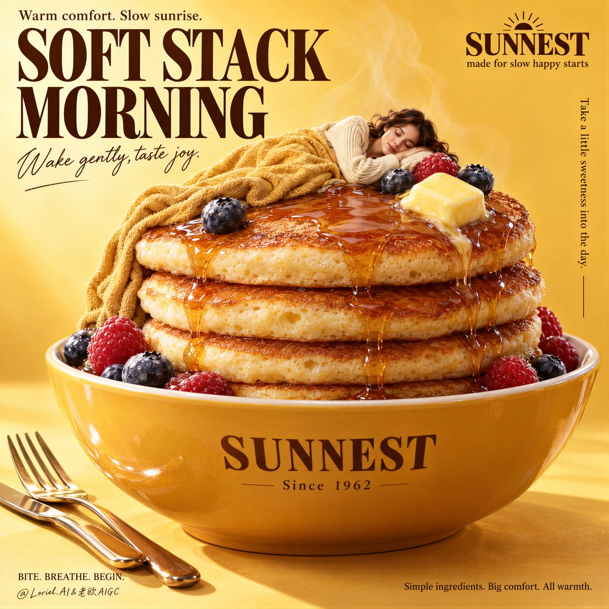
A hyper-real premium breakfast poster advertisement for a fictional comfort-food brand called SUNNEST, designed in an Orbit-plus-Transit-plus-Port direction where the original surreal breakfast logic remains intact, the product impact is stronger, the flavor system is easy to extend into a campaign family, and the overall poster language is cleaner and more curated. The absolute hero is a monumental stack of pancakes resting inside a glossy branded breakfast bowl at the lower center. The stack is thick, soft, and irresistibly warm, made of four to five fluffy pancakes with lightly browned rims, airy crumb, delicate surface pores, and rich amber maple syrup flowing in broad glossy ribbons across the top and down the sides. A melting butter cube sits near the upper right of the stack, with a restrained scatter of ripe blueberries and raspberries around the pancakes and bowl rim.

On the top pancake lies one petite adult woman, peacefully asleep as a comfort metaphor, clearly secondary to the food. She is fully adult, naturally proportioned, with correct anatomy, elegant hands, soft facial features, and realistic skin texture. She wears a cozy cream knit sweater and is partially wrapped in a warm honey-gold blanket that harmonizes with the pancake tones. Her body is curled gently in a restful pose, reading as serene, safe, and deeply comfortable rather than theatrical. She must look like an adult woman at miniature scale, not childlike, not doll-like, not sexualized.

Framing and composition: vertical poster layout, bright honey-yellow studio background, oversized tall serif headline dominating the upper left, compact brand block in the upper right, central bowl-and-pancake hero filling most of the lower two-thirds. Preserve the original visual skeleton of giant breakfast food plus miniature sleeping figure, but clean the page so the hierarchy is sharper and more iconic: headline first, pancake stack second, sleeping figure third, small support details last. Keep broad negative space around the typography and brand area, and let the bowl feel large, weighty, and visually more important than the human figure.

Flavor system and extension logic: make this hero version feel like the core “maple berry comfort” master key visual, but build it with series flexibility so the same composition can later evolve into blueberry cream, banana caramel, strawberry butter, or cinnamon honey variations without changing the core structure. The current version should therefore balance syrup warmth, berry freshness, and cream-knit softness in a way that feels both specific and campaign-ready.

Environment and supporting details: keep the scene clean and studio-controlled. Add only a polished fork and knife arranged neatly near the lower left foreground as breakfast cues, with a few soft steam wisps rising from the pancakes. No table clutter, no extra dishes, no kitchen background, no random props. The whole image should feel like a global premium ad, not a domestic snapshot.

Lighting and color: soft warm commercial key light from upper front-left, gentle fill from the right, subtle highlight roll-off across the syrup, butter, berries, bowl glaze, and knit sweater. Build stronger light-dark separation than a typical breakfast ad so the pancake stack gains sculptural volume and the syrup glows with richer depth. Palette balance: 60% honey yellow, butter gold, and toasted pancake beige; 30% cream knit, maple amber, and ceramic yellow-orange; 10% berry blue-red accents and small cocoa-brown shadows. Keep the yellows warm and clean, never muddy, never dirty.

Materials and finish: hyper-real breakfast food photography fused with premium poster design. Show syrup gloss and viscosity, melting butter softness, pancake crumb detail, ceramic bowl reflections, berry skin freshness, knit sweater fibers, subtle steam translucency, and crisp print-quality typography. The final image should feel like a Cannes-level breakfast campaign: warm, comforting, surreal in a controlled way, globally polished, and instantly memorable.

Typography: all visible text in English only, elegantly integrated into the poster design. Main headline at the upper left reads exactly: "SOFT STACK MORNING". Small line above it reads exactly: "Warm comfort. Slow sunrise." Script-style support line beneath the title reads exactly: "Wake gently, taste joy." Upper-right brand block reads exactly: "SUNNEST" and beneath it exactly: "made for slow happy starts". A small vertical support line on the right reads exactly: "Take a little sweetness into the day." On the bowl front print exactly: "SUNNEST" and beneath it exactly: "Since 1962". Lower-left footer line reads exactly: "BITE. BREATHE. BEGIN." Lower-right footer text reads exactly: "Simple ingredients. Big comfort. All warmth." Typography must feel elegant, editorial, and warm, never blocking the pancake silhouette or the sleeping figure.

Output and constraints: premium breakfast poster, product-first hierarchy, no copied source text, no real brand names, no extra people, no clutter, no cheap surrealism. Keep the woman clearly adult, anatomically correct, with normal hands and fingers, realistic skin texture, and believable scale relative to the pancakes. Keep pancake structure believable, syrup physics accurate, butter natural, bowl perspective correct, berries realistic, and typography crisp. Avoid childlike appearance, broken limbs, extra fingers, fused hands, warped bowl geometry, plastic food texture, greasy surfaces, muddy yellow cast, unreadable text, excessive steam, dead black patches, or any drift away from high-end commercial food realism.