PROMPT RECORD图像记录
看似随意缠绕的意大利面,实际上是一根连续的线条,引导着整张海报。 ✨ 从叉子到底部的一根连续的千层面条,具有可信的扭转感和重量感 这为构图提供了一条主线。零散的面条不见了,你看到的是一条清晰的...
中文说明
看似随意缠绕的意大利面,实际上是一根连续的线条,引导着整张海报。 ✨ 从叉子到底部的一根连续的千层面条,具有可信的扭转感和重量感 这为构图提供了一条主线。零散的面条不见了,你看到的是一条清晰的运动轨迹,将视线从叉子引向标题,再引向柠檬的收尾。 🧊 面条缠绕在字母笔画上,带有前后遮挡和接触阴影 关键不是“面条贴在字体上”。而是精确的藏与露:一条丝带在字母后面消失,又在下一个字母前面捕捉光线,让字体感觉被实体占据。 GPT- image 2.5 prompt👇 为原创高端意面品牌 VELLORA 创作一张戛纳级别的竖版海报广告,融合盘中餐点的温暖、奢华美食摄影的触觉权威,以及策展人主导的图形海报的克制感。核心创意是一根连续的柠檬黄油千层面带,物理地缠绕在字体上,让面条和字母在结构上不可分割。面条仍是真正的视觉主角,...
原始 Prompt
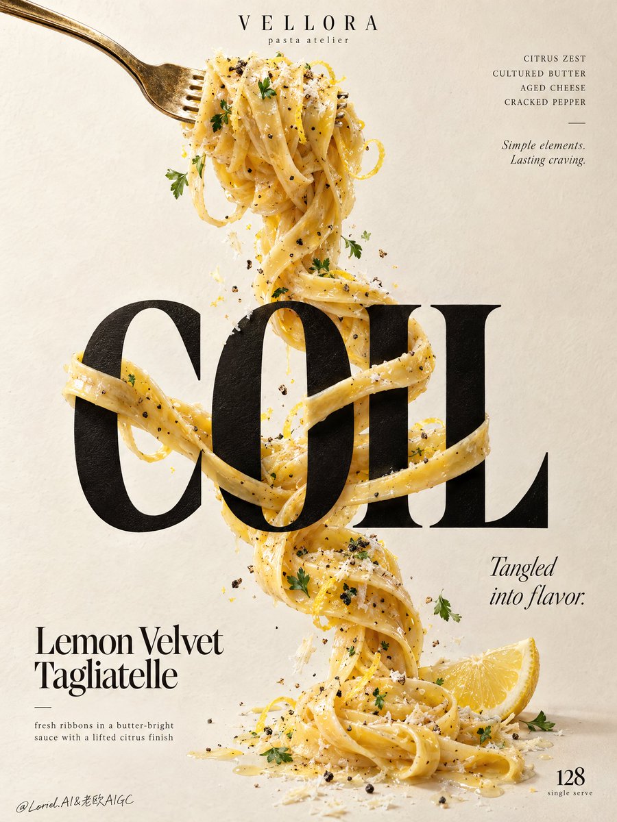
What looks casually tangled is actually one continuous line directing the entire poster.
✨ one continuous tagliatelle strand descending from fork to base, with believable torsion and weight
This gives the composition a spine. Instead of scattered pasta, you get one readable movement that pulls the eye from the fork, through the headline, to the lemon finish.
🧊 pasta wrapping around letter stems with front-back occlusion and contact shadows
The key is not “pasta on typography.” It’s precise hide-and-reveal: a ribbon disappears behind a letter, catches light in front of the next one, and makes the type feel physically occupied.

GPT- image 2.5 prompt👇
Create a Cannes-grade vertical poster ad for an original premium pasta brand, VELLORA, merging the warmth of a plated dish, the tactile authority of luxury food photography, and the restraint of a curator-led graphic poster. The core idea is a single continuous ribbon of lemon-butter tagliatelle physically twisting around typography, making pasta and letters structurally inseparable. The pasta remains the true visual hero, while the letter interaction delivers the conceptual impact.

Use a tall minimalist composition on a warm ivory paper-plaster background with subtle tactile grain and generous negative space. From the upper-left, a polished vintage-gold fork enters diagonally, holding a compact nest of glossy tagliatelle near the top center. From this lifted forkful, one continuous strand descends vertically through the poster, tightening, looping, crossing, and relaxing with believable weight and gravity. At the center, place one monumental ultra-bold black serif display word: "COIL". The pasta wraps around the letter stems, passes behind counters, crosses in front of key edges, and re-emerges with precise occlusion, natural contact shadows, and elegant tension. The strand continues below and resolves near the lower-right with a fresh lemon wedge accent, keeping the movement vertically unified.

Render the pasta with exceptional realism: silky ribbons with slight width variation, rich butter emulsion, subtle lemon zest, cracked black pepper, delicate grated aged cheese, and restrained parsley flecks. The noodles should feel freshly tossed, elastic, heavy, and luxurious, with visible drag, torsion, overlap, and sauce cling. Add only a few curated crumbs, pepper granules, zest curls, and tiny herb leaves close to the strand so the image feels alive without clutter. The fork must feel premium and tactile, with brushed metallic highlights, slight edge wear, and refined reflection control.

Typography must be entirely original and treated as graphic architecture. At the top center, place a small premium brand lockup reading "VELLORA" with the micro-line "pasta atelier". Top-right: "CITRUS ZEST / CULTURED BUTTER / AGED CHEESE / CRACKED PEPPER", with a small italic line beneath: "Simple elements. Lasting craving." The main central word is "COIL". In the lower-left, place "Lemon Velvet Tagliatelle", with the line "fresh ribbons in a butter-bright sauce with a lifted citrus finish". Mid-right: "Tangled into flavor." Bottom-right: a restrained numeric marker "128" with the tiny line "single serve". All lettering must feel custom-designed, beautifully kerned, spatially embedded, and tonally harmonized with the food, never crude, generic, or blocking the key pasta interaction.

Use soft directional daylight from the upper-left with refined studio discipline. The forkful catches creamy highlights, the black display word feels dense and premium without dead flat black, and the pasta carries luminous buttery reflections with layered shadows where it crosses the letters. Build a strong tonal step between the pale background, the dark central word, and the golden pasta so the concept reads instantly from a distance. Color hierarchy: 60% warm ivory and cream paper tones, 25% golden pasta and butter hues, 10% deep black typography, 5% lemon yellow and herb green accents. The overall mood is bright, tactile, elegant, modern, and quietly indulgent.

Materials must feel physically coherent and expensive: matte-ink or painted letter surface with subtle paper response, glossy butter-coated pasta with fine semolina texture, irregular grated cheese, crisp pepper granules, moist lemon flesh, and softly reflective metal. Hyper-real food photography merged with high-end editorial poster design, luxury print-ad finish, crisp readable text, believable gravity, clean background, strong product-first hierarchy, no clutter.

Avoid floating noodles without support logic, broken or melted strands, warped fork structure, unreadable text, generic menu-board styling, garnish overload, muddy shadows, dirty paper stains, dead black slabs, plastic-looking sauce, stiff pasta geometry, cheap glow, random particles, compositing artifacts, distorted letters, style drift, accidental resemblance to any real brand, or extra props that weaken the central noodle-and-typography interaction.