 1/2
1/2
PROMPT RECORD图像记录
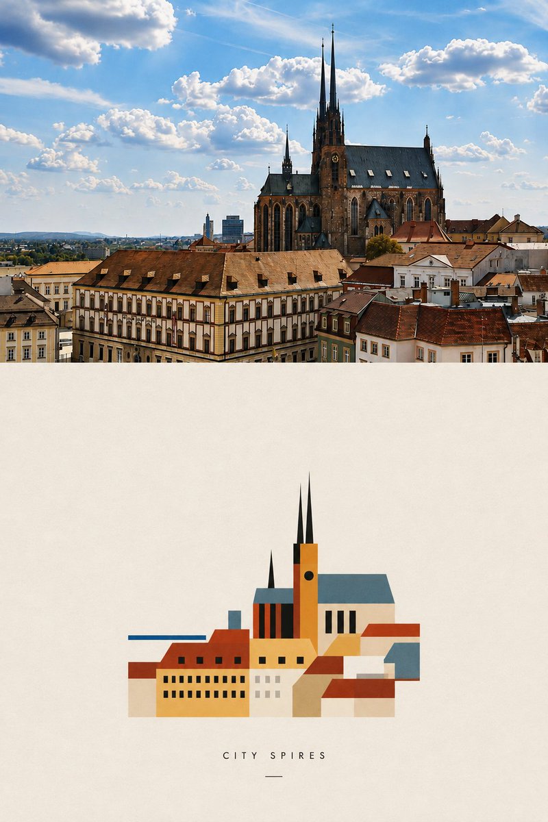
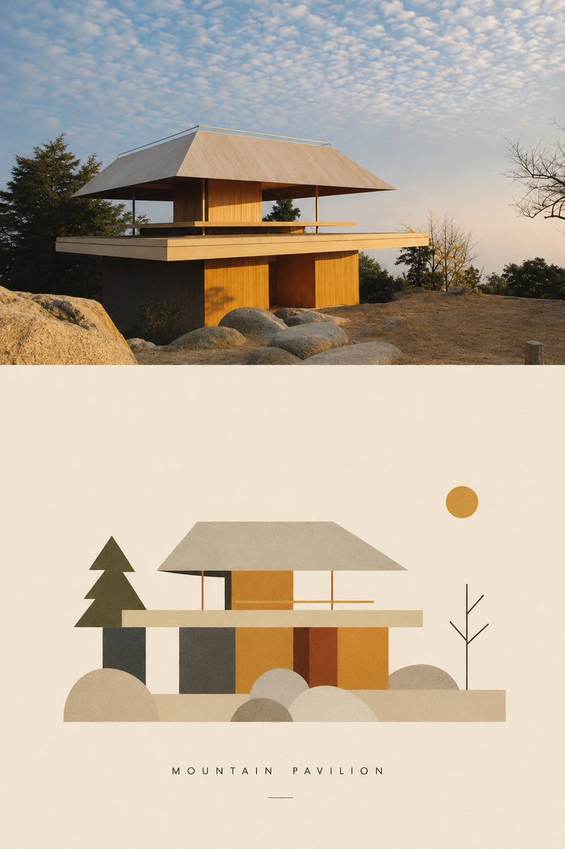
谁不爱包豪斯?我做了一个技能,可以把你的建筑照片转换成像包豪斯风格一样的极简插画。 #gptimage2 #prompt --------- 提示词在此 ✨✨ --------- 将上传的照片...
中文说明
谁不爱包豪斯?我做了一个技能,可以把你的建筑照片转换成像包豪斯风格一样的极简插画。 #gptimage2 #prompt --------- 提示词在此 ✨✨ --------- 将上传的照片转换为一幅极简的包豪斯风格编辑海报。 创建一个竖向海报,由两部分组成:顶部为原始照片,下方为高度简化的包豪斯风格诠释。 顶部 — 原始照片 将上传的照片放置在海报的最顶部。 重要: - 照片必须接触画布的 TOP、LEFT 和 RIGHT 边缘。 - 顶部照片四周绝对不能有任何内边距、外边距、边框、相框、米色空间或白色空间。 - 不要将照片放在卡片或容器中。 - 保留原始照片的构图和可识别内容。 - 仅在必要时进行裁剪以适应海报构图。 - 不要重绘、风格化或大幅改动照片。 - 仅允许进行细微的编辑级色彩校正。 照片应感觉满...
原始 Prompt
Who doesn’t love Bauhaus?  I made a skill that transforms your architectural photos into minimalist Bauhaus style illustration. #gptimage2 #prompt
---------
Prompt is here ✨✨
---------
Transform the uploaded photograph into a minimal Bauhaus-inspired editorial poster.

Create one vertical poster composed of two sections: the original photograph on top and a highly simplified Bauhaus interpretation below.

TOP — ORIGINAL PHOTOGRAPH

Place the uploaded photograph at the very top of the poster.

IMPORTANT:
- The photograph must touch the TOP, LEFT, and RIGHT edges of the canvas.
- There must be absolutely NO padding, margin, border, frame, beige space, or white space around the top photograph.
- Do not place the photograph inside a card or container.
- Preserve the original photograph’s composition and recognizable content.
- Crop only when necessary to fit the poster composition.
- Do not redraw, stylize, or significantly alter the photograph.
- Only subtle editorial color correction is allowed.

The photograph should feel full-bleed and visually dominant.

BOTTOM — BAUHAUS INTERPRETATION

Below the photograph, create a warm ivory / off-white paper field.

Reinterpret the photograph as an extremely minimal Bauhaus-inspired graphic composition.

Do NOT simply trace or vectorize the photograph.

Instead, analyze the image and identify:
- the primary subject
- the strongest silhouette
- the dominant architectural or natural forms
- important spatial relationships
- distinctive lines, angles, curves, repetitions, or proportions

Then reduce these elements into a small vocabulary of geometric forms.

Use:
- circles
- semicircles
- rectangles
- triangles
- straight lines
- simple curves
- overlapping planes
- strong silhouettes
- basic geometric blocks

Complex objects should become simple visual symbols.

Architecture can become rectangles, planes, windows, grids, or structural lines.

Trees and plants can become circles, fans, triangles, vertical lines, or abstract organic geometry.

People or animals, when present, should be reduced to minimal recognizable silhouettes rather than detailed characters.

Remove unnecessary background information, tiny details, textures, signs, clutter, and decorative elements.

The result should feel designed rather than traced.

COMPOSITION

The Bauhaus illustration should occupy approximately 70% of the available width of the lower section.

Do NOT stretch the illustration edge-to-edge.

Center it horizontally and surround it with generous negative space.

The illustration itself should remain relatively compact.

The large amount of empty ivory space is intentional and is an important part of the visual identity.

Maintain a clear visual relationship between the photograph and its abstract interpretation, but allow the lower composition to become significantly simpler.

The hierarchy should feel like:

FULL-BLEED PHOTOGRAPH
↓
LARGE QUIET SPACE
↓
SMALLER ABSTRACT BAUHAUS INTERPRETATION
↓
TITLE

COLOR

Extract a limited palette from the uploaded photograph.

Use approximately 3–5 colors.

Prioritize:
- one dominant color
- one secondary color
- one dark structural color
- one light neutral
- optionally one small accent color

Colors should feel slightly muted, warm, archival, and print-like.

When appropriate, subtle references to classic Bauhaus primary colors — red, blue, yellow, black, and off-white — may be introduced, but only when they complement the original photograph.

Do not force a standard Bauhaus palette onto every image.

Avoid:
- gradients
- glossy effects
- photorealistic shading
- 3D rendering
- complex lighting
- watercolor
- cartoon styling
- generic corporate vector illustration
- excessive detail

Use flat color fields and simple overlapping shapes.

STYLE

The lower image should feel influenced by early modernist visual communication, Bauhaus print design, geometric abstraction, architectural studies, and experimental European editorial graphics.

It should feel like an art-school composition or archival design plate rather than a contemporary vector illustration.

Keep the geometry slightly human and imperfect rather than digitally sterile.

A subtle paper or screen-print texture may be present, but it must remain understated.

CAPTION

Generate a short English title based specifically on the uploaded photograph.

The title should describe the subject, structure, place, atmosphere, or visual character of the image.

Maximum 3 words.
Prefer 1–2 words.

Use uppercase letters.

Set the title in a very small, clean geometric sans-serif typeface with generous letter spacing.

Place it centered beneath the Bauhaus illustration.

The caption should feel quiet and secondary to the artwork.

Do not reuse generic titles from previous images.

FINAL VISUAL DIRECTION

The final result should feel like a contemporary reinterpretation of a Bauhaus archival design study.

The upper photograph documents reality.

The lower composition reduces that reality to its essential visual grammar.

Do not decorate the photograph.

Do not reproduce every object.

Do not overfill the lower section.

Find the few forms that make the photograph recognizable and exaggerate their visual relationships.

The final poster should feel intelligent, restrained, geometric, collectible, and editorial.

Most importantly:

TOP PHOTO = FULL BLEED, ABSOLUTELY NO PADDING.
BOTTOM ILLUSTRATION = APPROXIMATELY 70% WIDTH, CENTERED.
LOWER SECTION = GENEROUS NEGATIVE SPACE.
SIMPLIFY AGGRESSIVELY.
KEEP LESS. EMPHASIZE MORE.

Generate the finished poster directly.