PROMPT RECORD图像记录
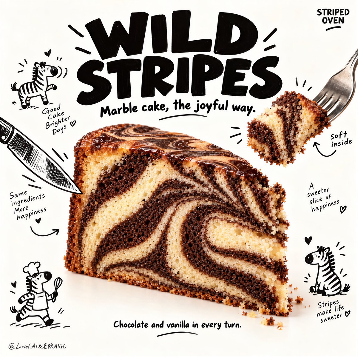
你先注意到的是蛋糕。令人难忘之处在于,条纹延续到了蛋糕之外。 🍊 紧密、高对比度的巧克力和香草漩涡带,贯穿整个切面 从远处就能清晰读出这一片蛋糕,图案强烈到足以撑起整张海报。 🪽 用叉子叉起一...
中文说明
你先注意到的是蛋糕。令人难忘之处在于,条纹延续到了蛋糕之外。 🍊 紧密、高对比度的巧克力和香草漩涡带,贯穿整个切面 从远处就能清晰读出这一片蛋糕,图案强烈到足以撑起整张海报。 🪽 用叉子叉起一小块,展示同样的条纹内部,柔和撕裂并略微压缩 这证明了漩涡纹路深藏于蛋糕内部,将静态的食物镜头变成可食用的瞬间。 GPT- image 2.5 prompt👇 一张超写实的优质甜品海报广告,为一家名为 STRIPED OVEN 的虚构烘焙品牌打造,沿纯 Orbit 方向精炼——保留原海报骨架,但让主角产品更令人无法抗拒,标题更厚重,可食用的瞬间更生动。一大切片的大理石斑马蛋糕置于干净暖白影棚背景中略低于中心的位置,以前四分之三角度展示,完整切面可见。蛋糕呈现强烈的巧克力和香草交替漩涡带,斑马纹更紧致、更丰富,深可可与浅香黄...
原始 Prompt
You notice the cake first. What makes it memorable is that the stripes continue beyond the cake.
🍊 tight, high-contrast chocolate-and-vanilla swirl bands across the full cut face
The slice reads clearly from a distance, with a pattern strong enough to carry the whole poster.
🪽 lift one bite on a fork and show the same striped interior, softly torn and slightly compressed
This proves the swirl is inside the cake, turning a static food shot into an edible moment.

GPT- image 2.5 prompt👇
A hyper-real premium dessert poster advertisement for a fictional bakery brand called STRIPED OVEN, refined in a pure Orbit direction where the original poster skeleton stays intact but the hero product becomes more irresistible, the title heavier, and the edible moment more vivid. One large zebra marble cake slice sits slightly below center in a clean warm-white studio field, shown in a front three-quarter angle with the full cut face visible. The cake displays strong alternating chocolate and vanilla swirl bands with tighter, richer zebra striping, deeper contrast between dark cocoa and pale vanilla crumb, a moist tender interior, slightly crisp baked outer edge, and a glossy chocolate-marble top crust. A small bite-sized piece is lifted away on a fork from the upper right, making the “soft bite” moment more explicit and appetizing.

Framing and composition: vertical poster layout, oversized bold black headline typography dominating the upper third, central photoreal cake wedge as the clear hero, and hand-drawn black cutlery illustrations entering from the edges like playful framing arrows. Preserve the original structure exactly: large title at top, cake in the center, fork-and-knife graphic elements surrounding it, and small doodle scenes distributed around the dessert. Keep generous negative space and a clean warm-white background so the product remains sharply readable. The cake slice must be slightly larger than before, with stronger central emphasis.

Product design: the zebra marble cake is a generous triangular bakery slice with a dense but tender crumb, dramatic curved chocolate-and-vanilla stripes, naturally baked pores, subtle crumb scatter at the cut edge, and a softly glossy marbled top surface. The swirl pattern must be the main delight factor, reading instantly from a distance. The lifted bite on the fork should clearly show the same striped interior, with a soft torn texture and believable crumb compression. The knife on the left should point inward more decisively, helping drive the eye into the central cut face.

Illustration system: surround the cake with clean black hand-drawn doodles including tiny zebra icons, short curved arrows, cheerful miniature food characters, and small chef-like sketches. In this Orbit pass, keep the doodles slightly more energetic and better placed to reinforce the product rhythm, but still clean and sparse. They should support the cake and title, never compete with them. The line quality remains light, playful, and packaging-like.

Lighting and color: bright premium studio food lighting from upper front-left with soft wraparound fill, crisp crumb readability, delicate shadow beneath the cake, and slightly stronger contrast than before so the chocolate stripes feel richer and the vanilla crumb feels softer. Palette balance: 60% warm off-white and vanilla tones, 30% deep cocoa brown and black headline mass, 10% tiny warm bakery accents and doodle notes. The frame should feel cheerful, tactile, and clean, with no muddy whites or flat low-contrast cake texture.

Materials and finish: hyper-real bakery photography fused with clean illustrated poster design. Show moist crumb texture, fine chocolate density, realistic marbled top crust, delicate cake pores, tiny loose crumbs near the cut, and crisp ink-clean doodle lines. The final finish should feel like a Cannes-level bakery campaign: playful, memorable, product-led, and commercially magnetic.

Typography: all visible text in English only, integrated as premium graphic design. The main headline at the top reads exactly: "WILD STRIPES" in large heavy playful black lettering. A smaller secondary line beneath it reads exactly: "Marble cake, the joyful way." Add a subtle small brand mark in an upper corner reading exactly: "STRIPED OVEN". Near the lifted bite add a tiny handwritten-style note reading exactly: "soft inside". Near the lower area add a small support line reading exactly: "Chocolate and vanilla in every turn." Typography should feel heavier, bolder, and more immediate than before while staying clear of the cake silhouette.

Output and constraints: polished premium dessert poster, product-first hierarchy, no copied source text, no real brand names, no people, no cluttered props, no table scene, no excessive crumb mess. Keep utensils natural and well-angled, the lifted bite believable, the zebra striping bold and clean, and the doodle system controlled. Avoid warped cake geometry, muddy crumb texture, unreadable text, messy sketch overload, plastic-looking cake surface, broken cutlery perspective, AI gibberish text, dead whites, or drift away from high-end commercial food realism.