PROMPT RECORD图像记录
你先注意到的是糖果丝带。真正的控制力在于让它成为一条有引导感的路线——而不是随意的洒落。 🪿 一条密集、有方向的糖果弧线,从右上方穿过中心区域,延伸至桌面 这让视线从标题清晰地移动到包装,再进...
中文说明
你先注意到的是糖果丝带。真正的控制力在于让它成为一条有引导感的路线——而不是随意的洒落。 🪿 一条密集、有方向的糖果弧线,从右上方穿过中心区域,延伸至桌面 这让视线从标题清晰地移动到包装,再进入右侧的奇幻世界。 ✨ 保持袋型轮廓干净;预留左上角的标题区域,让糖果世界退居次要 这样可以防止奇幻细节与产品主体争夺注意力。包装袋一眼即可清晰阅读。 GPT- image 2.5 prompt👇 一张超写实高级感海报广告,设定为一个名为 POPDOTS 的虚构糖果品牌,提炼为 Orbit 加 Port 的方向:保留左侧亮色自立糖果袋与右侧戏剧化糖果涌现的原始产品主导结构,但让整张图像更具标志性、更干净、更具策展式的控制感。一个适合上架、可重复密封的糖果自立袋置于左侧前景的温暖木质桌面上,完全可读且在物理上占据主导。从右上...
原始 Prompt
You notice the candy ribbon first. The real control is making it a guided route—not a random spill.
🪿 a dense, directed candy arc traveling from upper right through center toward the tabletop
This gives the eye one clear path from the headline to the pack, then into the world on the right.
✨ keep the pouch silhouette clean; reserve the upper-left headline zone and make the candy world secondary
This stops the fantasy detail from competing with the product. The pack remains readable at a glance.

GPT- image 2.5 prompt👇
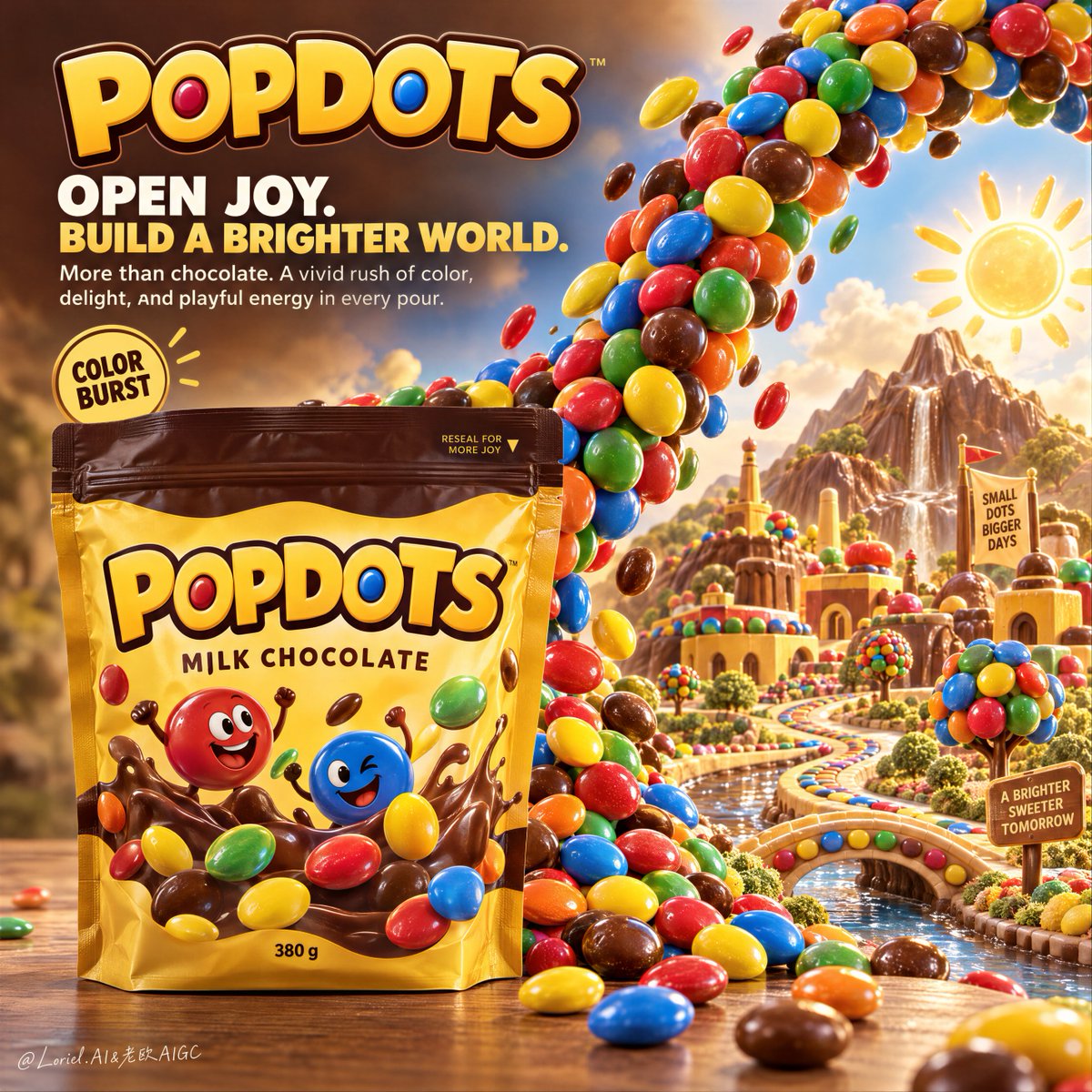
A hyper-real premium poster advertisement for a fictional candy brand called POPDOTS, refined into an Orbit-plus-Port direction: preserve the original product-led structure of a bright stand-up candy pouch on the left and a dramatic candy emergence on the right, but make the whole image more iconic, cleaner, and more curatorially controlled. A shelf-ready resealable candy pouch stands upright in the left foreground on a warm wooden tabletop, fully readable and physically dominant. From the upper right, a dense ribbon of glossy candy-coated chocolate buttons sweeps into frame in a powerful arc, then unfolds into a more ordered and art-directed miniature candy landscape on the right, as if an entire world has been poured from the pack. The pouch remains the absolute hero; the candy world is its emotional extension.

Framing and composition: vertical hero poster layout, strong left-right split, broad headline zone in the upper-left, pack anchored in the lower-left, major candy arc traveling from upper right through center toward the tabletop, then resolving into a stylized candy-city terrain on the lower-right. Keep the product silhouette clean and separated. Increase negative space and visual control compared with a more chaotic fantasy ad: fewer incidental details, stronger focal hierarchy, and a more sculptural read of the candy flow. The eye should move from brand and headline to pouch, then through the candy ribbon into the right-side world.

Product design: create a premium matte-gloss stand-up pouch in a warm golden yellow with a rich cocoa-brown top seal, realistic zipper closure, subtle shelf-ready creases, crisp printing, and elegant pack geometry. Front-of-pack text reads exactly: "POPDOTS". Flavor line reads exactly: "MILK CHOCOLATE". Small weight mark reads exactly: "380 g". Include two tiny cheerful printed candy mascots on the pouch artwork only, not as independent 3D characters outside the bag. The pack must feel globally commercial, tactile, and convincingly real.

Candy stream and world-building: the candy flow is made of glossy round candy-coated chocolates in saturated red, yellow, blue, green, orange, and brown, with believable shell sheen, slight size variance, realistic gravity, and strong highlight control. The stream should feel denser and more intentional than before, like a guided visual current rather than random spill. On the right side, the world becomes a curated candy-scape rather than a busy amusement park: candy-button trees, simplified toy-like architectural blocks, one winding color path, one candy-lined water channel or terrain ribbon, a few highly controlled landmark shapes, and a bright fantasy sun motif. The miniature world must clearly derive from the candy material itself while feeling cleaner, more art-directed, and less cluttered.

Lighting and color: warm commercial key light from upper front-right, soft frontal fill, controlled specular highlights on the candy shells, gentle reflections across the pouch surface, and a warm ambient glow in the right-side miniature world. Build stronger light-dark separation so the pouch reads as a premium object first, while the candy arc and the fantasy terrain remain vivid and dimensional. Palette balance: 60% golden yellow pack, warm wood, and ambient cocoa warmth; 30% saturated candy primaries; 10% bright white and sunlit accent glow. Keep colors joyful and intense but not oversaturated or muddy.

Materials and finish: hyper-real commercial product photography fused with premium fantasy advertising design. Show realistic candy shell gloss, fine shell scuffs, subtle chocolate mass beneath the coating, printed pouch texture, matte-laminate packaging finish, clean wooden tabletop grain, simplified but crisp miniature city detail, and controlled depth falloff. The final image should feel like a Cannes-level FMCG campaign: imaginative, polished, tactile, and editorially restrained.

Typography: all ad copy in English only, integrated into the upper-left zone as premium graphic design. Top brand mark reads exactly: "POPDOTS". Main headline reads exactly: "OPEN JOY. BUILD A BRIGHTER WORLD." Supporting copy below reads exactly: "More than chocolate. A vivid rush of color, delight, and playful energy in every pour." Add one small round badge reading exactly: "COLOR BURST". Typography should be bold, friendly, and highly art-directed, using warm yellow-gold and soft white tones that harmonize with the pack while staying clear of the product silhouette and candy arc.

Output and constraints: polished premium candy poster, product-first composition, no real brand names, no copied source slogans, no Arabic text, no Chinese text, no people, no unrelated props, no overloaded fantasy clutter. Keep pouch geometry correct, text crisp, candy scale consistent, candy flow physically plausible, right-side world readable but secondary, and the overall visual language clean and unified. Avoid warped packaging, fused candies, unreadable print, muddy blur, random floating structures, broken perspective, cheap cartoon rendering, dirty shadows, dead black patches, and style drift away from high-end commercial realism.