PROMPT RECORD图像记录
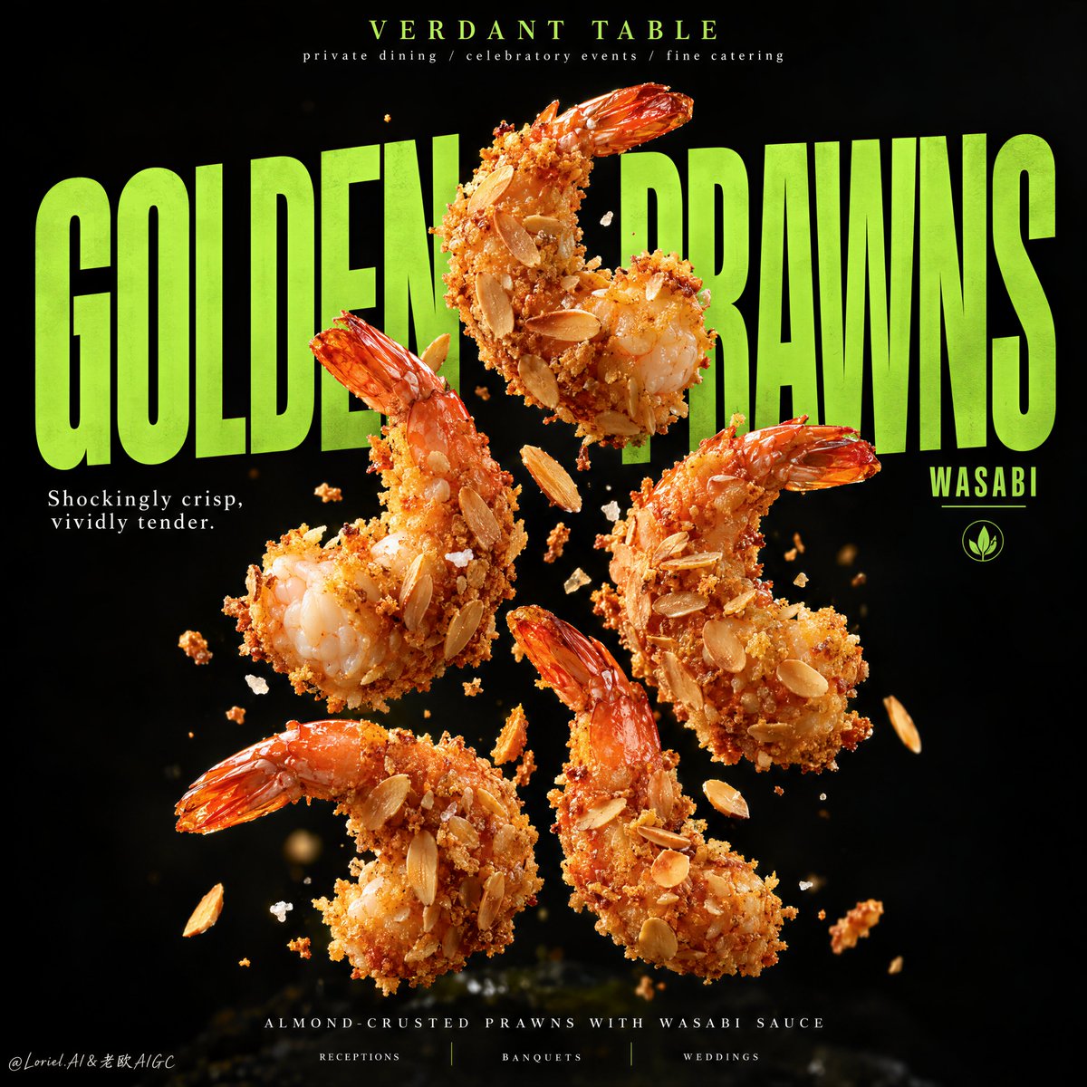
你首先会注意到大虾。让这张海报保持整体的,是字体像一个第二深度平面一样发挥作用。 �超大号窄体酸橙色大标题置于食物之后,字母被大虾选择性遮住和露出 食物感觉悬停在字体之内,而不是被贴在它上面。...
中文说明
你首先会注意到大虾。让这张海报保持整体的,是字体像一个第二深度平面一样发挥作用。 �超大号窄体酸橙色大标题置于食物之后,字母被大虾选择性遮住和露出 食物感觉悬停在字体之内,而不是被贴在它上面。 ✨五只大虾以严谨的纵向簇状排列,留有刻意的间隙,仅有少量飘落的面包屑 这让每只大虾拥有自己的剪影,使构图保持锐利而不是杂乱。 GPT- image 2.5 提示词👇 一个超写实的优质食品海报广告,为一个名为 VERDANT TABLE 的虚构餐饮与活动宴会品牌打造,提炼为 Orbit 加 Port 的方向,让食物与字体锁入一个更干净、更有标志性的视觉体系。主角产品为杏仁脆皮炸虾配芥末酱,作为绝对的视觉焦点呈现。五只巨大的金色大虾在深午夜黑色背景前以严谨的纵向簇状漂浮悬浮,以富有动感的间距和微妙的上扬能量排列。每只大虾裹着...
原始 Prompt
You notice the prawns first. What holds the poster together is the type acting like a second depth plane.
🪽 oversized condensed lime-green headline placed behind the food, with letters selectively hidden and revealed by the prawns
The food feels suspended inside the typography instead of pasted over it.
✨ five large prawns arranged as a disciplined vertical cluster, with deliberate gaps and only a few drifting crumbs
This gives each prawn its own silhouette and keeps the composition sharp rather than noisy.

GPT- image 2.5 prompt👇
A hyper-real premium food poster advertisement for a fictional catering and event-dining brand called VERDANT TABLE, refined into an Orbit-plus-Port direction where the food and typography lock into one cleaner, more iconic visual system. The hero product is almond-crusted fried prawns with wasabi sauce, presented as the absolute visual focus. Five large golden prawns float in a disciplined vertical cluster against a deep midnight-black background, suspended with dynamic spacing and subtle upward energy. Each prawn is coated in crisp toasted almond flakes and fine golden crumb, with vivid orange-red tail shells, tiny salt crystals, and a few restrained crumb fragments drifting around them. The image must feel luxurious, sharp, and highly memorable.

Framing and composition: vertical poster layout, central floating prawn cluster, giant lime-green headline typography occupying most of the middle plane behind the food. The typography acts as structure, not decoration: bold, tall, condensed letters partially hidden and revealed by the prawns, creating depth and a strong editorial rhythm. Keep the top area minimal with a small refined brand line, one short white support phrase crossing the middle-left field, and an ultra-clean footer line at the bottom. Reduce visual noise compared with a more conventional food ad. The shrimp-to-type relationship should feel almost architectural.

Subject design: the prawns are premium, large, naturally curled, and perfectly fried, with crisp almond crust, layered toasted slices, irregular crunchy edges, realistic fried granularity, and subtle juicy flesh visible in one or two broken-open pieces. The coating must feel dry-crisp and luxurious, never greasy. Wasabi appears only as a tightly controlled accent: a minimal green cue in copy, a tiny emblem, or the faintest sauce implication, but not as a messy splash. At the very bottom, if needed, allow only a barely visible soft-focus grounding shape, heavily subdued and secondary.

Lighting and color: strong directional key light from upper front-right, subtle soft fill from lower left, sharp highlights on the almond flakes, fine edge shimmer on the tails, and sculptural contrast against the black background. Palette balance: 60% black and deep charcoal field, 30% golden crust and warm seafood orange, 10% electric lime-green typography and wasabi accents. Build high tonal separation so the floating prawns feel luminous and tactile while the typography reads with aggressive clarity. No muddy blacks, no dead voids, no greasy brown haze.

Materials and finish: hyper-real food photography fused with premium graphic poster design. Show delicate almond-slice layering, crisp breadcrumb texture, realistic salt specks, glossy shell detail on the tail, and refined typography edges that feel printed and intentional. The final finish should feel like a Cannes-level hospitality campaign: bold, minimal, aggressive, and editorially controlled.

Typography: all visible text in English only, art-directed and integrated into the poster. Top brand mark reads exactly: "VERDANT TABLE". Small top descriptor reads exactly: "private dining / celebratory events / fine catering". Main giant central headline reads exactly: "GOLDEN PRAWNS" in oversized condensed lime-green uppercase lettering. Secondary word placed near the right side of the title reads exactly: "WASABI". Small support line at mid-left reads exactly: "Shockingly crisp, vividly tender." Bottom footer line reads exactly: "ALMOND-CRUSTED PRAWNS WITH WASABI SAUCE". Along the very bottom place three minimal service tags reading exactly: "RECEPTIONS", "BANQUETS", "WEDDINGS". Typography must be bold, clean, geometric, and spatially aware, never covering the key edible surfaces of the prawns.

Output and constraints: polished premium food poster, product-first hierarchy, no copied source text, no real brand names, no people, no cluttered props, no restaurant interior, no excessive garnish. Keep prawn anatomy correct, tails natural, crust physically believable, floating arrangement balanced, crumbs restrained, text crisp, and the whole page clean and high-end. Avoid malformed prawns, duplicate tails, broken crust geometry, greasy surfaces, unreadable typography, muddy black background, chaotic debris, cheap fast-food styling, or drift away from high-end commercial realism.